What Font Does Netflix Use in 2026?
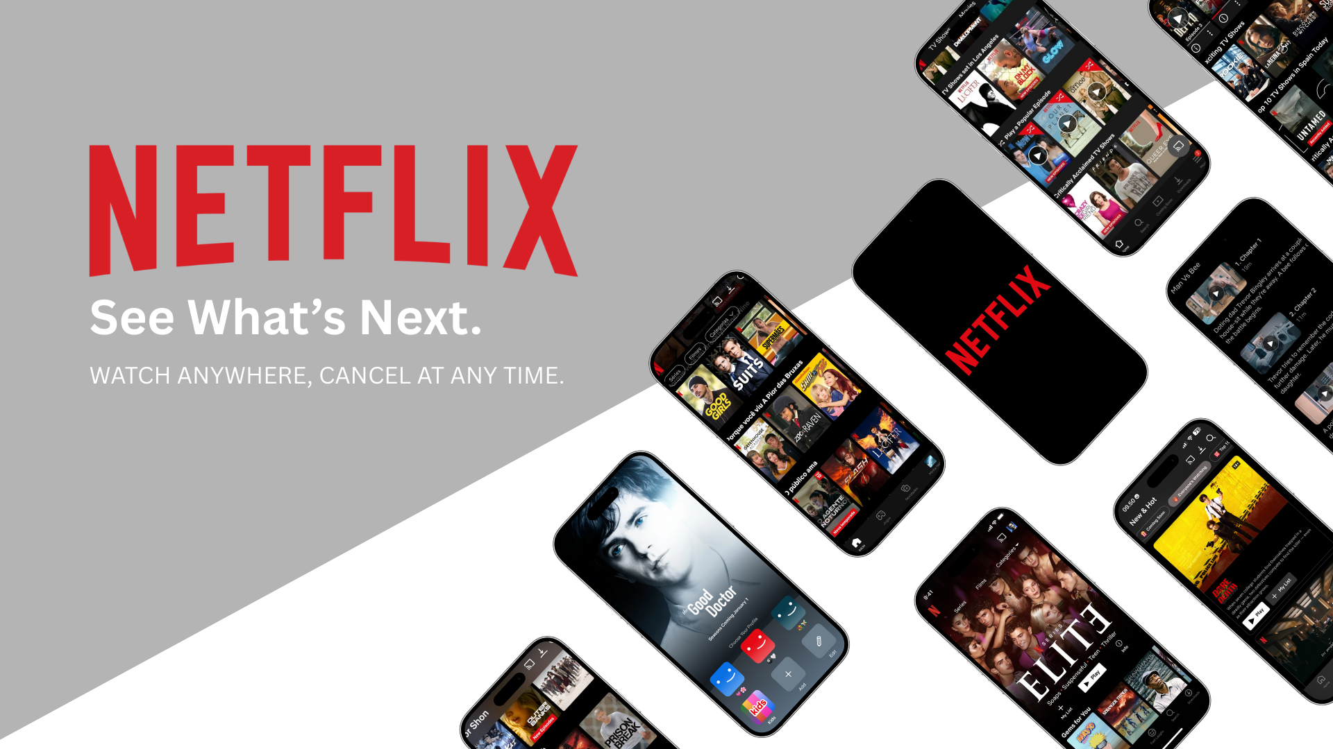
Netflix uses a custom typeface called Netflix Sans to maintain a consistent, modern, and highly readable visual identity across its global platform. This article explores the font Netflix uses in 2026, why custom typography matters in streaming platforms, and the best modern font alternatives designers can use today.

Netflix is one of the most popular subscription-based streaming platforms today. It gives you access to thousands of TV shows, movies, documentaries, and original content that you can watch anytime, anywhere. As long as your device is connected to the internet, whether it’s a smart TV, smartphone, tablet, or laptop, Netflix is ready to go with one simple monthly fee. As the streaming world keeps moving fast, Netflix continues to stay ahead of the curve.
With hundreds of new titles released every month, a clean and responsive interface, and a smooth watching experience, Netflix has built a strong and recognizable visual system. One detail people often overlook, but that has a big impact on how professional and consistent the brand feels, is typography. Fonts play a key role in shaping Netflix’s modern, confident, and polished identity.
So today, this article will explore the fonts used by Netflix and how they support its visual appeal and brand consistency. We’ll also share some great font alternatives inspired by the Netflix logo that you can download from Sensatype Studio.
What Font Does Netflix Use?
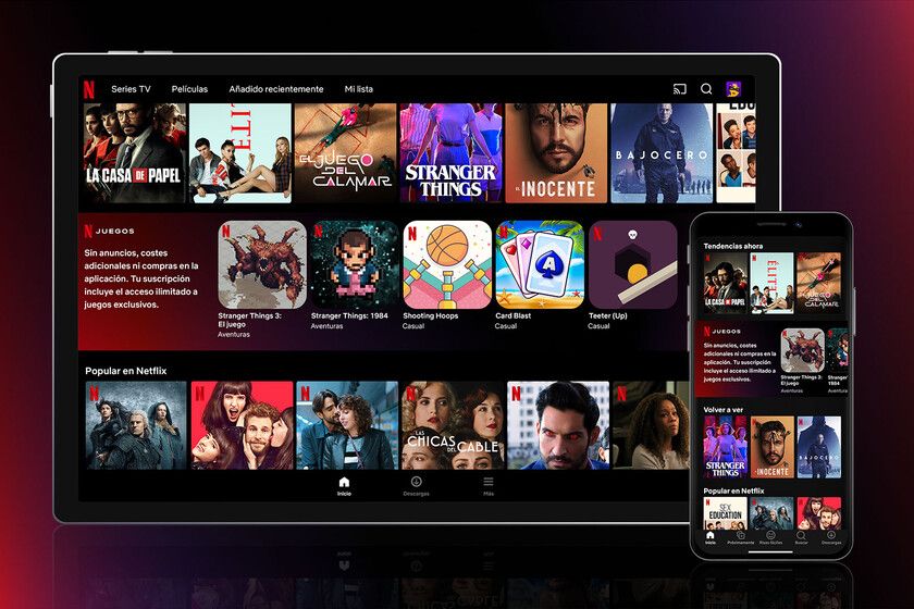
Netflix isn’t the only platform using a custom typeface. Netflix uses its own custom font called Netflix Sans, developed by Dalton Maag. This font wasn’t chosen randomly. As a global platform, Netflix needed a typeface that stays readable across all screen sizes, feels modern and professional, supports multiple languages, and reflects a sleek, cinematic brand personality.
Netflix Sans checks all those boxes with its clean geometric design, stable strokes, and a look that feels bold yet approachable. The font is used across the entire Netflix interface, from category titles and navigation buttons to profile pages and settings. For subtitles, Netflix uses a separate custom caption system that users can adjust for better comfort while watching.
Netflix Font Alternatives
Even though Netflix Sans is exclusive and not available for public use, Sensatype Studio offers a wide range of modern fonts inspired by the same global design principles. These fonts capture a similar visual energy and can be great alternatives if you’re aiming for a clean, modern, and cinematic feel in your own projects:
1. Ranks - Tall Condensed Font
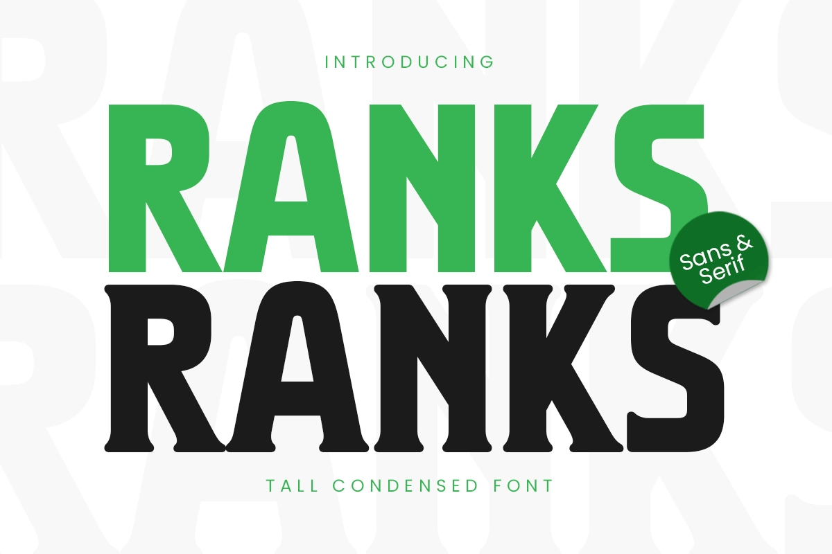
Ranks font is a tall and condensed font designed for bold, impactful typography. Perfect for editorial headlines, branding, posters, high-fashion graphics, and luxury packaging, Ranks font is ideal for making a strong visual statement. Whether you're crafting a minimalist logo, an eye-catching billboard, or striking website typography, Ranks font ensures high readability and bold impact.
2. Ultra Tall - Modern Condensed Font Family
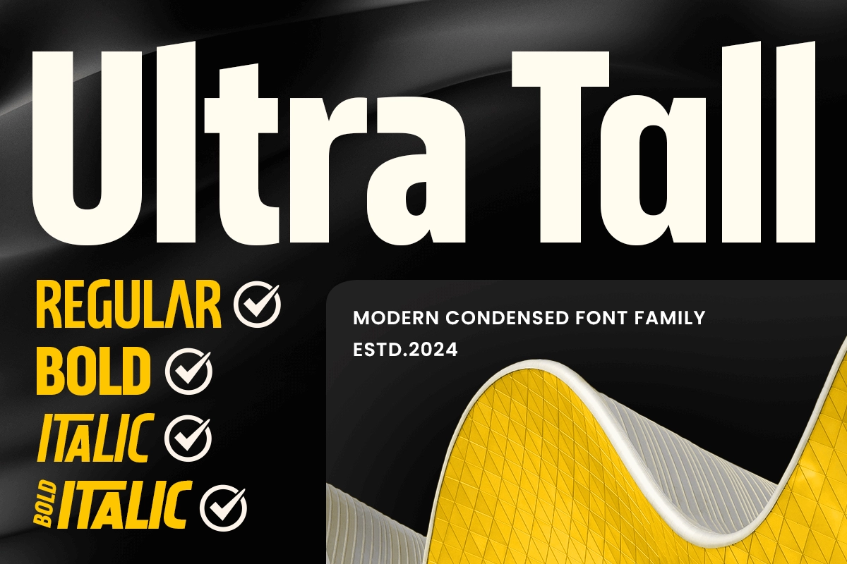
Ultra Tall is a modern condensed font family designed to make a striking impression. Its elongated characters and sleek lines create a bold yet elegant aesthetic, perfect for contemporary design needs. Its modern and minimalistic approach ensures your projects stand out while maintaining a clean and professional look. Its bold presence effortlessly conveys confidence and sophistication, making it a valuable tool for designers.
3. Upnormal - Minimalist Font
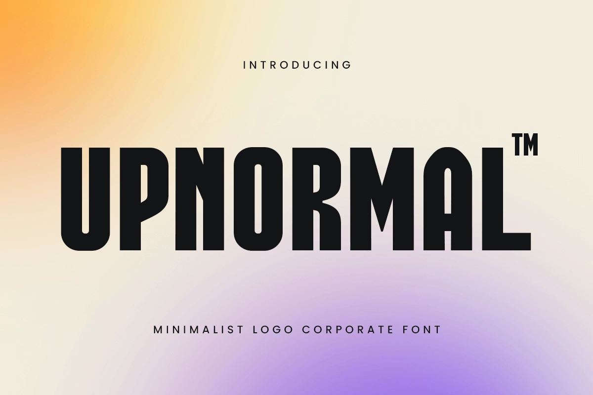
Introducing Upnormal, a font that blends condensed structure with minimalist aesthetics to bring sleek simplicity to your designs. Perfect for modern and clean layouts, Upnormal ensures your work stands out with elegance and clarity. Upnormal is ideal for designers who seek to create clean, professional, and stylish branding materials.
4. Runing - Sport Condensed Font
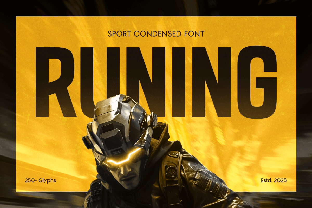
Runing font is a high-energy sport condensed font designed for speed, strength, and impact. With its bold, narrow letterforms and sleek structure, this typeface is perfect for athletic branding, esports visuals, fitness gear, and adrenaline-fueled marketing campaigns. Its sharp angles and tight spacing give a dynamic and aggressive look, making it ideal for racing posters, gym logos, game titles, and fitness apparel.
5. Omica - Tall Condensed Font
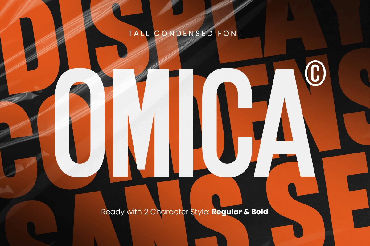
Omica is a tall, condensed font designed to make a bold statement in any project. Its sleek, elongated forms provide a modern and stylish touch that’s perfect for branding, editorial layouts, and impactful headlines. The unique vertical proportions of Omica create a distinctive look that captures attention while maintaining readability.
FAQ
Q: What font does Netflix use in 2026?
A: Netflix uses Netflix Sans, a custom typeface created by Dalton Maag.
Q: Can Netflix Sans be downloaded for free?
A: No. Netflix Sans is a proprietary font and is only used internally by Netflix.
Q: Why did Netflix choose a custom font?
A: To keep a strong and consistent brand identity, improve readability across devices, and reduce long-term licensing costs.
Q: What fonts are similar to Netflix Sans?
A: If you’re looking for a similar clean and modern feel, Ranks, Upnormal, Ultra Tall, Runing, and Omica from Sensatype Studio are solid alternatives with a comparable visual energy.
Netflix shows the world that typography is a core foundation of branding and user experience. By using Netflix Sans as its visual backbone, the platform stays consistent, modern, and instantly recognizable. More than just a design choice, Netflix proves that typography isn’t decoration, it’s a key part of how users experience a product.
For designers who want to create high-quality visuals without access to proprietary fonts like Netflix Sans, Sensatype Studio offers a smart alternative. With a curated collection of modern and versatile typefaces, Sensatype empowers creators to build brands that feel strong, professional, and memorable, without compromise.