What Font Does Spotify Use in 2026?
Curious what font Spotify uses in 2026? Spotify now uses its custom typeface, Spotify Mix, replacing Circular and Spotify Sans for a more modern, readable, and cohesive visual identity. Explore its history and discover clean modern font alternatives you can use legally.
Spotify is the world's largest digital music streaming platform, allowing users to listen to millions of songs, podcasts, and audio content from a variety of genres and creators. Launched in 2008, Spotify transformed the way people access music from purchasing physical albums to instantly enjoying their entire music catalog over the internet. As a leader in the streaming industry, Spotify is not just a music player but also a cultural platform that influences global music trends, introduces new artists, and supports audio creators worldwide.
Spotify has a carefully designed visual experience to enable millions of users to explore music easily and comfortably. Every interface element, from the signature dark colors and clean layout to the modern typography, plays a vital role in shaping Spotify identity. This typographic system works in harmony with Spotify logo design, a simple circle symbol with three sound waves and a minimalist wordmark that reflects clarity, rhythm, and a modern aesthetic. The combination of the logo, color system, layout structure, and Spotify Mix font creates a unified, intuitive, and distinctly Spotify like visual experience.
So... In this article, we'll take a closer look at the font choices used by spotify, their history and how they contribute to the platform's branding, user experience, and functionality in 2026.
A Brief History of Spotify Font
Spotify has gone through several font changes since its launch in 2008. These changes followed developments in UI design, branding needs, and Spotify global expansion. Here's a look at Spotify font evolution, from earliest to most recent:
1. Early Era (2008-2011)
Spotify didn't yet have its own dedicated font or typographic identity.
They used common fonts popular in the Web 2.0 era: Gotham and Proxima Nova. These two fonts were chosen for their modern and readable style, but they were widely used by startups. These fonts weren't enough to provide a unique identity for a brand as large as Spotify.
2. Major Rebranding Era (2013-2022)
In 2013, Spotify decided to build a stronger visual identity, one way of doing this was by using a new font. Spotify then chose Circular, a premium geometric sans serif font from Lineto. Its rounded, modern letterforms fit seamlessly with the Spotify icon. Because it has been in use for almost 10 years, Circular is often referred to as the "Spotify font".
3. Internal Modifications (2016-2022)
As the app grew, Spotify needed a more stable font for its small UI. They then collaborated with Lineto to create special versions of Circular: Spotify Circular and Spotify Sans. This font has become Spotify standard for years, especially in the mobile app.
4. Modern Era (2024-2025)
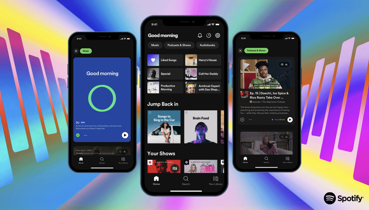
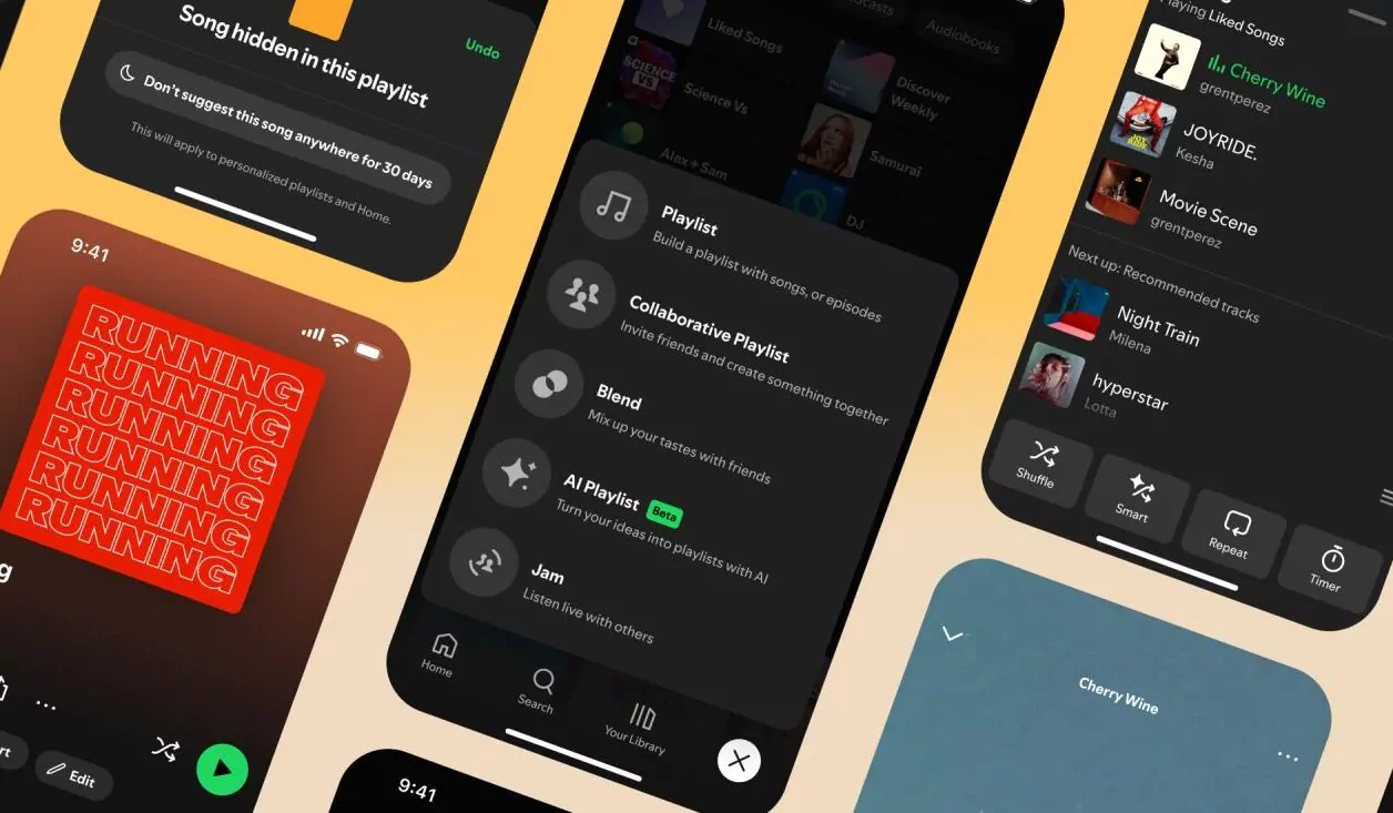
In 2024-2025, Spotify officially introduced Spotify Mix, a custom font designed specifically for Spotify identity and user experience. Spotify Mix's main characteristics are softer, less rigid than Circular, and easier to read on small screens. The balanced humanist and geometric characters reflect Spotify modern and friendly brand personality. Spotify Mix is now used in:
- Mobile app
- Spotify Desktop
- Web Player
- Playlist UI
- Spotify official design system
- Internal promotions
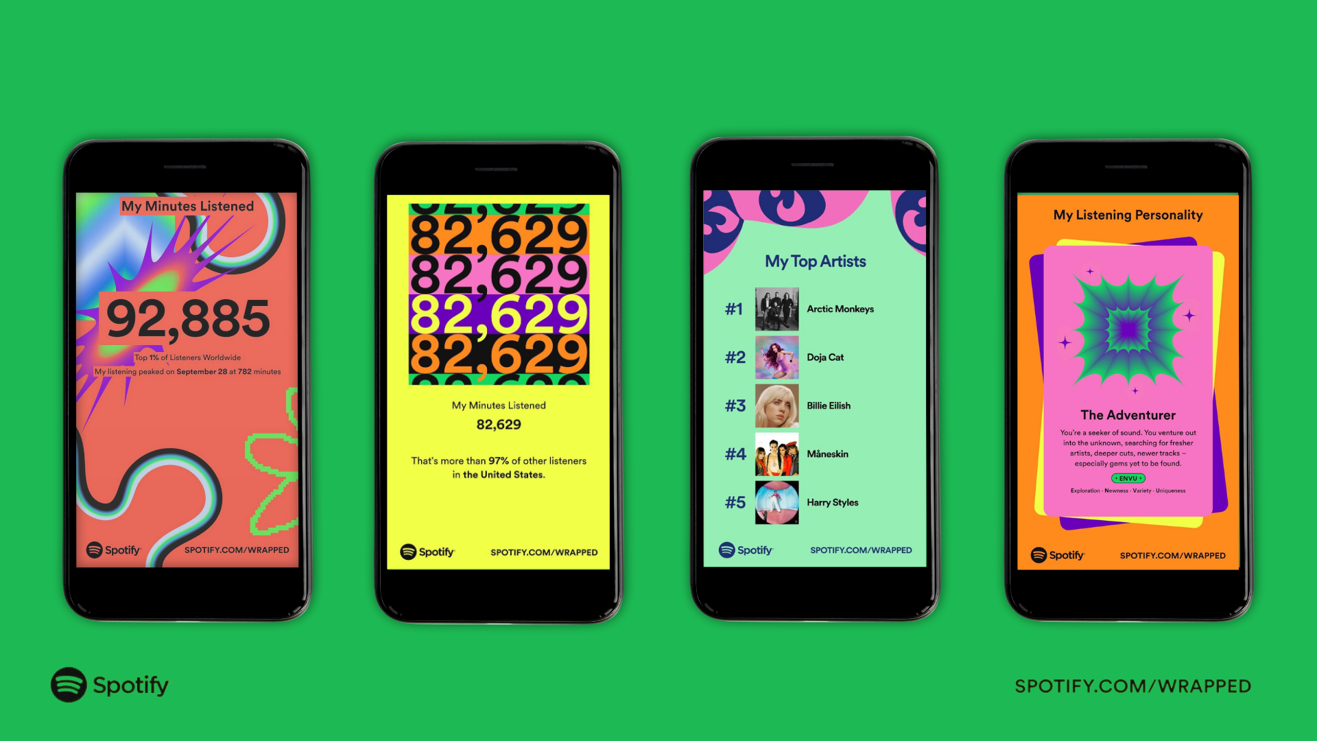
- Spotify Wrapped
Why Spotify Mix
Spotify adopted Spotify Mix to enhance the user experience through more legible, stable typography that aligns with modern design requirements, particularly on dark displays. This font also provides stronger brand differentiation, supports global language coverage, and ensures visual consistency across platforms. Furthermore, using custom fonts allows Spotify to reduce its reliance on third-party licensing.
10+ Spotify Font Alternatives (Freemium & Paid) You Can Use:
If you want a similar look to Spotify Mix or Spotify Circular for your design, but the official fonts aren't publicly available, there are several alternative options available in Sensatype Studio. These fonts offer a modern, clean, and geometric-humanist feel similar to Spotify typographic style.
1. Cornea-Premium Corporate Logo Font
A font designed to bring a modern and professional touch to your corporate branding. Combining sleek aesthetics with a minimalist approach, Cornea is perfect for creating logos and branding materials that exude sophistication and professionalism.
2. Geom-Modern Branding Font
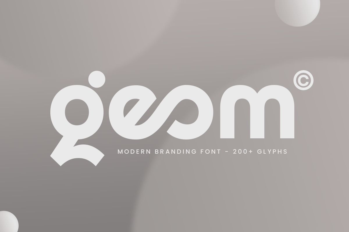
Geom is a modern branding font with a sleek geometric structure, perfect for logos, corporate branding, web design, and high-end marketing materials. Geom delivers a modern, minimal, and professional style that suits technology startups, corporate brands, and contemporary businesses.
3. Mafle-Modern Corporate Font
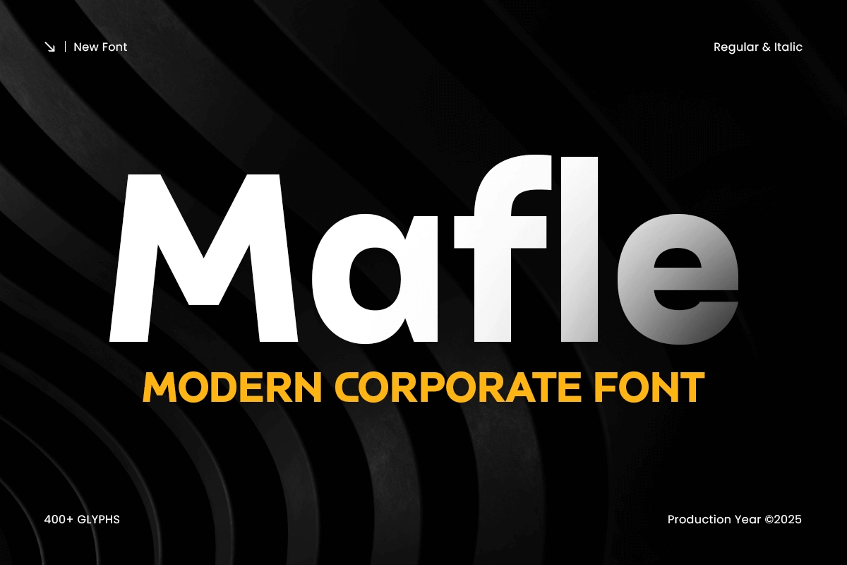
Mafle is a modern font with a strong balance of geometry and readability. It is suitable for logos, presentations, websites, and corporate materials, especially in the technology, finance, architecture, and professional business industries.
4. Ricko-Modern Corporate Logo Font
Ricko is a modern sans serif with precise geometry and balanced proportions. It is well-suited for corporate branding, logos, websites, and marketing due to its professional, clean, and trustworthy appearance.
5. Rosan Grotesk-Modern Humanist Font
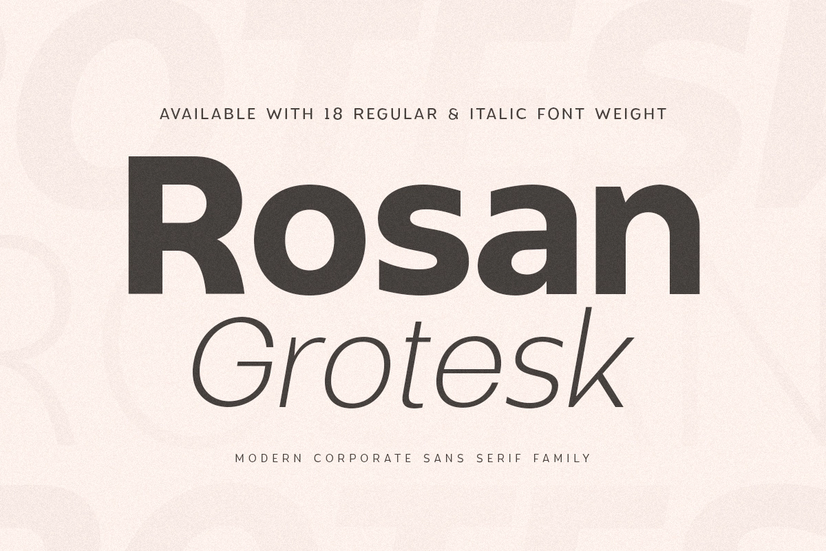
Rosan Grotesk is a modern humanist sans serif font that is minimalist, premium, and highly legible. Flexible for branding, posters, social media, product packaging, photography, and various other visual projects.
6. Seagul-Modern Humanist Sans Serif
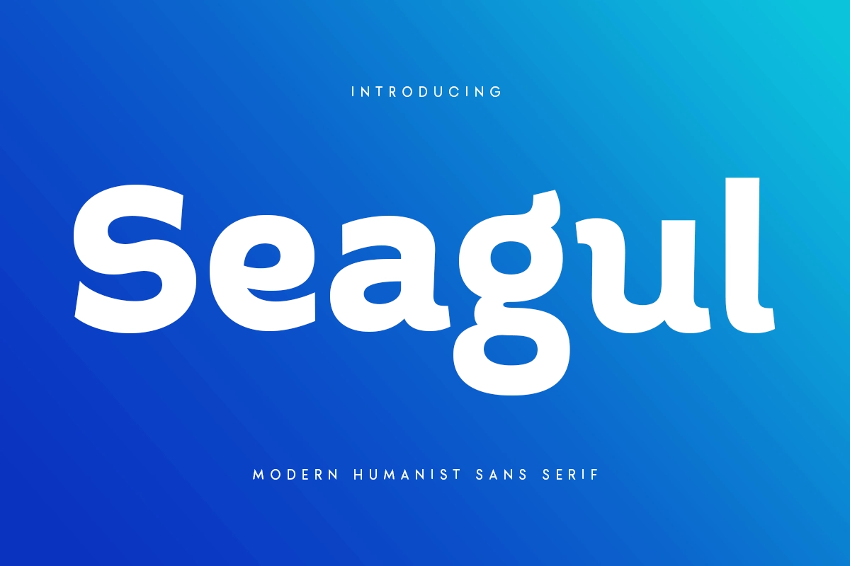
Seagul is a sans serif font specifically designed for headlines and titles that want to stand out. Its modern style makes it suitable for designs that require strong, standout typography.
7. Motive-Unique Modern Font Family
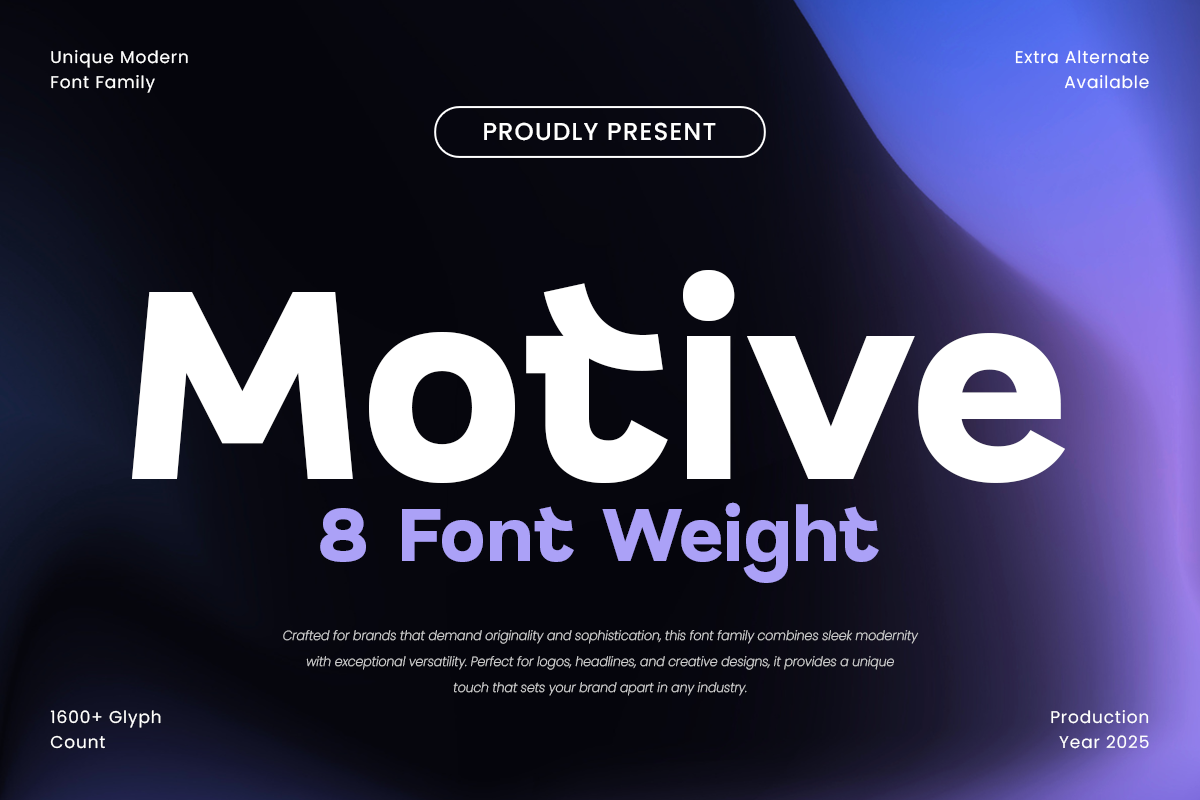
Motive is a unique modern font family crafted for those who seek versatility and boldness in their designs.Motive brings a sleek and contemporary feel to your projects. With a wide range of weights and styles, Motive is perfect for creating a strong visual identity across digital and print platforms.
8. Quotes-Geometric Feminine Women Day Font
Quotes is a modern geometric font with an elegant and feminine feel. It is very versatile for branding, editorial, social media, packaging, and invitations, providing a clean and stylish look.
9. Nautic-Modern Corporate Font
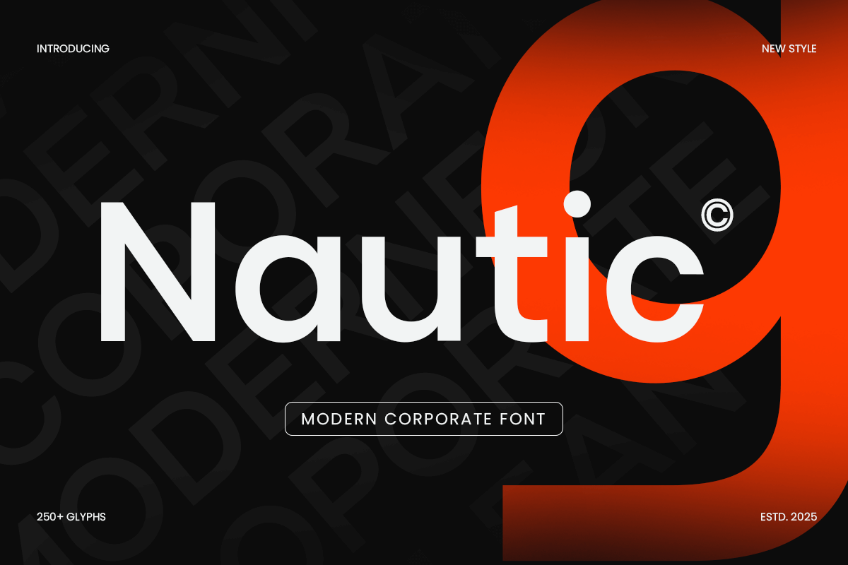
Nautic is font designed to bring a polished, professional look to your branding and business design projects. Nautic is perfect for creating sleek logos, high-impact corporate identities, and contemporary business designs. Nautic provides a refined and modern touch to your brand's visual identity.
10. Montreal-Modern Logo Corporate Font
It is introducing Montreal, a font crafted to bring a touch of modern elegance to corporate branding. With its sleek and professional design, Montreal is perfect for creating logos and branding materials that exude sophistication and contemporary style.
11. Refoke-Luxury Corporate Font Family
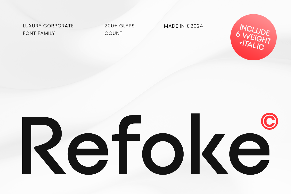
Inspired by modern, high-end aesthetics, Refoke offers a refined and professional touch, making it ideal for businesses that want to exude confidence and class in their visual identity. Refoke is perfect for companies looking to make a bold, premium statement. It stands out in corporate identity, editorial design, and even website headers.
FAQ :
Q: What font is Spotify using in 2025?
A: Spotify Mix.
Q: Is Spotify Mix available for download?
A: No, Spotify Mix is not available for download.
Q: Why is Spotify Mix not available for download?
A: Because this font is proprietary, and its unauthorized use violates copyright and licensing laws.
Q: What font did Spotify use before Spotify Mix?
A: Before that, Spotify used Spotify Circular, a modified version of Circular.
Q: What type of font is Spotify Mix?
A: Spotify Mix is a sans serif geometric humanist font designed specifically for Spotify's interface and branding.
Q: What font is similar to Spotify Mix?
A: Of all the Sensatype Studio fonts, Mafle, Ricko, and Rosan are the three that most closely match the Spotify Mix aesthetic.
Q: What font does Spotify Wrapped use?
A: Spotify Wrapped uses a different custom font each year, not Spotify Mix.
Spotify adopted the Spotify Mix font as a step in its typographic evolution, moving it toward a more modern, legible, and digitally optimized font. After years of relying on Spotify Circular and Spotify Sans, Spotify needed a font that was more flexible, supported multiple languages, and provided a stronger and more unique visual identity.
Spotify Mix offers a balance between geometric style and humanist flair, making it comfortable to read at small sizes and perfectly suited to dark mode, two key factors within the Spotify interface. In addition to enhancing design consistency, this custom font also gives Spotify full control over the typography without additional licensing fees. So, Spotify Mix is a crucial foundation for Spotify modern visual experience.