
25 Best Wedding Invitation Fonts, Matched to Your Wedding Style
Find the best wedding invitation fonts for every wedding style, from elegant calligraphy and romantic script fonts to modern serif and minimalist sans serif typefaces. This guide explores font pairings, free and premium options, print considerations, and expert tips to create beautiful wedding stationery that looks timeless and professional.
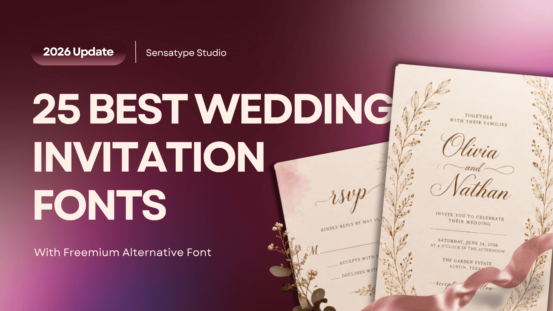
Your guests will judge the formality of your wedding in about two seconds, before they've read a single word of your invitation. That snap judgment comes almost entirely from the font. A copperplate script says black tie. A clean sans serif says rooftop cocktails. Get the match wrong and guests show up in linen for a ballroom wedding.
That's why the best fonts for wedding invitations aren't the prettiest ones on a list. They're the ones that match your wedding's style and still print cleanly on real paper. This guide breaks down the four font categories, the strongest picks for every wedding aesthetic (including free options and the premium scripts worth paying for), pairing formulas professional stationers rely on, and the print rules that separate polished invitations from ones that look homemade.
Short on time? You can browse Sensatype's script and calligraphy fonts now, then come back here to pair your pick.
The 4 Font Categories Every Couple Should Know
Wedding fonts fall into four categories: script and calligraphy, serif, sans serif, and handwritten or display. Most invitations use two of them. One expressive font carries your names, and one quiet font carries the details. Once you can tell the categories apart, choosing gets dramatically easier.
Script & Calligraphy Fonts
Script fonts imitate handwriting with a pen or brush, with letters that connect and flow. They split into two moods. Formal calligraphy signals traditional elegance: think copperplate styles with dramatic contrast between thick and thin strokes, the kind produced by a pointed nib pen. Modern calligraphy is bouncier and looser, with uneven baselines that feel personal rather than ceremonial.
Scripts are the star of the invitation. Perfect for your names, terrible for everything else. Set your venue address in an elegant script font and your grandmother will be squinting at it. Use cursive wedding fonts for the two or three most important words, then hand off to something calmer.
Serif Fonts
Serifs are the small "feet" at the ends of letterstrokes, the detail that makes fonts like Garamond, Didot, Playfair Display, and Cormorant feel timeless. Serif fonts have appeared on formal printed invitations for two centuries, which is exactly why they read as traditional and trustworthy.
Are serifs formal? Yes, and they're also workhorses. A good serif handles your date, venue, and RSVP details at small sizes without losing elegance, which makes serifs the most versatile category on this page. If you only remember one rule, make it this one: when in doubt, pair your script with a classic serif.
Sans Serif Fonts
Sans serifs drop the feet in favor of clean, geometric letterforms. Montserrat, Lato, and Josefin Sans are the ones you'll see most in modern wedding stationery. They signal contemporary and minimal rather than traditional.
Can a wedding invitation be sans serif? Absolutely. A light sans serif with generous letterspacing can look every bit as considered as engraved copperplate. It just says "gallery opening" instead of "grand ballroom." Sans serifs usually play the supporting role for details, though couples with a modern, minimal aesthetic increasingly use them for everything, names included.
Handwritten & Display Fonts
Handwritten fonts look like actual casual handwriting (marker, brush pen, pencil) rather than formal calligraphy. Display fonts are decorative designs built for headlines and little else. Both bring personality, and both need restraint. They suit garden parties and backyard weddings beautifully, but a whole invitation set in a whimsical handwritten font tips from charming into hard to read. Use them as an accent, a single "we're getting married!" moment, not the main event.
The Best Fonts for Wedding Invitations, by Style
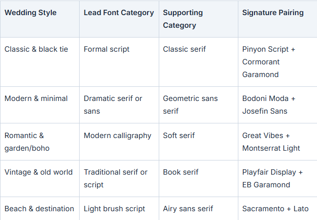
Here's the honest truth most font lists skip: there's no universal "best" font. There's only the best font for your wedding. Use this matrix to jump to your aesthetic, then read the picks below it.
Classic & Black Tie
For formal weddings, you want fonts with pedigree: styles guests have seen on engraved invitations their whole lives.
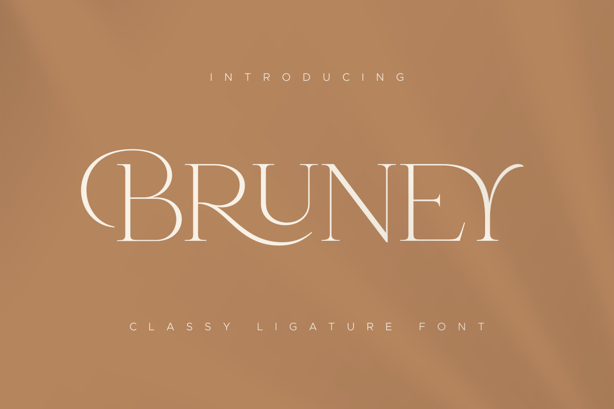
Bruney (premium, Sensatype) — a luxury script full of ligatures, with the connected elegance formal suites call for and the alternate characters that let you adjust exactly how your names flow together
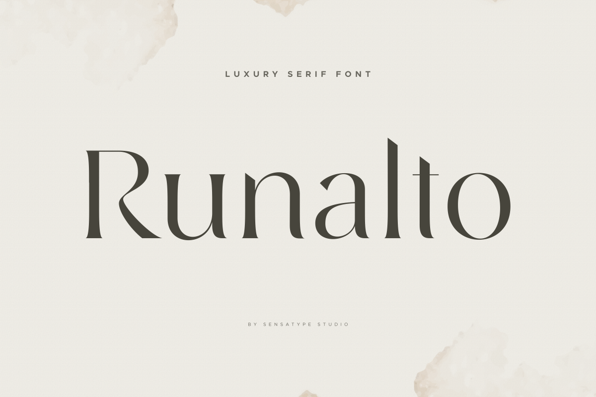
Runalto - Luxury Serif Font 1.png Runalto (premium, Sensatype) — a luxury serif with the drama of Didot but sturdier hairlines, so it survives textured stock better than the fashion magazine classics it evokes.
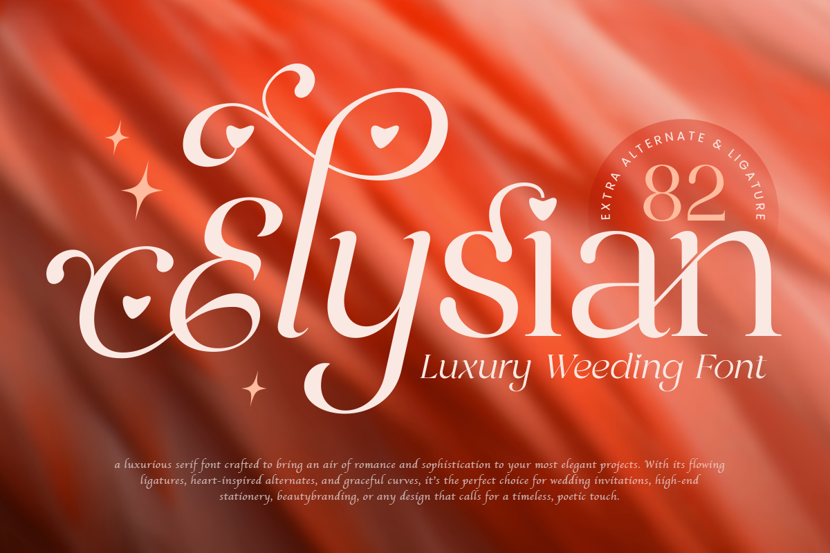
Elysian - Luxury Weding Font 1.png Elysian (Premium, Sensatype) — a genuine copperplate calligraphy font that stays crisp where cheaper scripts get muddy. The safest formal script that costs nothing.
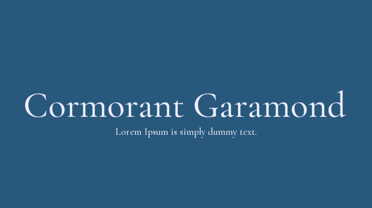
Cormorant-Garamond-1-1.jpg Cormorant Garamond (free, Google Fonts) — a refined Garamond revival that makes venue details look engraved. Its small caps style is a quiet luxury move for dress codes and dates.
Modern & Minimal
Modern invitations get their elegance from restraint: fewer flourishes, more white space, careful spacing.
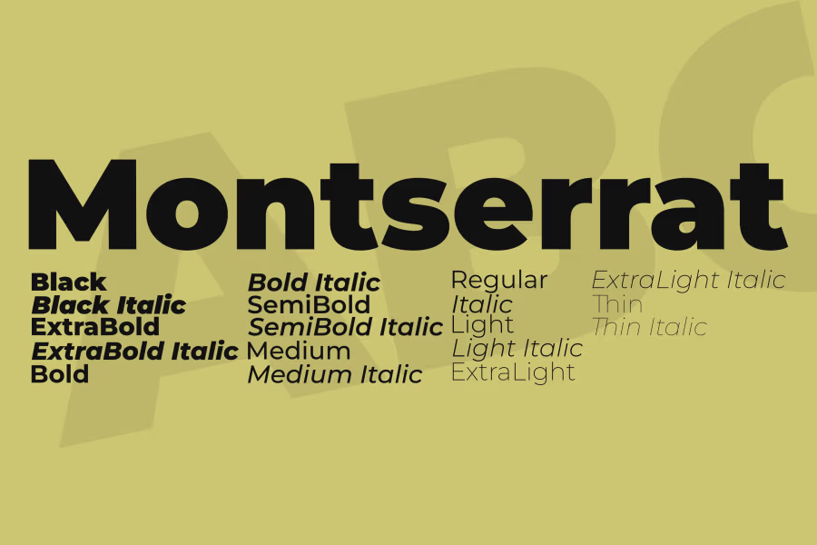
Montserrat (free, Google Fonts) — the modern wedding workhorse. Its Light weight, letterspaced in all caps, is the single most reliable detail font in contemporary stationery.
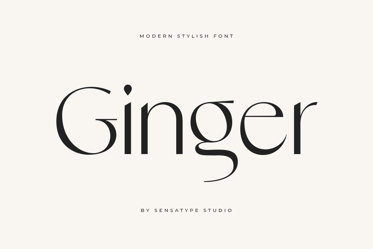
Artboard 1.png Ginger (Premium, Sensatype) — extreme contrast between thick and thin strokes, which reads as high fashion. Use it large; the hairlines vanish below 14pt.
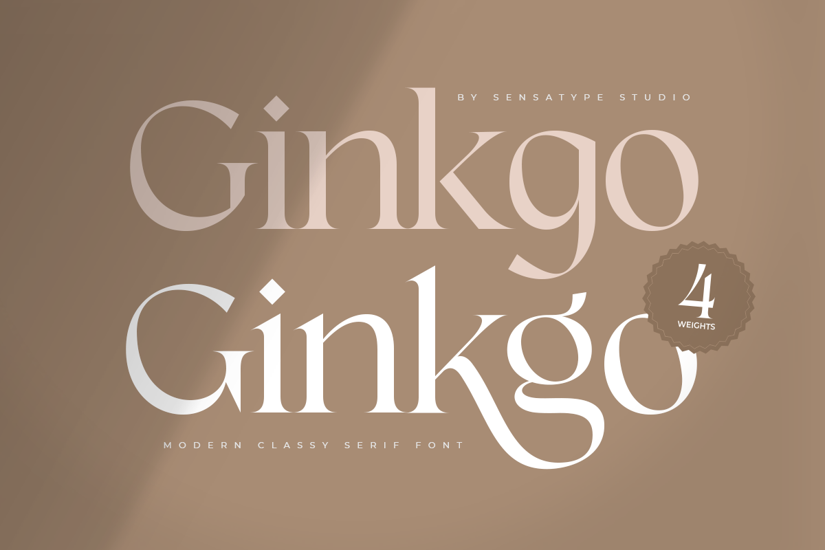
Ginkgo - Modern Classy Serif Font.png Ginkgo (premium, Sensatype) — geometric with Art Deco bones, so it feels designed rather than default.
Romantic & Garden/Boho
If you're searching for the best cursive fonts for wedding invitations, this is your section. Romantic weddings live and die on the script.
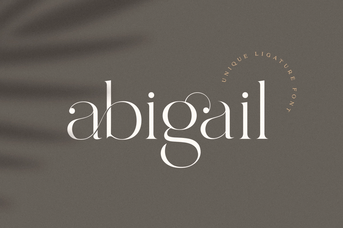
Abigail (premium, Sensatype) — a ligature script with the bouncy, irregular baseline that makes a suite feel lettered by hand, and enough swash alternates to give both your names a custom flourish.
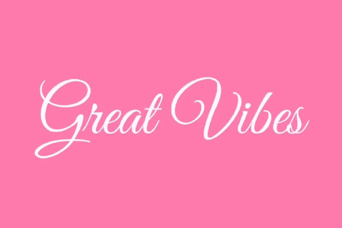
great-vibes-font-free-download.webp Great Vibes (free, Google Fonts) — the most beloved free wedding script for a reason: flowing, feminine, and legible even at moderate sizes.
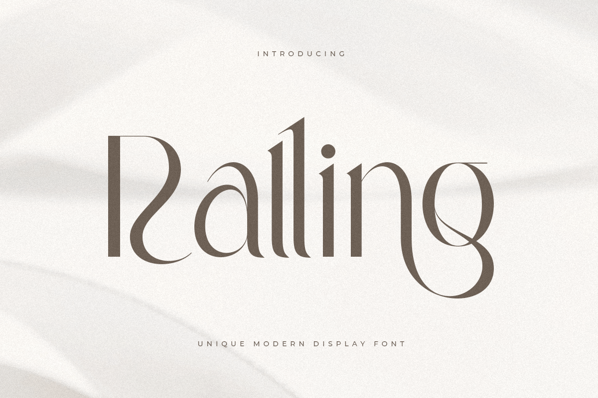
Ralling - Unique Modern Display Font 1.png Ralling (premium, Sensatype) — the warmth of a brush pen with slightly more casual energy than Great Vibes. Lovely for garden and vineyard weddings.
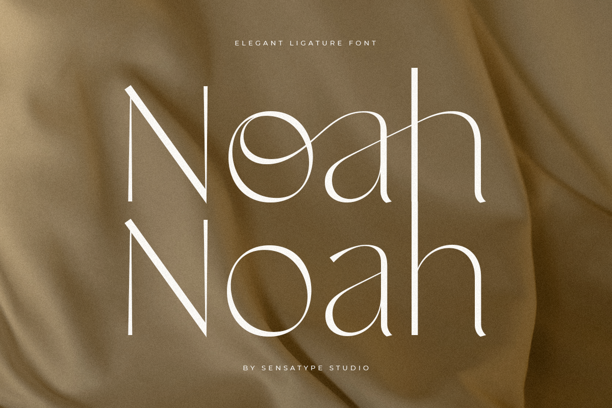
Noah - Elegant Ligature Font 1.png Noah (premium, Sensatype) — an old style serif that sits naturally beside botanical illustration and designs full of greenery.
Vintage & Old World
Vintage style rewards fonts with genuine historical roots.
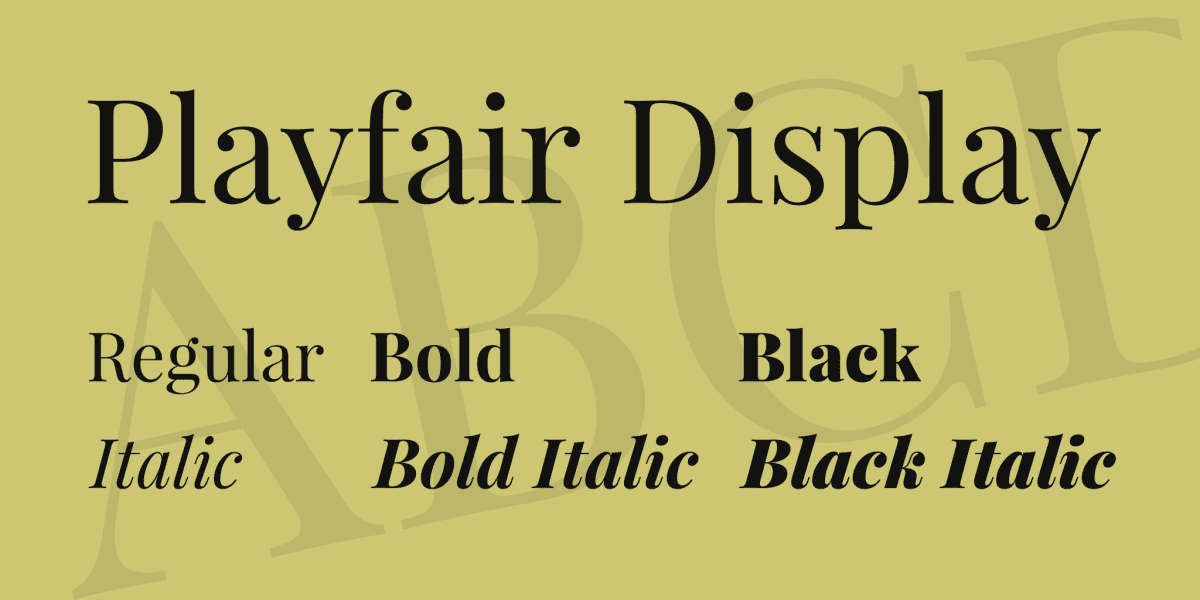
Playfair Display (free, Google Fonts) — rooted in letterforms from the 18th century, it feels instantly old world without feeling like a costume. Arguably the most useful free serif in wedding design.
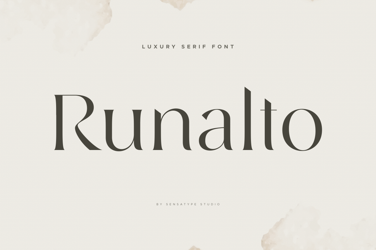
Runalto - Luxury Serif Font 1.png Runalto (premium, Sensatype) — its old style contrast makes it equally at home on estate and manor house suites as on black tie ones.
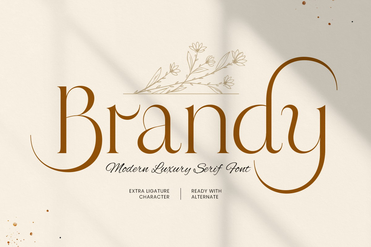
Brandy - Modern Luxury Serif Font 1.png Brandy (premium, Sensatype) — Caslon is the typeface of centuries of book printing, and this revival is sturdy enough for letterpress.
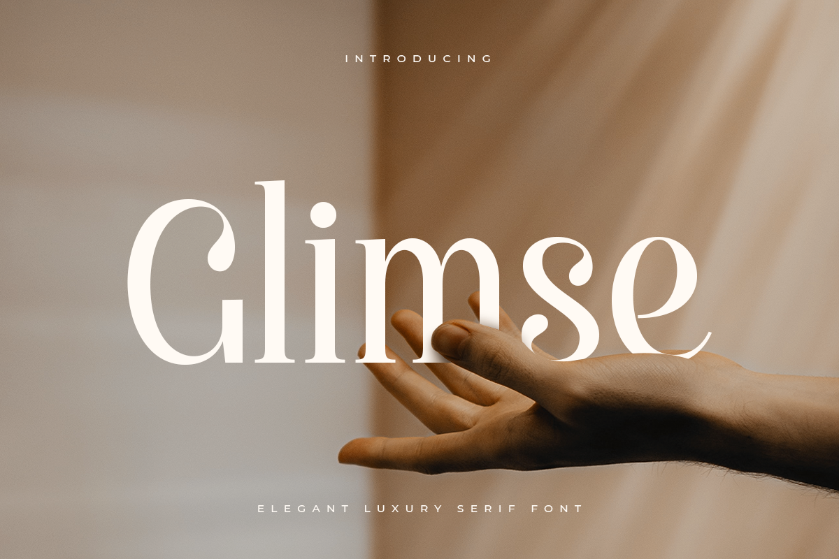
Glimse - Elegant Luxury Serif Font 1.png Glimse (premium, Sensatype) — deliberately weathered edges for apothecary, manor house, or candlelit aesthetics. Accent use only.
Beach & Destination
Coastal invitations want air and light: thinner weights, open spacing, relaxed scripts.
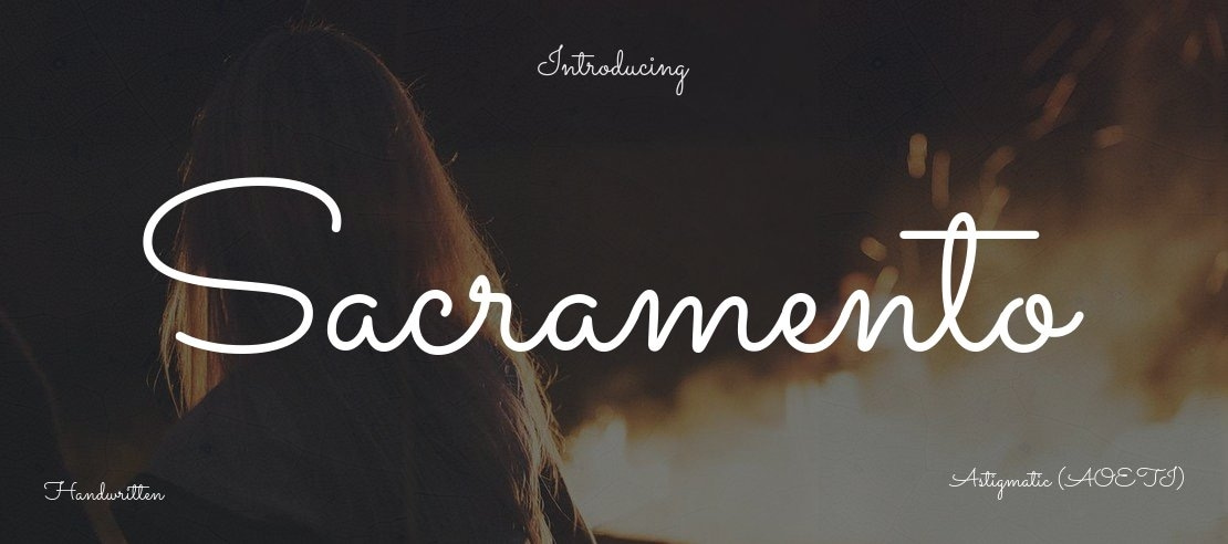
Sacramento (free, Google Fonts) — a light monoline script that feels like handwriting on a postcard.
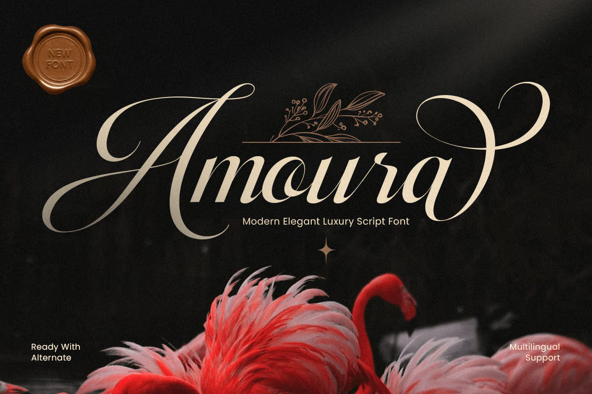
4251487a-27b9-47d0-b9cc-94c85b76d5b0.avif Amoura (premium, Sensatype) — a warm, rounded sans serif that keeps travel details friendly and effortless to read.
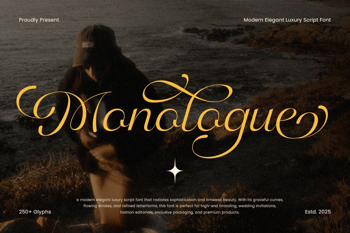
Monologue - Modern Elegant Luxury Script Font 1.png Monologue (premium, Sensatype) — a casual script with brush influence and just enough polish for an invitation.
Free vs. Premium Wedding Fonts: What You're Actually Paying For
Free fonts from Google Fonts can absolutely carry a beautiful invitation. Several of the picks above prove it. So why do professional stationers keep buying scripts? Three things free wedding fonts almost never include.
Stylistic alternates and swashes. A premium wedding script typically ships with hundreds of extra glyphs: alternate versions of each letter, decorative swashes for capitals, and flourished endings. That's what lets a designer make your names look like custom lettering. An "S" that sweeps under the whole word, a "y" whose tail curls back like a pen stroke. Free scripts usually give you one version of each letter, so every couple's names look the same. One practitioner rule worth stealing: a swash on every capital reads as clutter, while one or two per line reads as calligraphy.
Ligatures and contextual alternates. Good scripts adjust how letters connect depending on their neighbors. Pairs like "tt" and "th" and double letters get joins drawn for that exact combination instead of awkward collisions. This is the difference between a script that flows and one that visibly repeats.
Construction built for print. Premium foundries draw stroke weights with paper in mind: thick enough to survive ink gain on cotton stock, spaced to stay open at invitation sizes.
One practical note before you buy. Those extra glyphs live in the font's OpenType features, and not every app shows them equally. Illustrator and Affinity expose the full glyph panel; Canva supports alternates only on some fonts and hides them behind the text menu. If you're designing in Canva, check that the alternates are accessible there before purchasing, or ask the foundry.
See the difference alternates make: preview Sensatype's wedding scripts and open any product page to view the full glyph set before you buy.
Designing Invitations for Clients?
If you're a stationer or designer selling invitations, the font license matters as much as the font. A personal use license, or even a basic desktop one, often doesn't cover client work or resold printed goods. Sensatype's licenses come in Desktop, Business, and Corporate tiers. Check the license page to confirm which tier covers client invitation work before you build a suite around a typeface. Sorting this out upfront is cheaper than buying a new license after a client's order ships.
How to Pair Wedding Fonts (Formulas That Always Work)
Choosing fonts is half the job. Combining them is where most DIY invitations go sideways, so here are the wedding font pairings and rules stationers actually use.
The Rule of Two
Use exactly two fonts: one expressive, one neutral. The expressive font (usually a script) carries your names and maybe one headline moment. The neutral font (a serif or sans serif) carries everything else, from the date and venue down to the dress code and RSVP details.
A third font is occasionally justified, say small caps for a dress code line, but treat three as the absolute ceiling. Then create hierarchy with size, not variety: names largest, date and venue in the middle, logistics smallest. If every line is a different font at a similar size, the eye has nowhere to land.
One more consistency rule. Whatever pairing you choose should carry across your whole suite: save the dates, RSVP cards, your wedding website, and the stationery for the day itself, meaning menus, place cards, and welcome signage. A script that changes between the save the date and the invitation reads as a mistake, not a design choice. A welcome sign in the same script as the invitation reads as intentional design. (One more reason licensing matters: buy the script once, use it across the entire suite.)
5 Proven Pairings
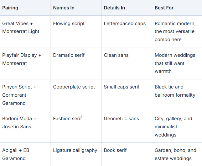
Legibility & Print Rules Stationers Swear By
This is the section that saves you from reprinting 120 invitations. Digital previews lie a little. Paper tells the truth.
Minimum sizes. Keep serif and sans serif body text at 7–10pt minimum. 8pt is a comfortable floor for guests to read without effort. Scripts need to run noticeably larger, because connected letterforms lose definition fast as they shrink. Your names should be the largest element on the card by a clear margin.
Thin strokes and textured paper. Hairline fonts, from serifs in the Didot tradition to delicate copperplate scripts, look stunning on screen and on smooth stock. On soft cotton or uncoated textured paper, ink spreads slightly as it absorbs (printers call this ink gain), and those hairlines can fill in or break apart. In our own test prints, hairline scripts that looked flawless in the digital proof have come off a cotton run with gaps in every loop. It's why we check stroke weights on textured paper before releasing a script. If your heart is set on textured paper, choose sturdier strokes or bump sizes up.
Letterpress and foil. Letterpress presses the design into thick stock, and foil stamping applies metallic film with a heated die. Both are gorgeous, and both dislike ultra fine detail. Very thin strokes can crumble in letterpress or bridge together in foil. Your printer will flag problem areas, but choosing fonts that behave well in letterpress (Cormorant Garamond, Libre Caslon, Pinyon Script at generous sizes) upfront avoids redesigns.
Digital invitations. Phone screens compress fine detail, so digital wedding invitations need higher contrast and larger relative sizes than print. Test on an actual phone, not just your laptop.
Always order a test print. One proof at home or from your printer, held at arm's length, tells you more than an hour of zooming on screen.
Fonts to Avoid on Wedding Invitations
A short list, offered with love:
Extremely ornate scripts at small sizes. If you have to decode your own venue name, guests don't stand a chance. Ornate is fine. Small and ornate is not.
Default system fonts. Arial, Calibri, and Times New Roman aren't wrong; they're just invisible. They read as "office memo" because that's where guests see them daily.
More than three typefaces. Every additional font subtracts elegance. Two is the sweet spot.
Hairline fonts on textured stock. See above. Beautiful on screen, broken on cotton.
Dated novelty fonts. Papyrus, Comic Sans, and heavily distressed "rustic" fonts from 2014 will timestamp your invitations in the worst way.
None of this means your invitation must be conservative. It means whatever personality you choose should survive the trip from screen to paper to your guests' hands.
FAQ
What is the best font for wedding invitations?
There's no single best font; it depends on your wedding's formality. The safest universally elegant choice is a classic script such as Pinyon Script or Great Vibes for your names, paired with a clean serif like Cormorant Garamond for the details. Match the script's formality to your venue and dress code.
How many fonts should a wedding invitation have?
Two: one expressive font for your names and one neutral font for the details. A third is occasionally fine for a small accent like a dress code line, but never more. Hierarchy should come from size and weight, not from adding typefaces.
What font size should wedding invitations be?
Keep serif and sans serif body text at 7–10pt minimum, with 8pt as a comfortable floor. Script fonts need to be set larger to stay legible, and your names should be the biggest element on the card.
What fonts do stationers and calligraphers actually use?
Professional standards include copperplate scripts like Pinyon Script for formal calligraphy, Cormorant Garamond and EB Garamond for detail text, and Montserrat for modern suites, plus premium ligature scripts for suites that need custom lettered names. The pattern matters more than the names: one proven script plus one proven serif or sans.
Are there good free wedding invitation fonts?
Yes. Google Fonts alone covers most weddings: Great Vibes, Alex Brush, Pinyon Script, Playfair Display, Cormorant Garamond, and Montserrat are all free, including for commercial printing under their open licenses. The trade-off is customization, since free scripts rarely include the swash alternates and ligatures that make premium scripts feel lettered by hand.
What's the difference between free and premium wedding fonts?
Mostly glyph depth and print construction. Premium wedding scripts include stylistic alternates, swashes, and ligatures drawn for specific letter combinations: hundreds of extra characters that let a designer customize how your names flow. Free scripts typically offer one version of each letter. Premium scripts are also usually drawn with print reproduction in mind, with stroke weights that survive textured paper.
How do I access a font's swashes and alternate letters?
Through the app's glyph or alternates panel. Adobe Illustrator, InDesign, and Affinity show the full glyph set. Canva supports alternates on some fonts via the text formatting menu but not all. If you're designing in Canva, confirm alternate access for that specific font before buying.
Can I use a purchased font to design invitations for paying clients?
Only if the license covers commercial client work. Personal use and some basic desktop licenses don't. Check the foundry's license tiers before building a client suite; Sensatype publishes its Desktop, Business, and Corporate coverage on its license page.
What is the classic cursive font used on formal invitations?
The traditional look comes from copperplate calligraphy: thick and thin strokes that imitate a pointed nib pen, which is why they read as instantly formal. Pinyon Script is the most recognizable free example, while premium copperplate and ligature scripts add the alternate characters engravers would have drawn by hand.
Should the invitation font match my save the dates and wedding website?
Yes. Your invitation, save the dates, RSVP cards, website, and pieces for the day itself like menus and welcome signs form one visual suite, and switching fonts midway breaks the coherence guests subconsciously notice. Pick your pairing once and carry it everywhere.
Can I use a sans serif font for a formal wedding?
Yes, for a modern formal aesthetic. A light sans serif like Montserrat Light, set in all caps with generous letterspacing, carries real formality. It signals "contemporary elegant" rather than "traditional elegant." Weight and spacing do the work that serifs and flourishes do in classic designs.
Do script fonts print well on textured paper?
Not always. Thin script strokes can fill in or break apart on cotton and other uncoated textured stocks, and letterpress and foil struggle with fine hairlines. Choose sturdier scripts, increase the size, or order a printed proof before committing to a full run.
Bring Your Font to Life
Here's where you should be by now: a style direction, a shortlist of two fonts, and a sense of how they'll behave on paper. That's the entire hard part of invitation design. The rest is seeing it come together.
Ready to set your names in something built for paper? Explore Sensatype's full wedding script collection and open any product page to preview the complete glyph set, swashes included, before you commit. Every typeface is designed and proofed for print reproduction, so what you see in the specimen is what arrives in your guests' hands.
Still narrowing your style? Start with a free script and test it in print on your shortlisted paper. You'll learn more from one proof than from any list, this one included.