
Top 10+ GTA VI Font Alternatives
Discover the best Grand Theft Auto VI font alternatives inspired by bold gaming typography, condensed display fonts, and cinematic visuals. Explore GTA VI style fonts from Sensatype Studio.
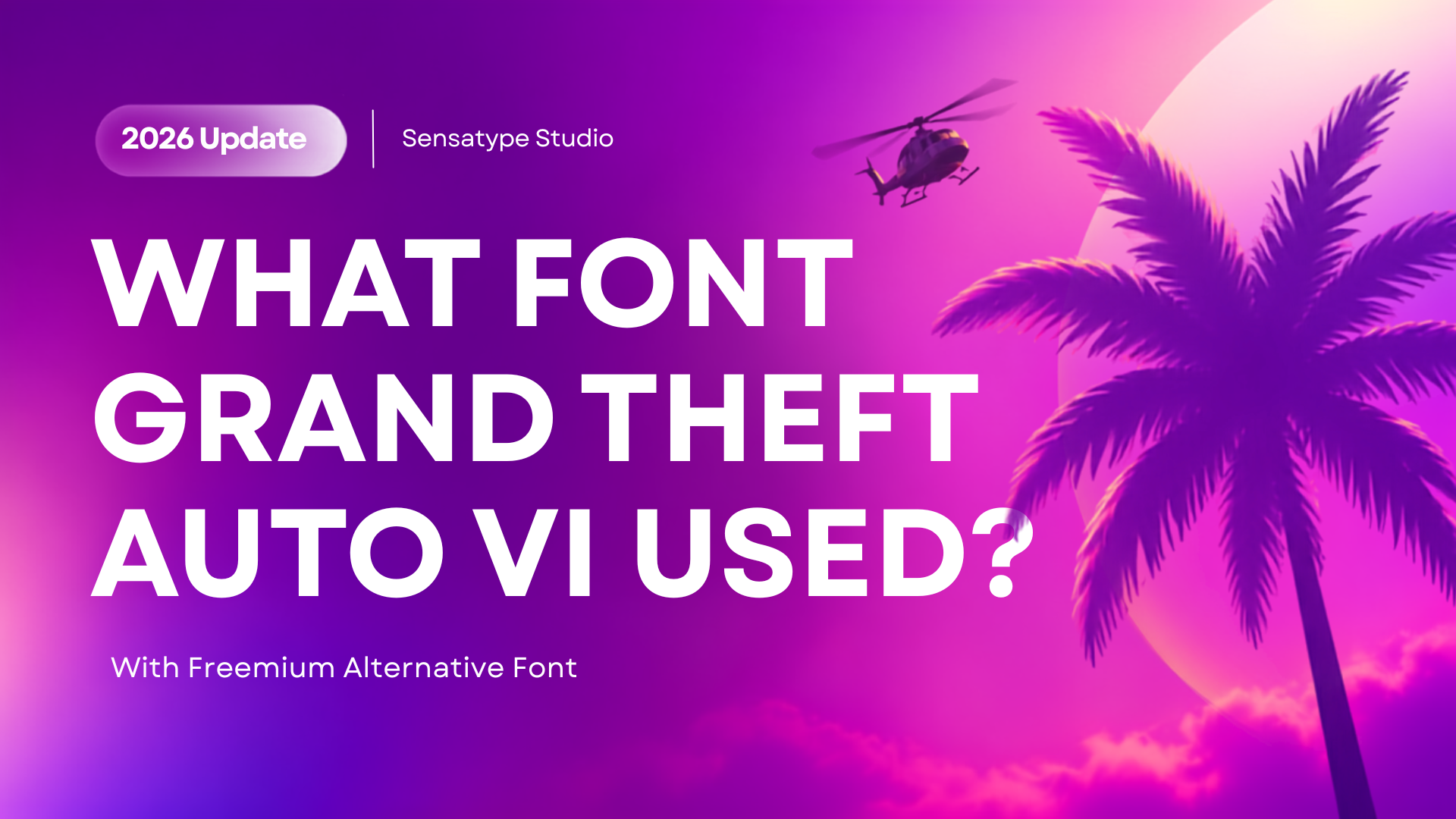
The GTA 6 logo is recognizable because it combines two powerful visual ideas: the familiar stacked Grand Theft Auto wordmark and a large stylized Roman numeral “VI.” Together, they create a high-energy identity associated with Vice City-inspired nightlife, tropical color, luxury, cars, street culture, and cinematic storytelling.
Rockstar Games has not publicly identified a downloadable font used for the complete Grand Theft Auto VI logo. The stacked “Grand Theft Auto” lettering is widely associated with the Pricedown style used across the series, while the large “VI” is best understood as custom logo artwork rather than a standard font available from a font library.
For that reason, designers should not expect to find one exact “GTA VI font” that can recreate the official logo perfectly. A more useful approach is to understand the visual ingredients behind the look: bold display lettering, tight stacking, strong outlines, dramatic numerals, neon-to-sunset gradients, and a cinematic tropical-urban mood.
This guide explores GTA VI-inspired typography and presents licensed Sensatype Studio font alternatives for original gaming posters, entertainment branding, thumbnails, merchandise, fictional companies, automotive campaigns, and nightlife graphics.
Trademark notice: Grand Theft Auto, GTA, GTA VI, Rockstar Games, Vice City, and Leonida are trademarks or related properties of their respective owners. Sensatype Studio is not affiliated with or endorsed by Rockstar Games. Create original work and do not use official logos, artwork, characters, or trademarks without permission.
What Font Is Used in the GTA VI Logo?
The complete GTA VI logo does not have a publicly confirmed, downloadable font file. It combines a familiar franchise wordmark with a customized “VI” treatment that functions as logo artwork.
The stacked “Grand Theft Auto” lettering is commonly linked to Pricedown-style typography, a bold rounded display style closely associated with the wider GTA franchise. The oversized “VI,” however, uses a specialized treatment with gradient color, decorative imagery, outline work, and proportions designed specifically for the game’s visual identity.
In practical terms, there are two different design questions:
What resembles the classic GTA wordmark? Look for rounded, bold, stacked display lettering with high contrast and strong outlines.
What creates a GTA VI-inspired mood? Look for expressive display fonts, cinematic layouts, tropical-neon colors, urban imagery, large numerals, and original art direction.
The best GTA VI font alternative is therefore not necessarily the closest copy of the logo. It is the font that gives your own title, brand, poster, or campaign the right personality while remaining original and properly licensed.
Why GTA VI Typography Feels So Distinctive?
GTA VI-inspired visual design is more than typography. The impact comes from the relationship between type, color, composition, photography, illustration, and cultural references.
A successful original design in this direction often combines the following elements:
A bold display headline with a memorable silhouette.
A condensed secondary typeface for speed, tension, racing energy, or compact poster layouts.
Tropical-neon color combinations such as coral, orange, violet, pink, electric blue, deep navy, and white.
Original palm, waterfront, nightlife, automotive, luxury, street, or city imagery.
Large numerals, high-contrast outlines, and layered titles that create a cinematic focal point.
Clean supporting text so the main headline remains the strongest visual element.
Instead of recreating the official GTA VI logo, build an original system around these broader visual principles. That approach produces work that feels energetic and contemporary while giving your project its own identity.
Best GTA VI-Inspired Font Alternatives
The fonts below are not official GTA VI fonts and are not intended to replicate Rockstar Games’ branding. They are licensed Sensatype Studio typefaces that can help designers create original gaming, entertainment, racing, nightlife, technology, and urban visual projects.
NIBOR - Display Condensed Logo Font
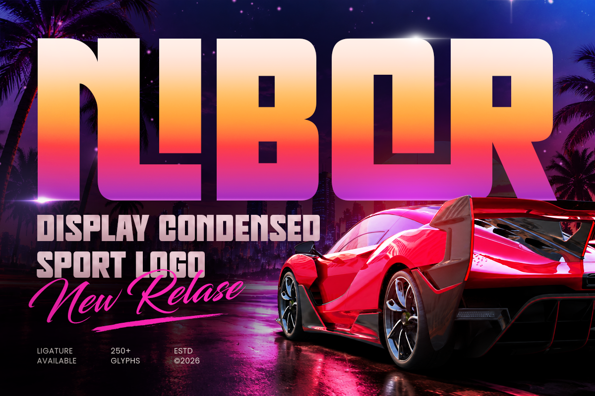
NIBOR brings an aggressive, high-energy personality to condensed display typography. Its narrow proportions help large titles dominate a layout without consuming excessive horizontal space, making it particularly effective for action posters, fictional racing brands, streetwear graphics, and bold gaming headlines.
For an original GTA VI-inspired direction, use NIBOR in a stacked title with an oversized number, saturated sunset colors, and original nighttime automotive photography. It works best when the goal is speed, pressure, movement, or competition.
Best for: Racing posters, gaming identities, automotive graphics, streetwear, action campaigns, and large headlines.
Rebona - Display Modern Condensed E-Sport Font
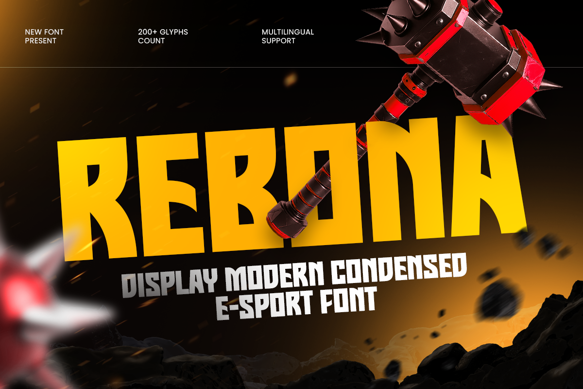
REBONA is designed for high-impact competitive visuals. Its tall and bold construction supports dramatic scale, making it a strong option for esports teams, tournament graphics, streaming overlays, event banners, and gaming thumbnails.
Use REBONA when a title needs urgency and vertical energy. Pair it with a simple sans serif for match details, dates, locations, social handles, or calls to action.
Best for: Esports identities, gaming posters, tournament graphics, streaming visuals, event banners, and digital campaigns.
Crallo - Display Logo Condensed Font
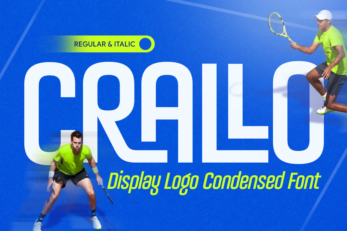
CRALLO offers a bold condensed structure with strong logo potential. Its compact form allows large typography to sit comfortably with photography, illustration, or supporting information, making it useful for cover art, merchandise, entertainment posters, and campaign graphics.
For a cinematic urban concept, use CRALLO as the main title over an original cityscape, waterfront photograph, or character illustration. Its compact proportions leave room for credits, taglines, dates, and secondary copy without weakening the title.
Best for: Gaming posters, logos, entertainment branding, merchandise, campaign graphics, and social media design.
Cravon - Modern Futuristic Sport Font
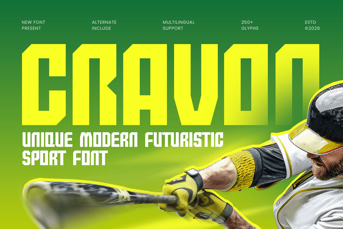
CRAVON combines bold athletic forms with sharp futuristic details. Its dynamic structure works naturally in racing, automotive, sports, and technology-driven entertainment projects that need a strong sense of motion.
CRAVON is especially effective for original designs centered on performance cars, night races, high-speed competition, or modern urban action. Use it with chrome textures, dark backgrounds, electric color accents, and large cropped imagery for a performance-focused visual system.
Best for: Racing graphics, gaming identities, esports branding, sport posters, automotive campaigns, and promotional visuals.
Nigera - Modern Techno Logo Font
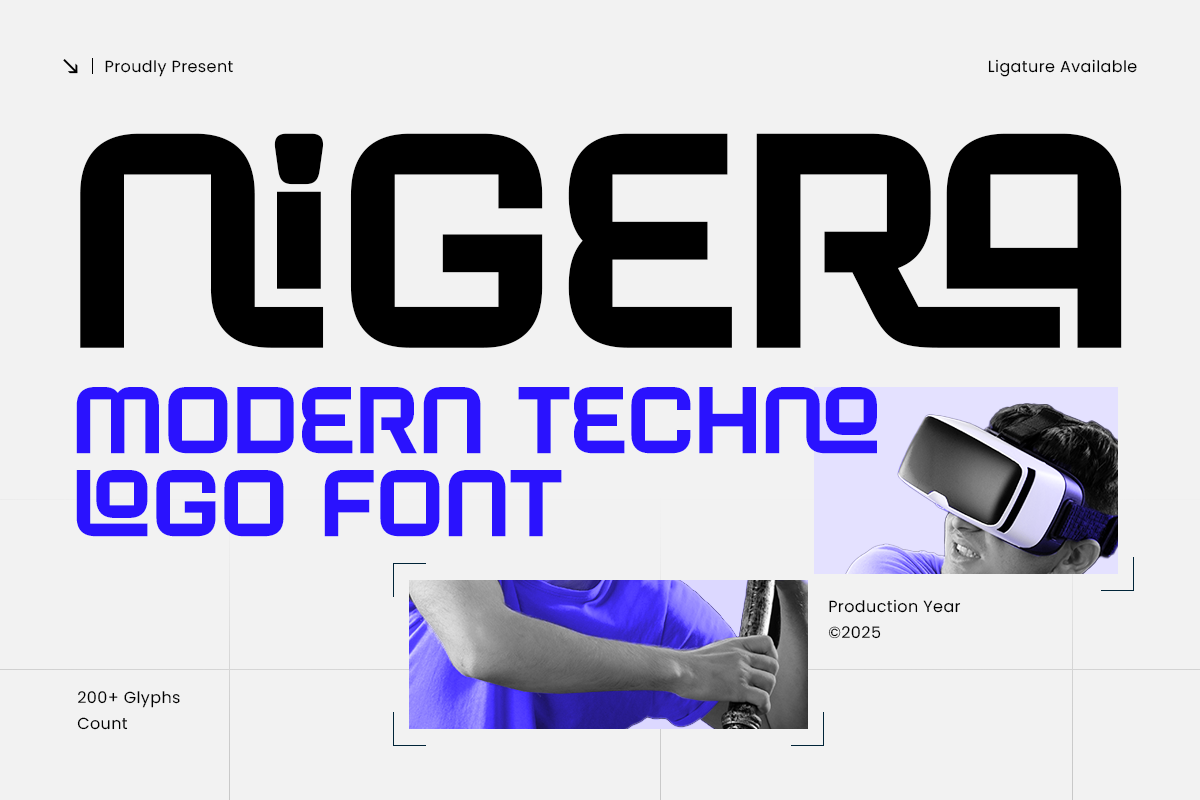
NIGERA has a clean geometric construction with a precise techno character. It is a useful choice when you want a gaming-related design to feel polished and modern rather than aggressively sporty.
This font works well for fictional apps, game interfaces, digital products, technology companies, and in-world corporate identities. Pair it with dark city imagery, illuminated architecture, interface elements, or restrained neon accents.
Best for: Technology branding, gaming logos, software identities, sci-fi posters, app interfaces, and digital campaigns.
Gaber - Modern Condensed Font
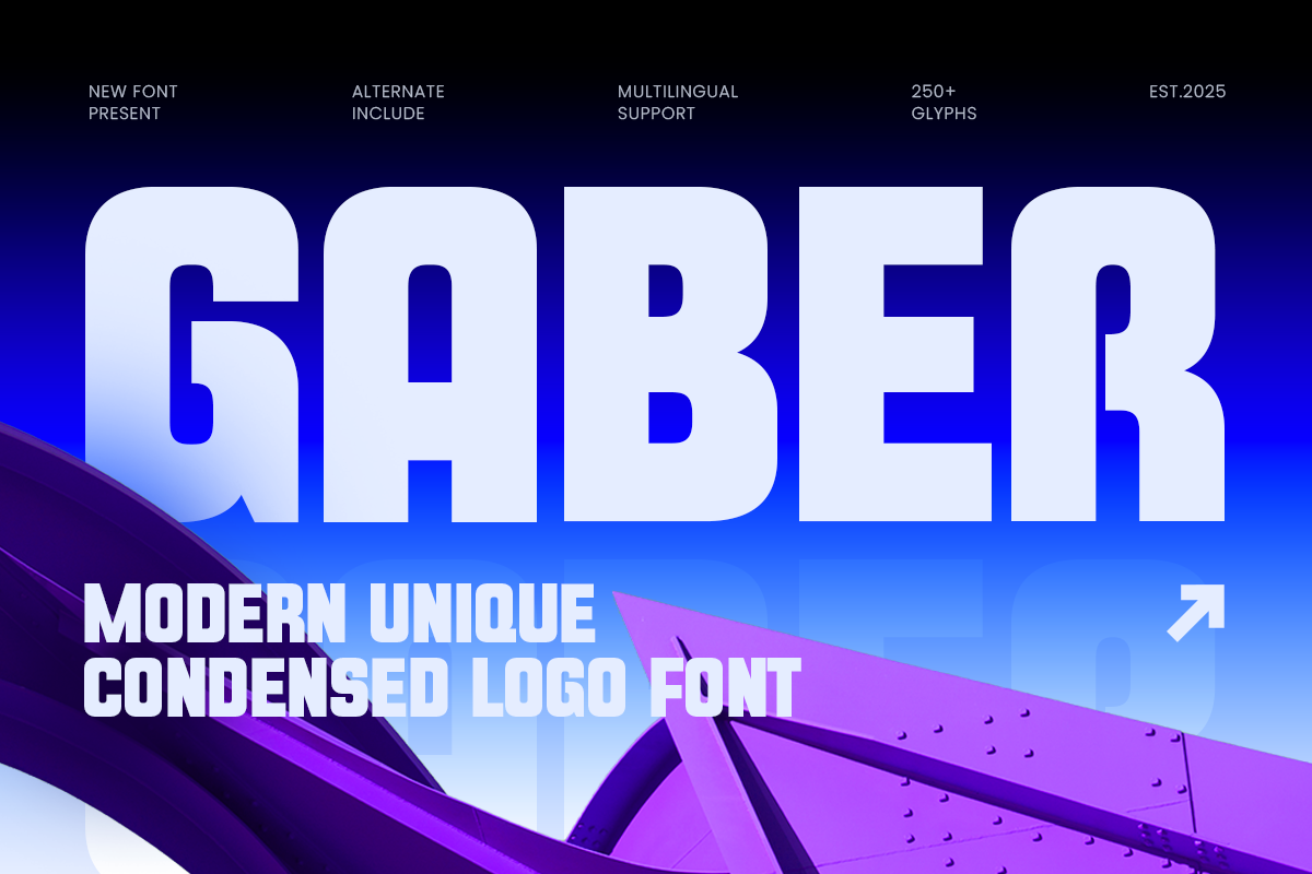
GABER combines sleek condensed proportions with a refined modern personality. It is a strong choice for designers who want to interpret GTA VI-inspired nightlife and urban culture through fashion, music, editorial design, or sophisticated entertainment branding.
Use GABER with original club photography, city scenes, luxury imagery, or minimal compositions. It is less aggressive than a sports font and more suitable for projects that need a clean, polished headline treatment.
Best for: Logos, gaming posters, fashion branding, editorial layouts, entertainment graphics, and social media campaigns.
Rector - Unique Ligature Sci-fi Futuristic Font
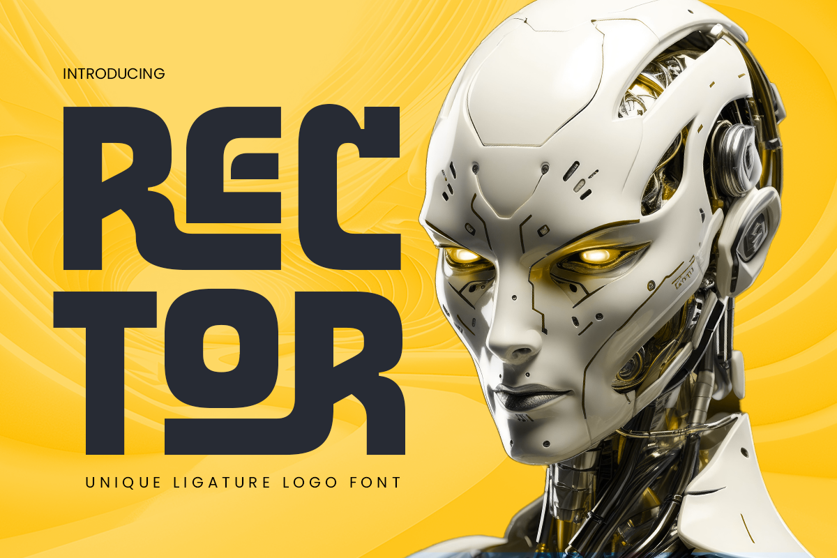
RECTOR adds a more experimental direction through sleek forms and distinctive ligatures. These letter combinations can make a title feel custom-built, which is especially useful for fictional game titles, tech launches, sci-fi posters, and entertainment identities.
Choose RECTOR for projects exploring futuristic city environments, digital culture, nightlife, or fictional technology brands. Use its ligatures selectively so the headline stays readable while still feeling distinctive.
Best for: Gaming logos, sci-fi posters, technology branding, digital campaigns, entertainment identities, and futuristic headlines.
Dynro - Branding Technology Logo Font
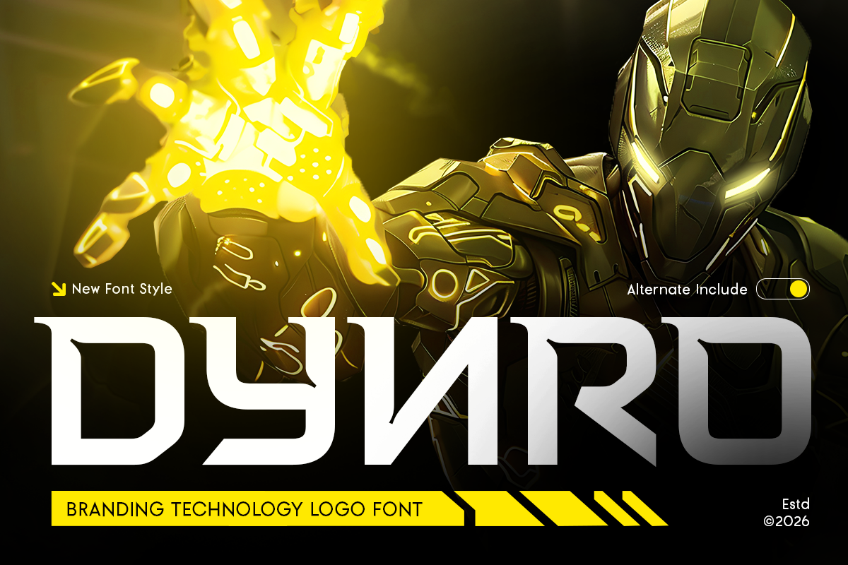
DYNRO combines clean geometric forms with a contemporary technology-driven personality. It offers good readability while retaining enough character for logos, headlines, interface naming, and fictional corporate brand systems.
DYNRO is ideal for designing believable companies within an original game world: digital banks, mobility services, nightlife platforms, media brands, security firms, or futuristic retail concepts. Pair it with UI components, structured grids, and modern architectural imagery.
Best for: Technology brands, gaming platforms, startup identities, websites, UI/UX design, and fictional corporate branding.
Moxira - Condensed Display Ligature Font
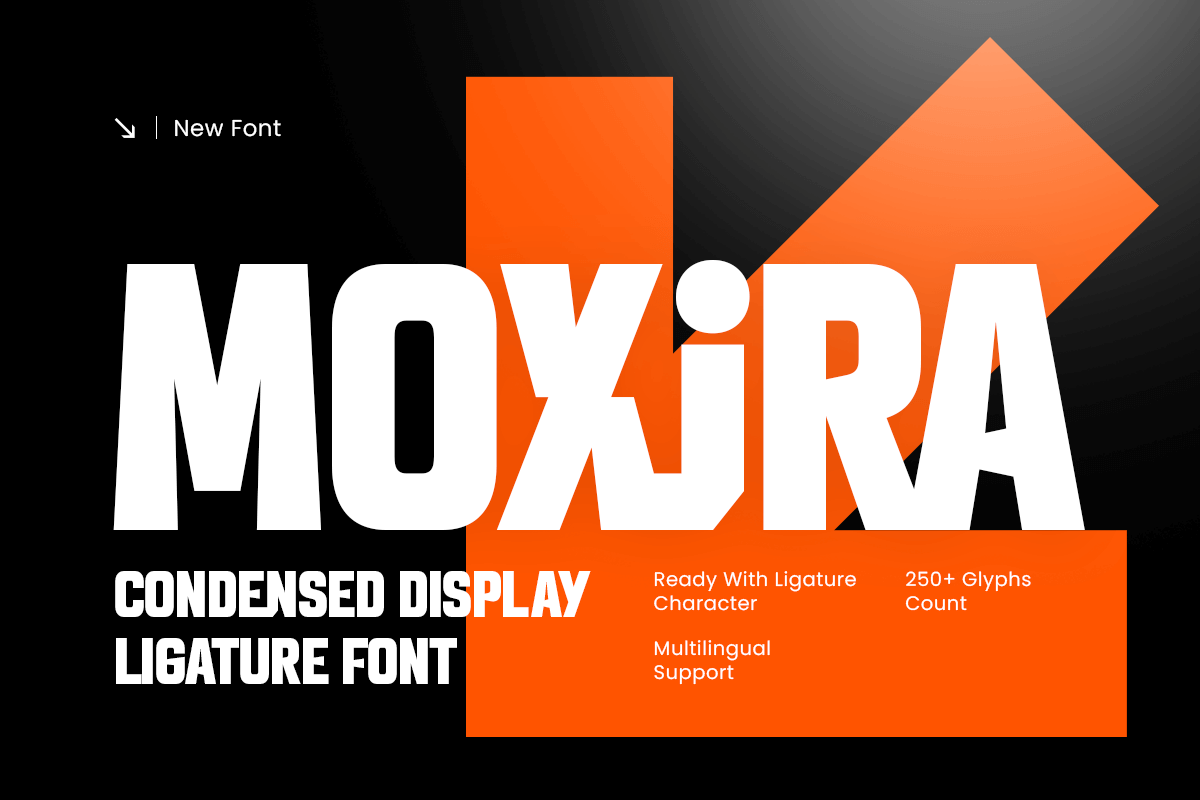
MOXIRA uses a clean condensed structure to create an efficient and controlled visual presence. Its narrow forms make it suitable for signage, posters, urban advertising, structured layouts, and fictional business branding.
For a GTA VI-inspired setting, use MOXIRA for an original hotel sign, waterfront billboard, luxury apartment ad, nightclub campaign, or city transit concept. It works especially well when typography must coexist with imagery and practical information.
Best for: Branding systems, posters, fictional businesses, signage, website headers, editorial layouts, and promotional graphics.
Rostan - Techno Condensed Font
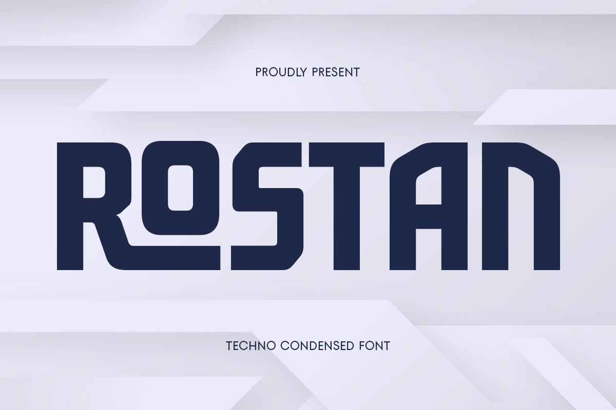
ROSTAN delivers a darker, more technological personality through narrow proportions, bold construction, and sharp geometric details. It is a strong choice for cyber-racing, neon nightlife, futuristic games, and action-oriented entertainment projects.
Use ROSTAN when the project calls for a harder edge than tropical luxury or retro nostalgia. It pairs well with dark backgrounds, vivid light trails, vehicle imagery, futuristic interfaces, and nighttime urban photography.
Best for: Gaming titles, esports branding, sci-fi posters, technology campaigns, cyber graphics, and futuristic logos.
How to Create a GTA VI-Inspired Poster Without Copying the Logo
A GTA VI-inspired poster should borrow broad design principles, not the official logo or artwork. Follow this simple framework to create a professional and original result.
Create a new title. Use an original name for your event, fictional brand, racing league, music release, game concept, or campaign.
Choose one visual direction. Decide whether the project is about street racing, tropical nightlife, luxury fashion, futuristic technology, or cinematic crime drama.
Pick a display font with a clear purpose. For example, use NIBOR for racing energy, GABER for refined nightlife, or DYNRO for fictional tech branding.
Build a focused color palette. Combine two or three high-contrast colors such as coral, violet, electric blue, white, and deep navy.
Use original visual assets. Shoot your own photos, license stock photography, commission illustrations, or create 3D scenes. Avoid official GTA VI screenshots, logos, character artwork, and branded graphics.
Add supporting typography carefully. Use a neutral sans serif for dates, names, locations, product details, or calls to action.
For example, an original poster titled Midnight Coast Street Racing League could use NIBOR for the main title, a neutral sans serif for event details, coral and violet lighting, a licensed waterfront car photo, and a large “26” as an independent graphic element. The atmosphere can feel energetic and cinematic without reproducing GTA VI branding.
Frequently Asked Questions
Q: What font is used in the GTA VI logo?
A: Rockstar Games has not publicly named a downloadable font for the complete GTA VI logo. The stacked “Grand Theft Auto” wordmark is commonly associated with Pricedown-style lettering, while the large “VI” appears to be customized logo artwork rather than a standard typeface.
Q: Is Pricedown the GTA VI font?
A: Pricedown is widely recognized as the typeface associated with the classic Grand Theft Auto wordmark. However, the full GTA VI logo includes customized treatment, especially in the large Roman numeral “VI,” so it should not be treated as a one-font recreation.
Q: Can I use the GTA VI logo font commercially?
A: Do not use Rockstar Games’ logo, trademark, or official artwork for commercial branding, merchandise, advertising, or client work without permission. For commercial projects, choose a properly licensed typeface and create original wording, composition, colors, and visual assets.
Q: What fonts are good for a GTA VI-inspired poster?
A: For action, racing, or gaming posters, consider condensed display styles such as NIBOR, REBONA, CRALLO, CRAVON, or ROSTAN. For fictional tech brands or interface concepts, NIGERA, DYNRO, and MOXIRA offer a cleaner direction. Treat these as tools for original work, not copies of the official GTA VI logo.
Q: How can I make GTA VI-inspired typography look original?
A: The appeal of GTA VI typography is not limited to one logo or one typeface. Its power comes from a mix of bold title design, cinematic composition, tropical energy, urban culture, modern luxury, and nightlife atmosphere.