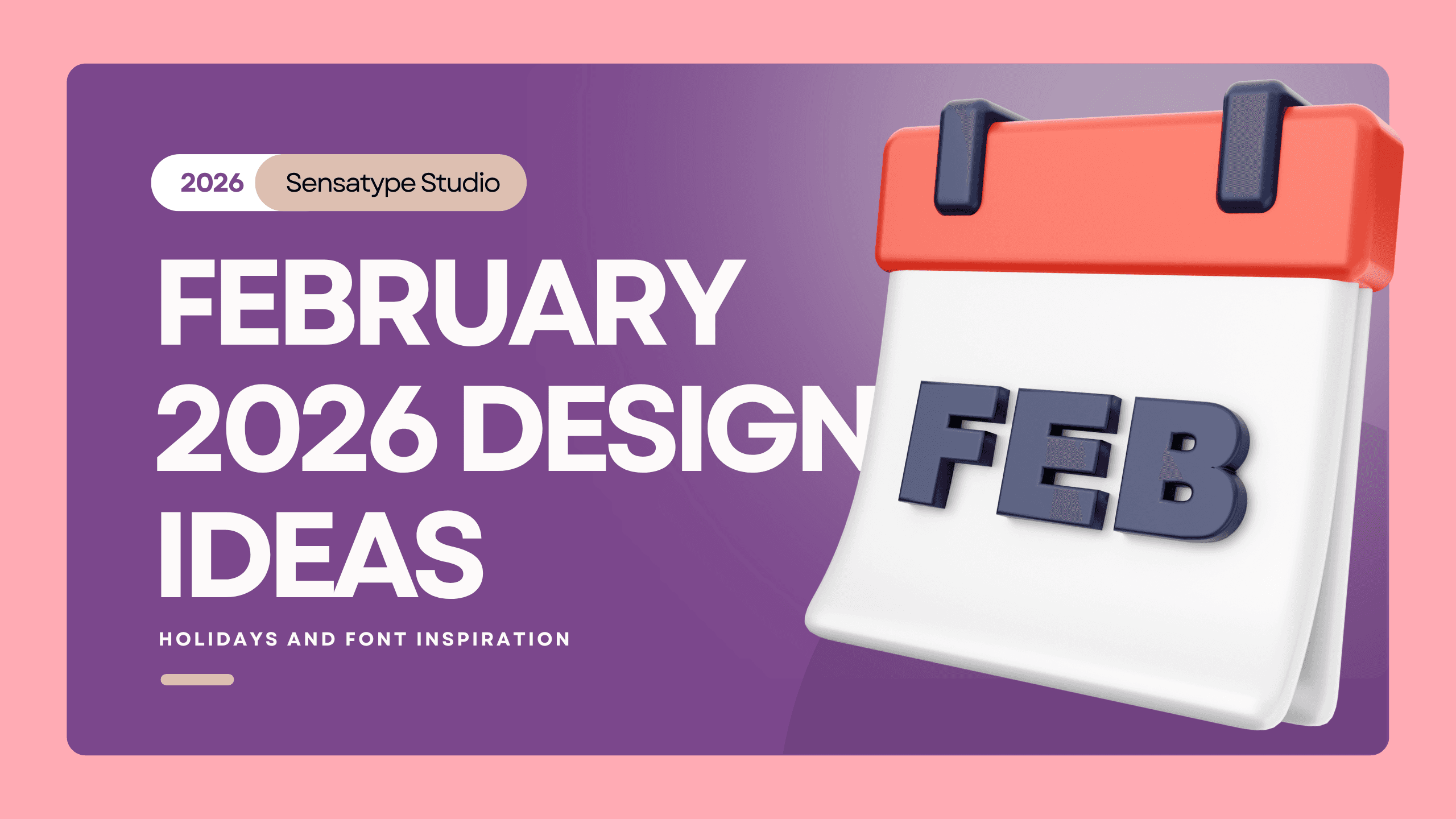
February 2026 Design Ideas, Holidays, and Font Inspiration
Explore February 2026 design ideas, key holidays, color directions, and font inspiration for romantic, feminine, playful, and soft luxury branding.
February is where design gets a little softer, a little warmer, and a lot more emotional. February tends to invite campaigns that feel more intimate, expressive, and visually polished. It is a strong month for brands that want to lean into romance, thoughtful storytelling, feminine branding, soft luxury, or playful promotions.
Why February?
Brands often use this month to create visuals around affection, appreciation, gifting, self-love, friendship, and warmth. Valentine’s Day lands on February 14, 2026, and Random Acts of Kindness Day lands on February 17, 2026, which gives the month both a romantic side and a human, community-centered side.
That combination is useful because it gives you more than one mood to design around. February does not have to mean roses and clichés. It can also mean:
elegant beauty campaigns
soft editorial storytelling
thoughtful community messaging
premium gift promotions
warm, human-centered branding
Visually, February is strong because the emotional direction is easy to understand. A campaign can feel tender, playful, luxurious, or heartfelt without needing too much explanation. The mood does a lot of the heavy lifting.
February Color and Visual Theme Ideas
February is not only for romance. It is also a strong month for warmth. February has a wider palette than people think. Yes, red still works. But relying only on classic red can make the design feel too obvious, too seasonal, or too flat. A better move is to choose a palette that matches the brand’s mood. Here are some strong February directions:
Blush pink and cream
Burgundy and warm neutral
Dusty rose and muted red
Soft red and pale beige
Warm neutral luxury palette
Visually, February works well with:
satin or paper textures
editorial whitespace
close-up product photography
floral accents used sparingly
delicate borders or frames
layered typography
minimal collage elements
soft shadows and warm lighting
Best Fonts For February
Sophia - Beauty Lovely Swash Font
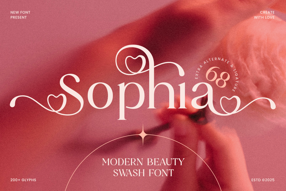
Sophia is a beauty lovely swash font designed to bring softness, charm, and feminine elegance to your design projects. With flowing curves, expressive swashes, and a delicate feel, this typeface is perfect for beauty branding, wedding invitations, product packaging, and romantic editorial layouts.
Romanes - Elegant Swash Wedding Font
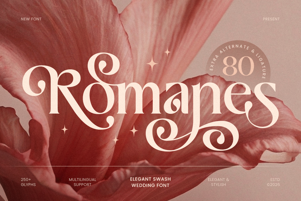
Romanes is an elegant swash wedding font crafted to bring romance, grace, and timeless beauty to your typography. With flowing strokes, decorative swashes, and a refined handwritten rhythm, this typeface creates a soft luxurious tone that feels intimate, elegant, and instantly memorable.
Kalcer - Modern Branding Feminine Serif Font
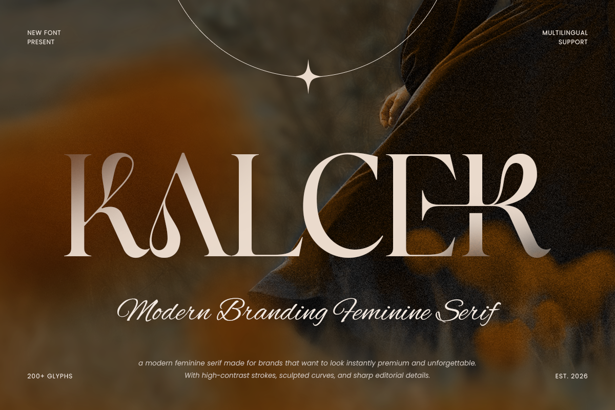
Kalcer is a modern branding feminine serif font designed to bring softness, elegance, and refined confidence to your typography. With graceful serif details, balanced proportions, and a polished modern rhythm, this typeface creates a premium visual tone that feels stylish, delicate and instantly brand-ready.
Ciglera - Modern Branding Swash Font
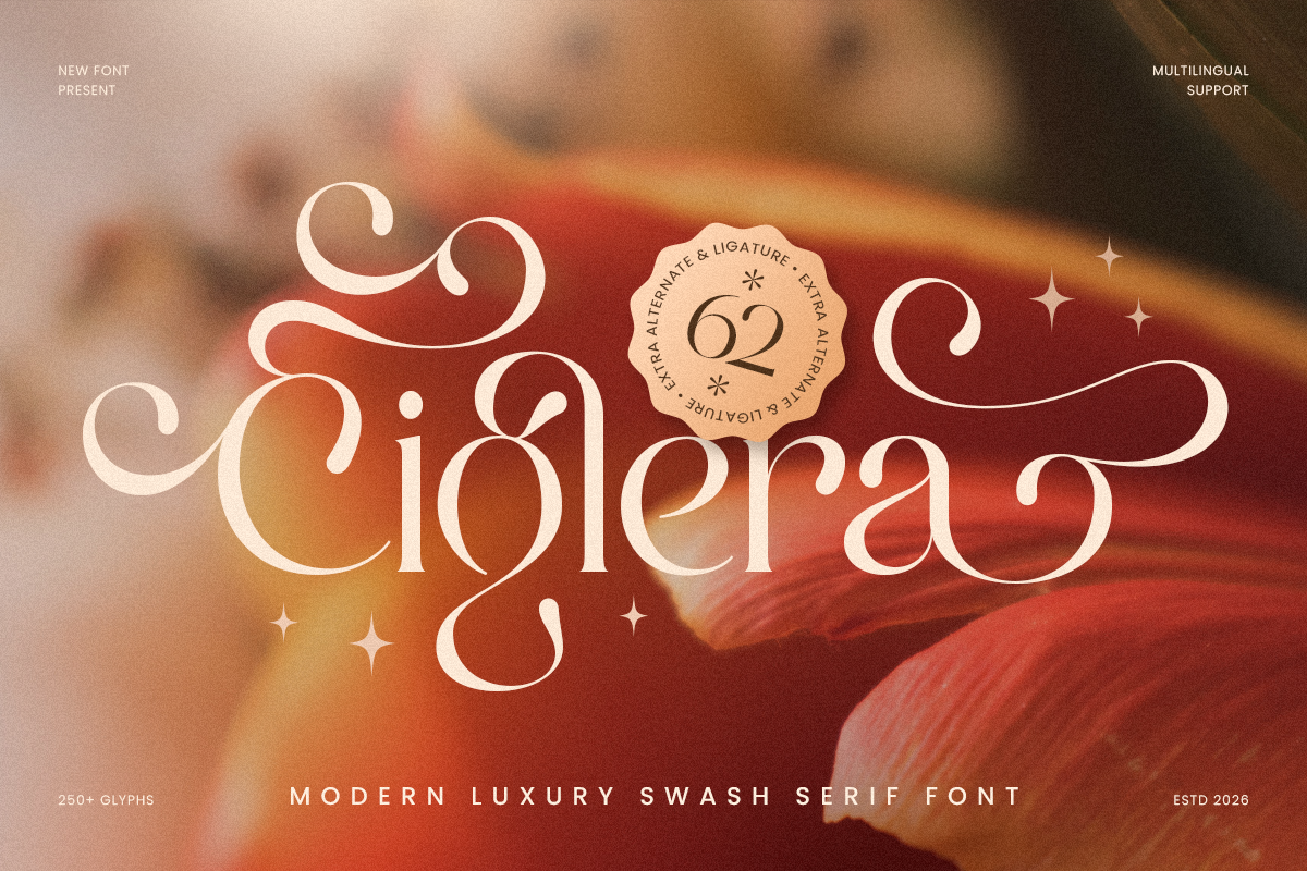
Ciglera is a modern luxury swash font designed to bring refined elegance and expressive charm to your typography. With graceful swash details, polished letterforms, and a sophisticated rhythm, this typeface creates a premium visual tone that feels stylish, feminine, and instantly brand-ready.
Romena - Feminine Luxury Serif Font
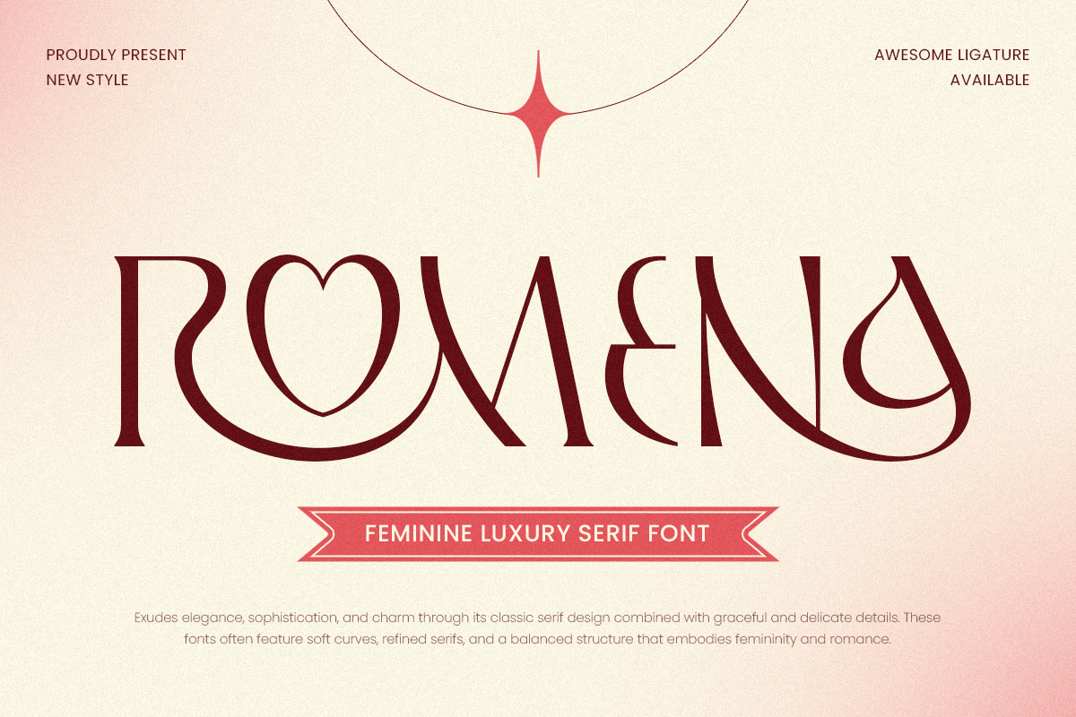
Romena is a feminine luxury serif font designed to exude beauty, elegance, and timeless charm. Its soft curves, refined contrast, and graceful serifs make it a perfect choice for branding, wedding invitations, high-end beauty packaging, and editorial headlines.
February is one of the richest visual months in the design calendar. It gives brands room to explore emotional branding, romantic campaigns, feminine storytelling, customer appreciation, and warm community-focused content. It can feel playful, elegant, expressive, or premium depending on how the visuals are shaped.
For designers, this is where color palette, typography, and campaign mood need to work together. A February campaign does not need to be loud to be effective. In many cases, the strongest direction is the one that feels softer, smarter, and more intentional.