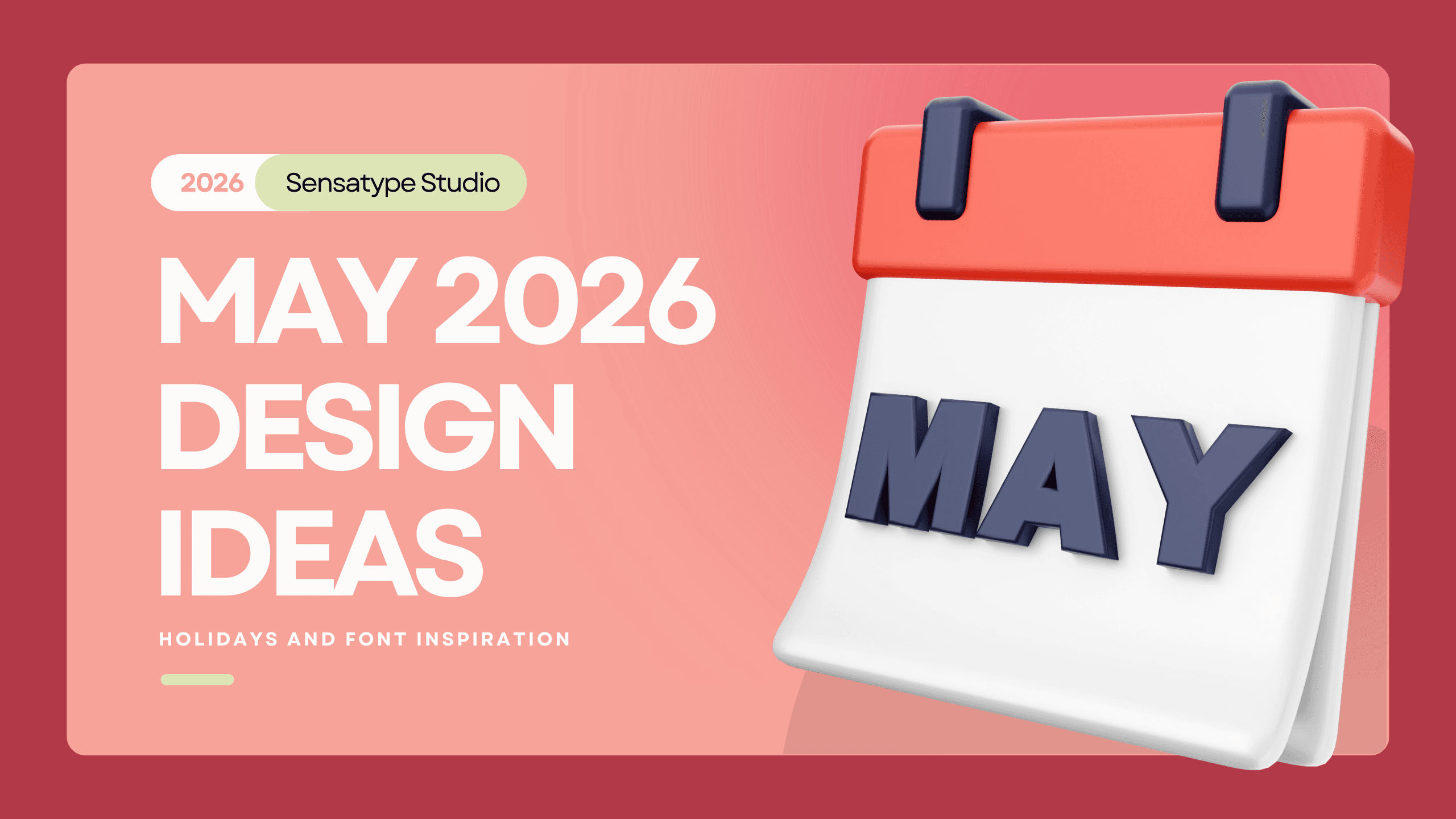
May 2026 Design Ideas, Holidays, and Font Inspiration
May 2026 brings warm and versatile design opportunities for Mother’s Day campaigns, family-themed content, appreciation posts, and lifestyle branding, with soft seasonal color palettes, elegant font inspiration, and polished visual ideas that help designers and creative brands build content that feels personal, refined, and relevant.
May has a softer kind of energy. It is warm, bright, and full of moments that feel personal without becoming overly sentimental. It works for lifestyle brands, beauty businesses, home decor promotions, family-centered campaigns, gifting visuals, wellness content, and editorial storytelling.
That balance is what makes May interesting. It is not only about seasonal beauty. It is also about appreciation, family, connection, gifting, and the quieter side of storytelling. If you are planning content for campaigns, social media, product launches, or editorial visuals, May gives you a lot to work with.
May is also a very good month for family and connection-centered branding. This can mean traditional family content, but it can also stretch further into ideas like home, support, community, routines, belonging, and shared moments. That broader direction makes the month more useful for brands that do not want to run an obvious holiday campaign.
Visually, family-themed branding in May tends to work best when it feels calm, inclusive, and human. The design language should be warm, but not noisy. You want the content to feel lived-in rather than staged.
May Color and Visual Theme Ideas
Color in May should feel warm and inviting, but not loud. This is not the month for harsh contrast unless the brand identity specifically calls for it. In most cases, softer palettes create a more relevant seasonal mood. Some strong directions for May 2026 include:
Blush beige
Sage green
Cream
Soft peach
Muted floral tones
Warm daylight-inspired palettes
Visually, May content often benefits from a lighter touch. Use more breathing room. Let typography sit comfortably. Avoid overfilling the composition. When the color palette is soft and the layout is controlled, the design feels more expensive and more emotionally believable. The strongest May content usually avoids feeling too transactional.
Best Alternative Fonts For May
Amoura - Modern Elegant Script Font
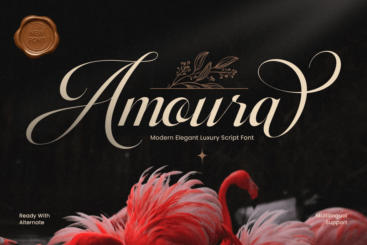
Amoura is a modern elegant luxury script font crafted to bring graceful movement and refined sophistication to your typography. With flowing strokes, polished curves, and a premium handwritten rhythm, this typeface creates a luxurious visual tone that feels stylish, feminine, and instantly memorable.
Rosena - Premium Stencil Branding Logo Font
Rosena is a premium branding logo font designed to deliver a polished, high-end impression with modern clarity. Its refined letterforms and confident structure create a clean luxury feel, perfect for brands that want to look exclusive, professional, and instantly recognizable.
Bungaria - Feminine Handwritten Font
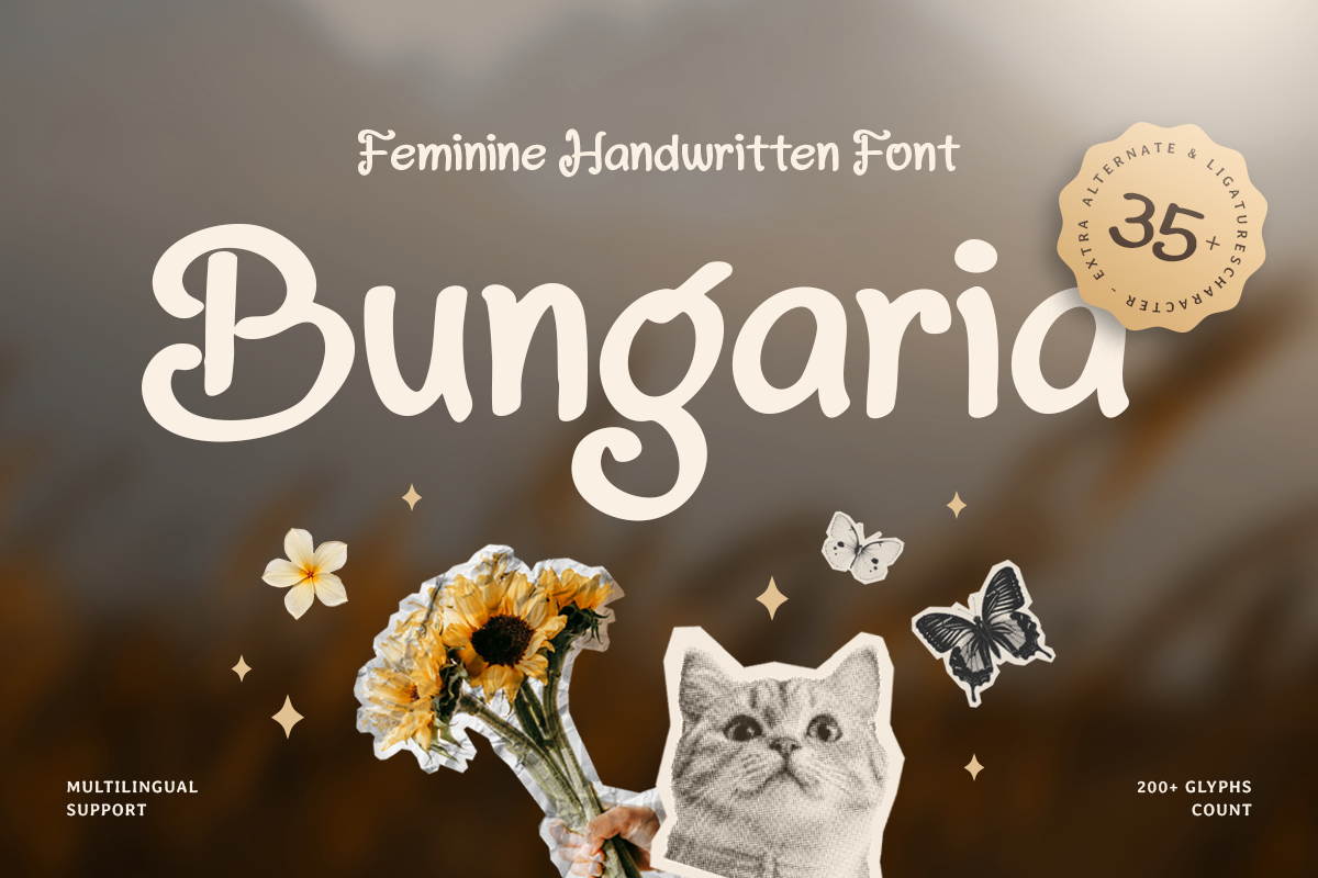
Bungaria is a feminine handwritten font crafted to bring softness, elegance, and natural charm to your typography. With flowing handwritten strokes and a graceful rhythm, this typeface creates a warm visual tone that feels personal, stylish, and beautifully expressive.
Giraffe - Bold Funny Handwritten Font
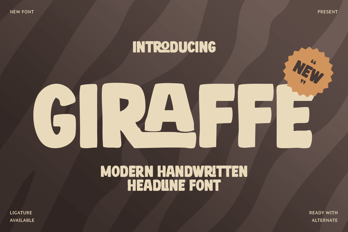
Giraffe is a modern bold funny handwritten headline font crafted to bring playful energy and cheerful personality to your typography. With thick handwritten strokes, lively rhythm, and a friendly visual character, this typeface creates a fun tone that feels expressive, modern, and instantly eye-catching.
Hello Frolic - Whimsical Fun Handwritten Font
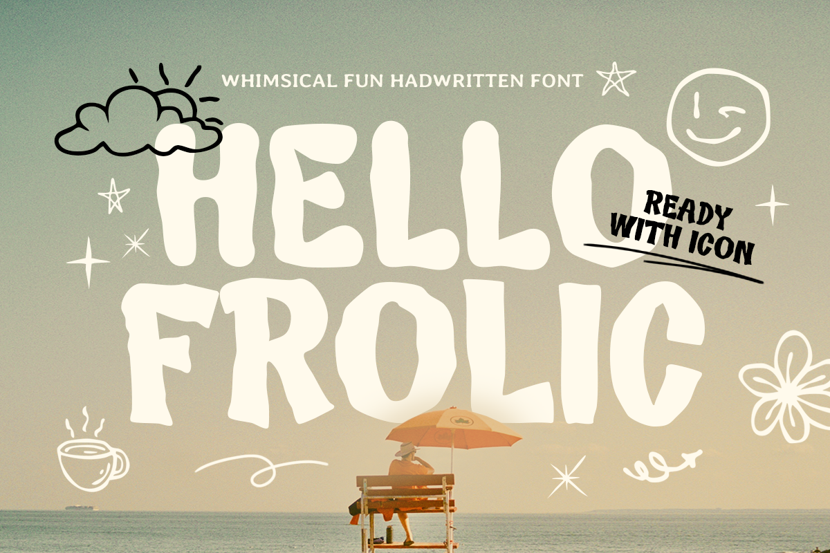
Hello Frolic is a whimsical fun handwritten font made to bring instant joy to your typography. With its bouncy rhythm, quirky strokes, and friendly personality, this typeface feels warm, casual, and full of playful energy perfect for designs that want to smile back.
FAQ
Q: What are the best May design themes for 2026?
A: Some of the strongest May design themes are appreciation, connection, gifting, family, soft lifestyle storytelling, and warm seasonal branding. The month works well when visuals feel human, polished, and approachable.
Q: What fonts work well for Mother’s Day campaigns?
A: Elegant serif fonts are usually the best starting point. They feel refined and emotional at the same time. Soft feminine fonts also work well, and a subtle script accent can add a more personal touch when used carefully.
Q: How can designers create warm visuals for May content?
A: Start with a softer palette, use more breathing room in the layout, and choose typefaces that support the emotional tone of the campaign. Editorial photography, warm daylight-inspired tones, and calm visual hierarchy also help.
Q: What branding ideas fit family-themed campaigns?
A: Family-themed campaigns work best when they focus on connection, belonging, care, and shared moments. This can be expressed through lifestyle storytelling, community-centered content, calm typography, and more inclusive visual language.
Q: What colors work best for May campaign design?
A: Blush beige, sage green, cream, soft peach, muted floral tones, and warm daylight-inspired neutrals are all strong choices for May. These palettes feel seasonal without becoming overly bright or overly sweet.
May 2026 is a strong month for design because it carries emotional warmth without locking brands into one narrow visual formula. It can support appreciation-based campaigns, family-centered storytelling, refined lifestyle promotions, and content that feels both personal and polished.
That flexibility is the real value of the month. You can build visuals that feel elegant, soft, uplifting, or community-focused depending on your brand direction. Mother’s Day is an important anchor, but it should not be the only lens. May has room for family, connection, gratitude, gifting, and calm seasonal storytelling.
For designers, the biggest opportunity is in the details. Typography shapes the emotional tone. Color controls the softness. Layout decides whether the campaign feels premium or predictable. When those elements work together, May becomes a month full of creative range rather than a single holiday post waiting to happen.