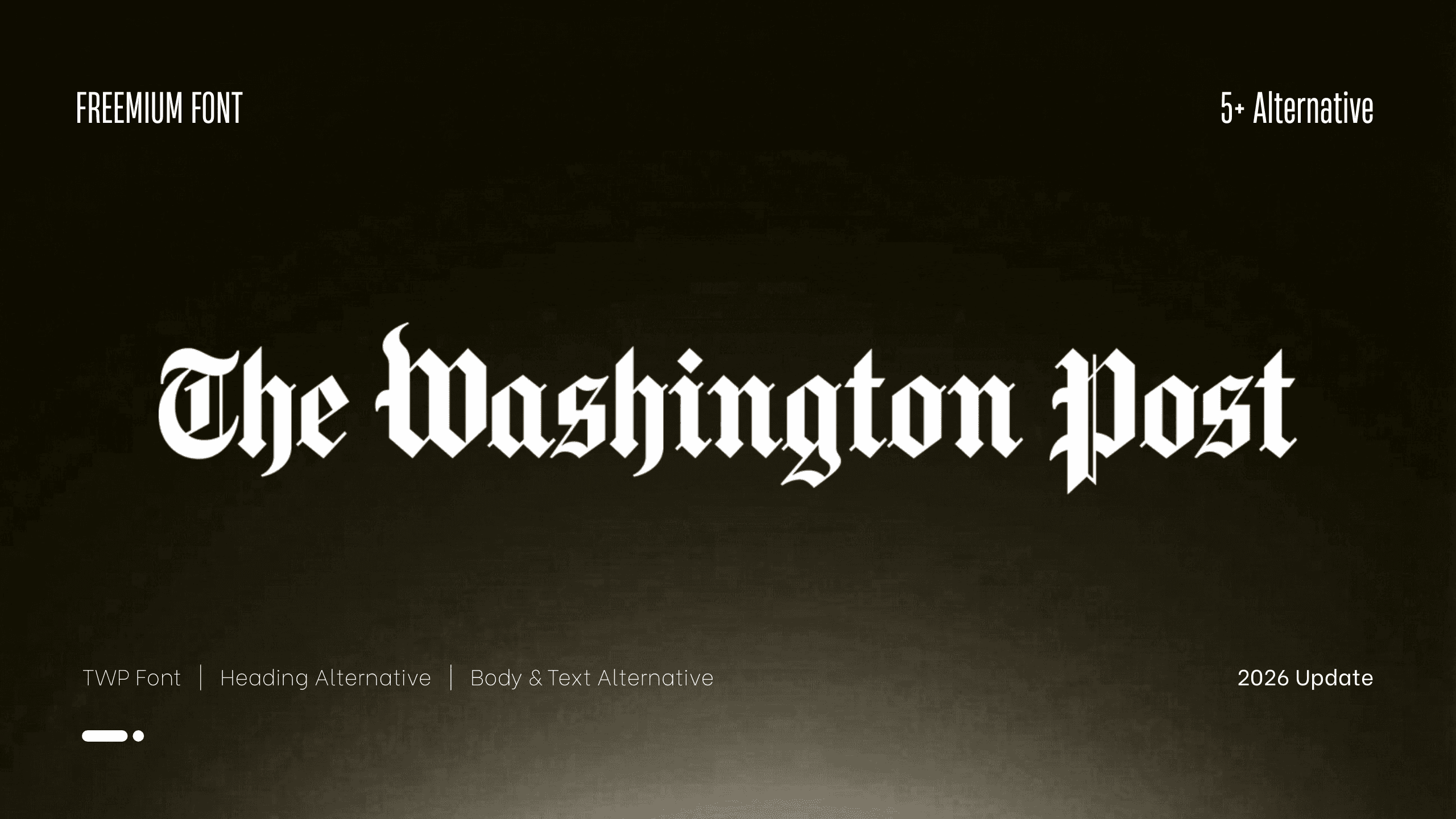
What Font Does The Washington Post Use in 2026? Logo, Headlines & Typography
Discover what font The Washington Post uses for its logo, headlines, and body text. Learn about Postoni, Postroman, and the paper’s iconic blackletter masthead.
What Font Does The Washington Post Use? Logo, Headlines, and Typography Explained
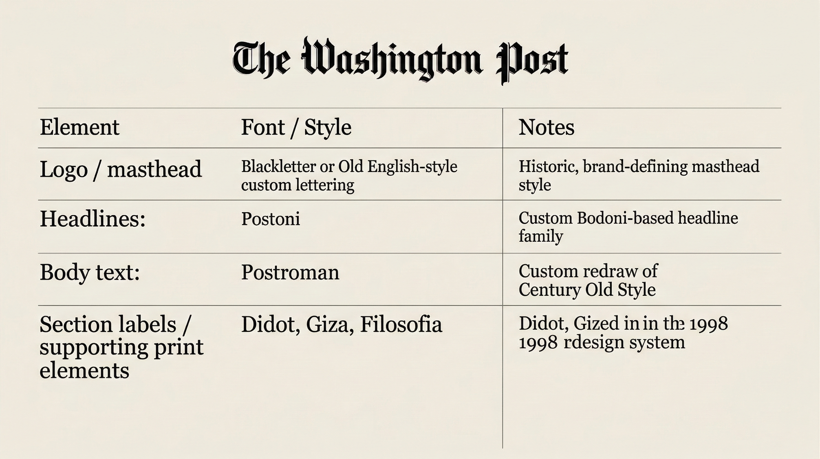
If you’re wondering what font The Washington Post uses, the most accurate answer is this: its logo uses a blackletter-style masthead, its headlines are closely associated with Postoni, and its body text has historically been tied to Postroman. These were part of a major typographic redesign shaped by Matthew Carter, giving the paper a visual identity built on authority, readability, and newsroom tradition.
That means The Washington Post is not defined by one font alone. It uses a typography system, where each layer serves a different purpose: the masthead carries heritage, the headlines deliver editorial force, and the reading text supports clarity over long articles. That layered approach is a big reason the paper still feels timeless in both print and digital contexts.
Quick Answer
The Washington Post uses:
a blackletter-style custom masthead for its logo,
Postoni for its signature headline style,
and Postroman, a redesigned version of Century Old Style, for body text in its print system.
If you are searching for a font similar to The Washington Post, the closest matches depend on which part you mean: a blackletter font for the logo, a Bodoni-inspired editorial serif for headlines, or a classic readable newspaper serif for article text.
The Washington Post Font at a Glance
This breakdown is supported by The Washington Post’s redesign archive and Type Network’s documentation of the Postoni family, later released under the name Stilson.
What Font Is Used in The Washington Post Logo?
The Washington Post logo is best described as a custom blackletter-style masthead inspired by traditional newspaper and Old English lettering. It is not typically treated as a standard public font in the way a retail typeface would be. Instead, it works as a brand signature, carrying the kind of institutional weight that instantly signals history, seriousness, and editorial authority.
That old-world look is not accidental. Blackletter and gothic newspaper mastheads were historically associated with prestige, permanence, and public trust. In The Washington Post’s case, the masthead acts like a carved nameplate above the newsroom door: ceremonial, memorable, and loaded with identity.
So if your question is, “What is The Washington Post logo font?”, the most accurate answer is: a proprietary blackletter-style masthead, not a simple off-the-shelf retail font.
Why The Washington Post Typography Feels So Authoritative
The Washington Post’s type system feels authoritative because it combines symbolic heritage with functional clarity. The masthead looks historical and ceremonial, while the headline and body fonts were engineered for readability and production efficiency. It is a classic case of tradition wearing modern tailoring.
Postoni gives headlines a polished editorial snap. Postroman keeps text compact and readable. The masthead preserves legacy. Together, they create a tone that feels credible without becoming visually cold.
For designers, this is the real lesson: strong editorial branding is usually not about finding one magical font. It is about creating a system where display type, text type, and brand lettering each do their own job beautifully.
A Brief History of The Washington Post Font Logo
A major turning point came with The Washington Post redesign of 1998. The paper retained its editorial seriousness but refined the way its typography worked on the page. That redesign introduced Postoni for headlines and Postroman for text, while also assigning supporting roles to faces like Didot, Giza, and Filosofia.
Later, Type Network documented how the headline family evolved beyond its original form, expanding into additional styles and eventually appearing under the commercial name Stilson. That history shows that The Washington Post’s typography was not frozen in amber. It kept evolving while staying recognizable.
Best Sensatype Alternative to The Washington Post Logo Font
If you want to recreate the historic newspaper mood of The Washington Post without copying its proprietary masthead, Times York New is one of the strongest Sensatype alternatives to consider.
Times York New captures the blackletter-inspired authority, heritage feel, and editorial gravitas often associated with classic American newspaper branding. Unlike gothic fonts that lean too decorative or too medieval, Times York New feels more controlled and more usable for modern editorial work.
It is especially suitable for:
newspaper-style mastheads
editorial branding
heritage-inspired logos
opinion magazine covers
political commentary visuals
publication-style posters
bold editorial headlines with a historic feel
If your goal is to build a design that feels traditional, journalistic, and visually credible, Times York New offers one of the closest Sensatype directions to that Washington Post-inspired atmosphere.
Times York New — Gothic Blackletter Font
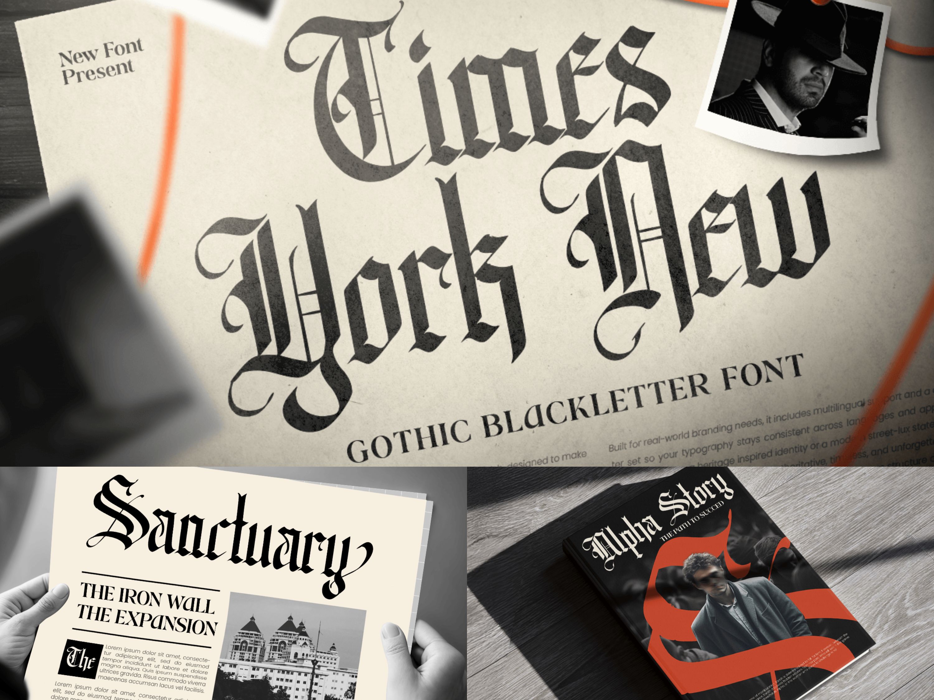
Times York New blends historic newspaper lettering with modern refinement, making it a strong choice for designers who want a Washington Post-style atmosphere in branding or editorial projects. Its bold gothic structure creates an immediate sense of authority, tradition, and publication heritage, while still feeling polished enough for contemporary layouts.
Use Times York New for mastheads, editorial identity systems, newspaper-inspired logos, political commentary covers, heritage campaigns, and premium publishing visuals that need a timeless newsroom character.
Gothic — Modern Blackletter Font
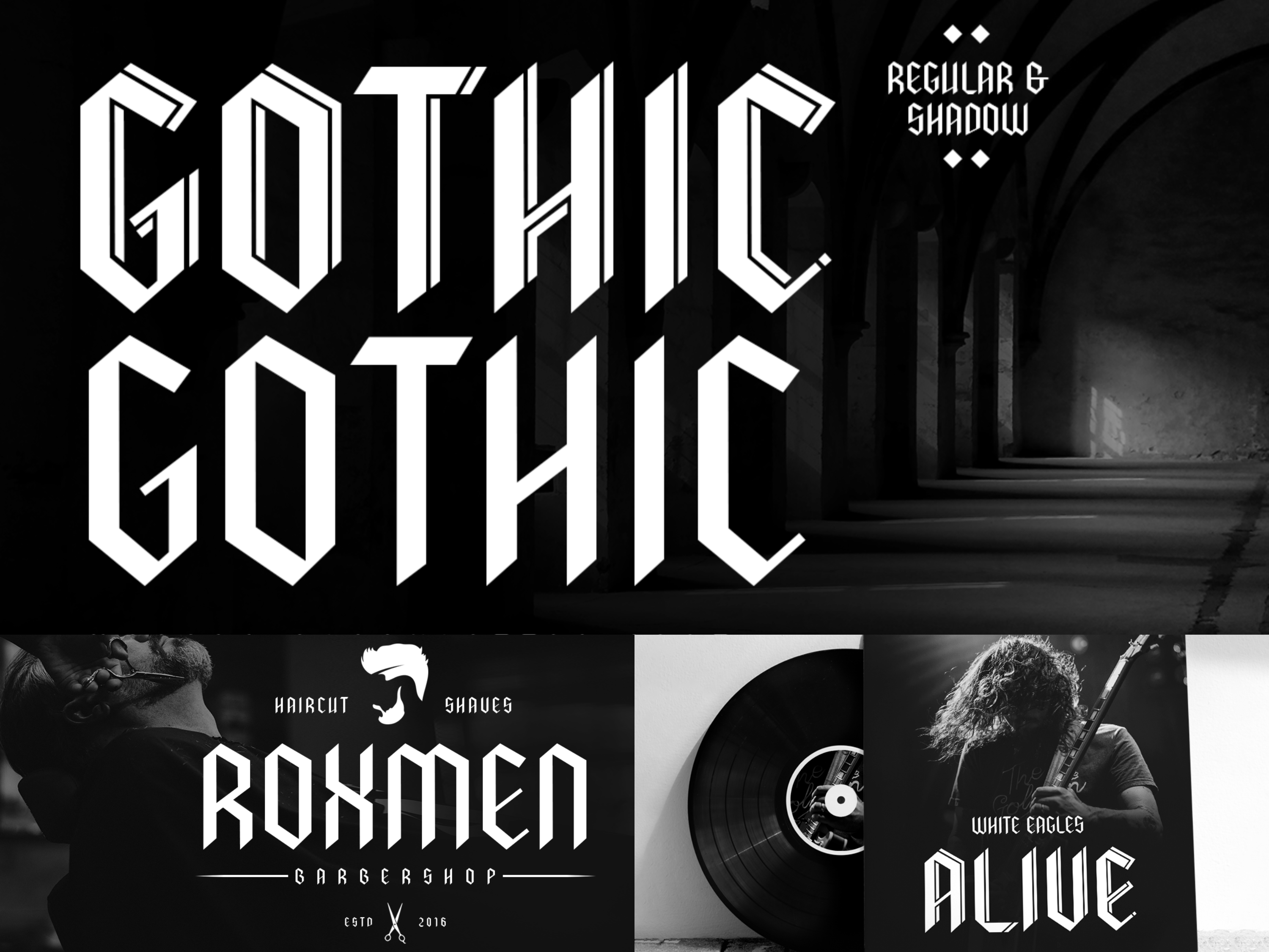
Gothic is a modern blackletter display font featuring stylistic alternates that allow flexible variations and unique shapes. This typeface works well for logos, branding, and editorial projects that require traditional elegance with contemporary usability.
What Font Does The Washington Post Use for Headlines?
The headline font most strongly associated with The Washington Post is Postoni. In the paper’s 1998 redesign, Matthew Carter was commissioned to redraw the headline face, resulting in Postoni, a custom Bodoni-based typeface with a higher x-height and more balanced weight between capitals and lowercase letters. That redesign improved readability while preserving the elegant authority expected from a major newspaper.
This is one of the most important corrections many articles miss. The Post’s headline style is not best summarized as “just Miller” or “just Bodoni.” The more evidence-backed answer is Postoni, which was custom-made for the publication’s editorial needs.
Type Network later documented that this Washington Post headline family expanded over time and was eventually released commercially under the name Stilson. That makes Stilson one of the closest legitimate public references to the Washington Post headline look.
Best Sensatype Fonts for Washington Post-Style Headlines
While The Washington Post uses a custom headline system rooted in Postoni, designers looking for a similar editorial tone can explore Sensatype fonts that capture the same sense of authority, contrast, and readability. For this direction, the best alternatives are fonts that feel structured, serious, and strong in large-format headlines.
Campaign Serif — Editorial Headline Alternative
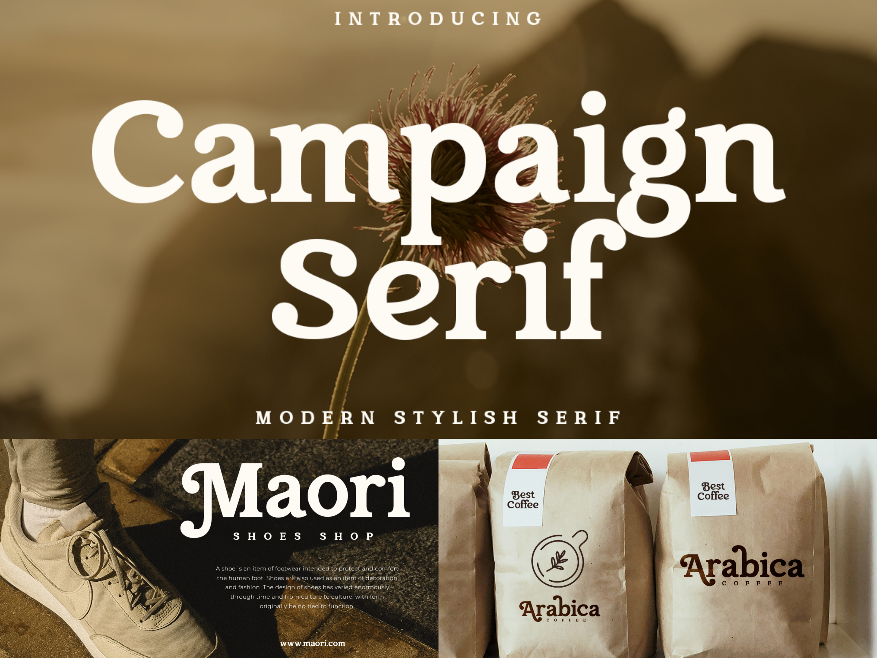
Campaign Serif is a strong choice for Washington Post-style headlines because it combines sharp serif contrast with a disciplined editorial rhythm. It works especially well for feature titles, opinion headlines, and publication covers that need a refined newsroom tone.
Barbeque — Modern Luxury Serif Font
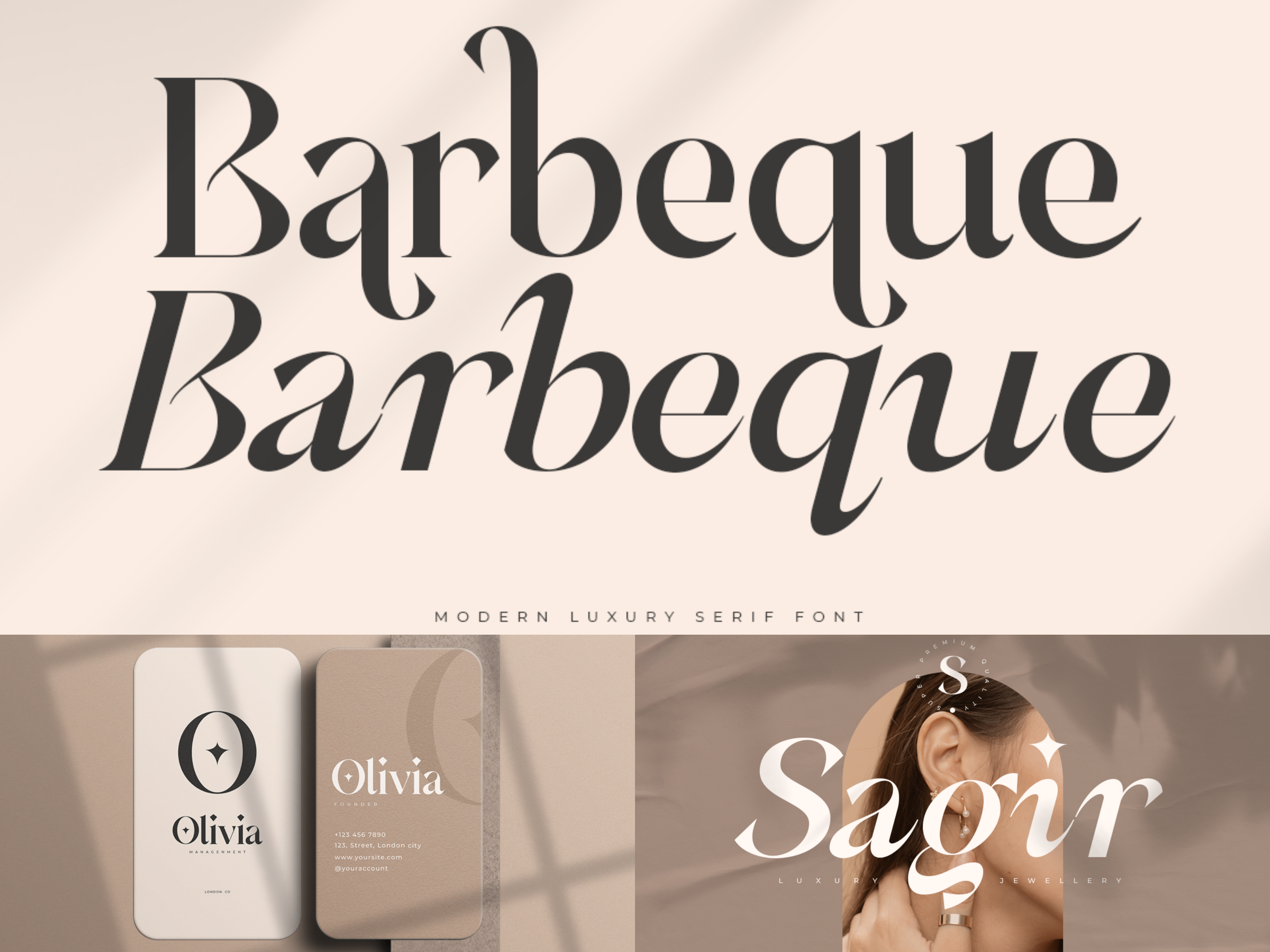
Barbeque combines bold serif structure with elegant curves, producing headlines that feel both authoritative and visually refined. This typeface works especially well for feature headlines and long-form editorial layouts requiring visual sophistication.
Naomi — Elegant Branding Serif Font
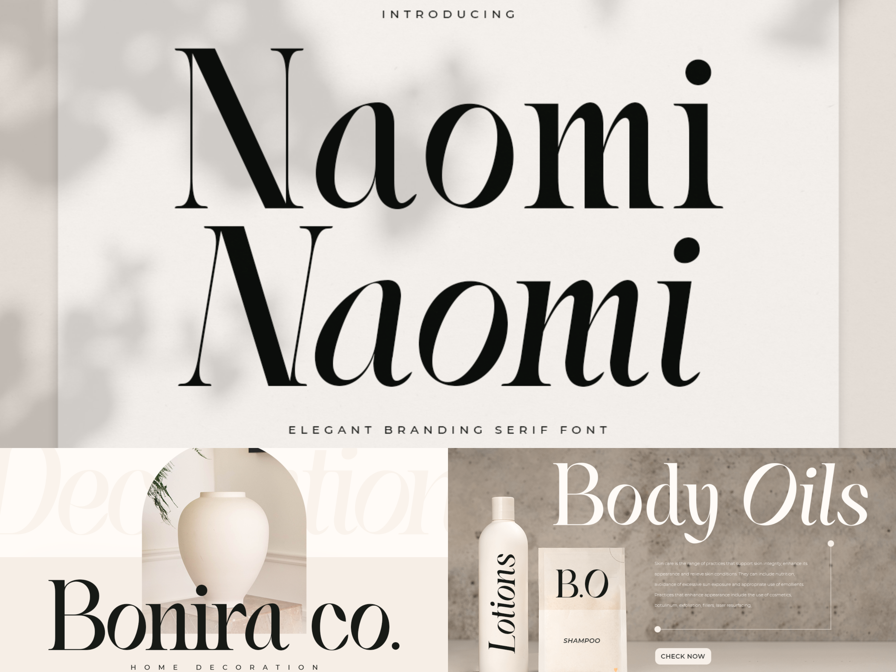
Naomi offers graceful letterforms and a polished aesthetic suited for professional editorial design. Its refined structure makes it an excellent choice for headlines that need clarity while maintaining an upscale tone.
Montage — Cinematic Logo Luxury Font

Montage delivers a dramatic serif style that commands attention while preserving readability. It is well suited for feature stories, magazine-style layouts, and editorial designs that benefit from a bold visual hierarchy.
Righty — Bold Vintage Editorial Alternative

Righty offers a more expressive newspaper feel with bold weight and classic headline energy. It is suitable for impactful cover lines, retro editorial branding, and story-driven layouts that need strong visual presence.
What Font Does The Washington Post Use for Body Text?
For body text, The Washington Post’s print redesign identifies Postroman as the reading typeface tied to its system. Postroman was developed as a redesigned version of Century Old Style, intended to perform better at slightly smaller sizes, in narrower newspaper columns, and across dense article layouts.
That makes it a practical editorial workhorse rather than a decorative serif. Its job is to support readability, efficiency, and reader comfort over long passages, which is exactly what serious news publications need in article typography.
So if someone asks, “What font does The Washington Post use for articles?”, the strongest historical answer is Postroma
Readable Sensatype Serif Alternatives for Editorial Layouts
The Washington Post’s body text system was built for clarity and efficiency. If you want a similar reading experience for your own editorial project, choose serif fonts that stay calm, readable, and balanced over long passages.
Runalto — Elegant Editorial Reading Serif
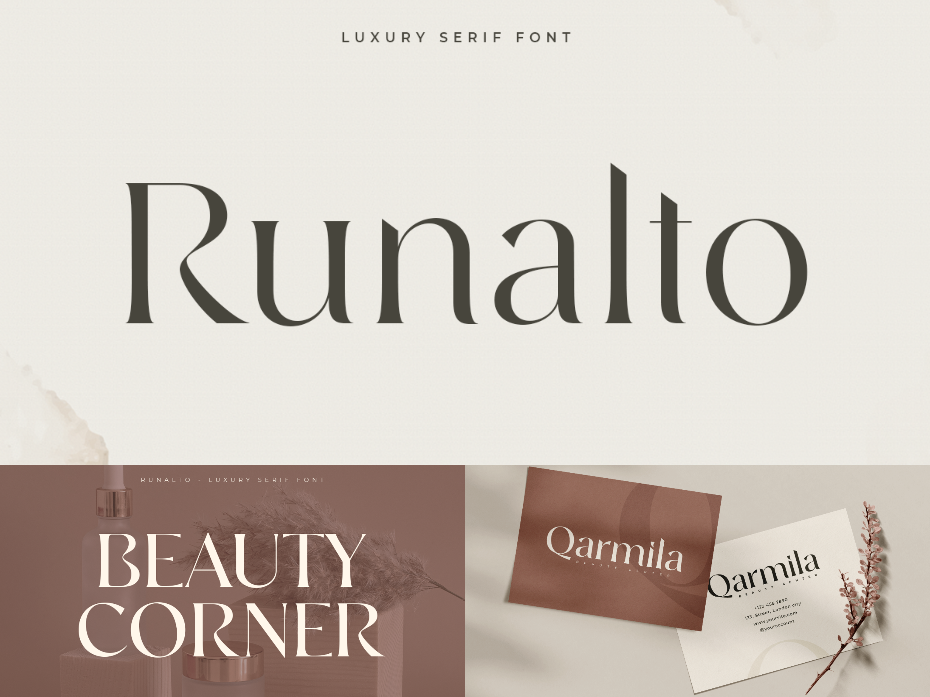
Runalto offers refined proportions and a smooth reading rhythm, making it suitable for long-form articles, essays, and publication layouts that require both readability and sophistication.
Margaret — Luxury Cool Modern Font
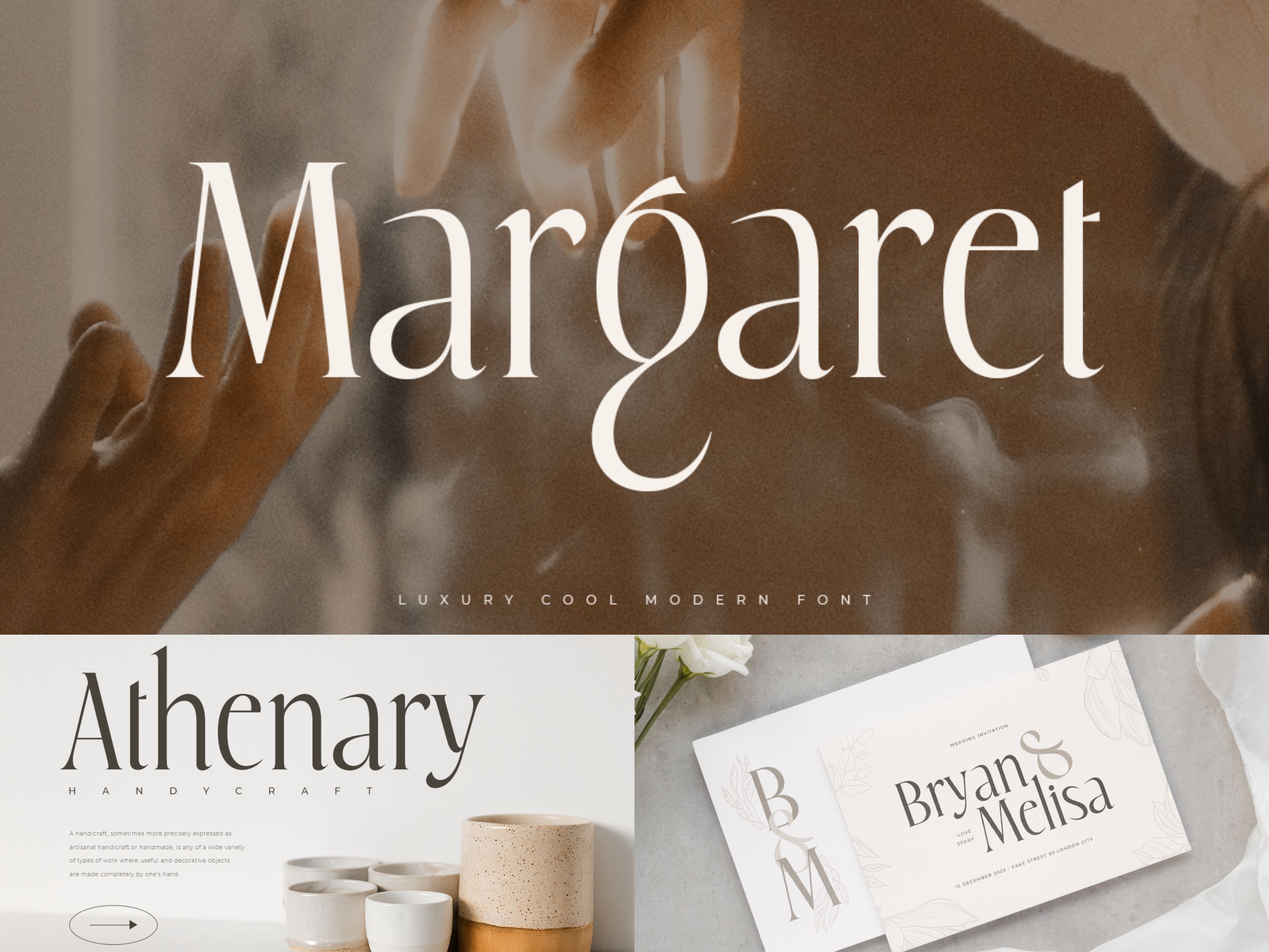
Margaret combines modern serif styling with excellent readability. This font works well for professional publishing, offering clarity while maintaining a polished editorial tone.
Monik — Clean Serif for Polished Content
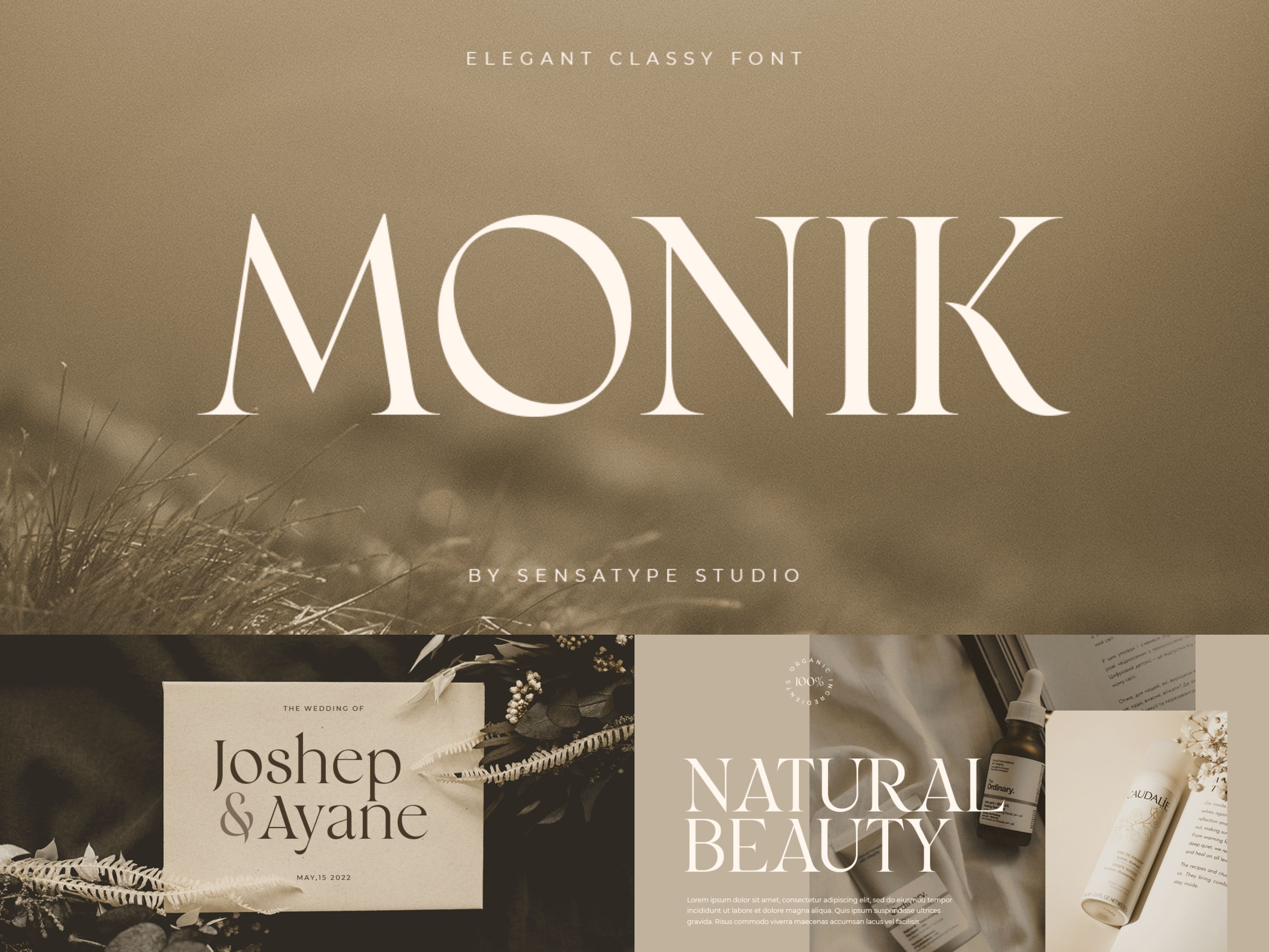
Monik features smooth curves and sophisticated structure, creating a comfortable reading experience. It is suitable for articles, blog content, and editorial designs requiring both readability and elegance.
Gray — Luxury Classy Brand Font
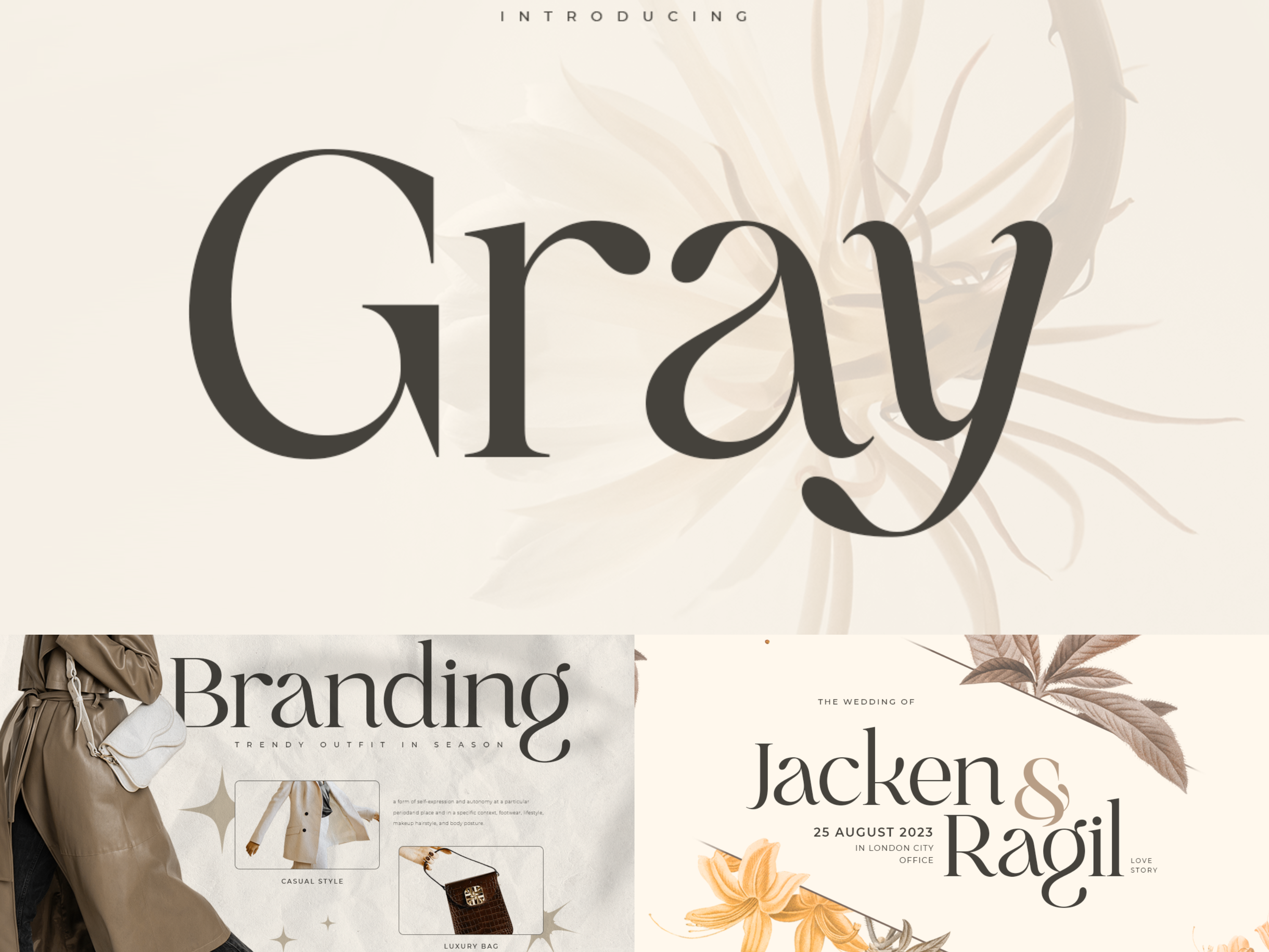
Gray offers a clean serif structure with modern refinement. Its clarity and consistent stroke weight make it effective for extended reading in digital publications.
Anymore — Fancy Minimalist Aesthetic Font
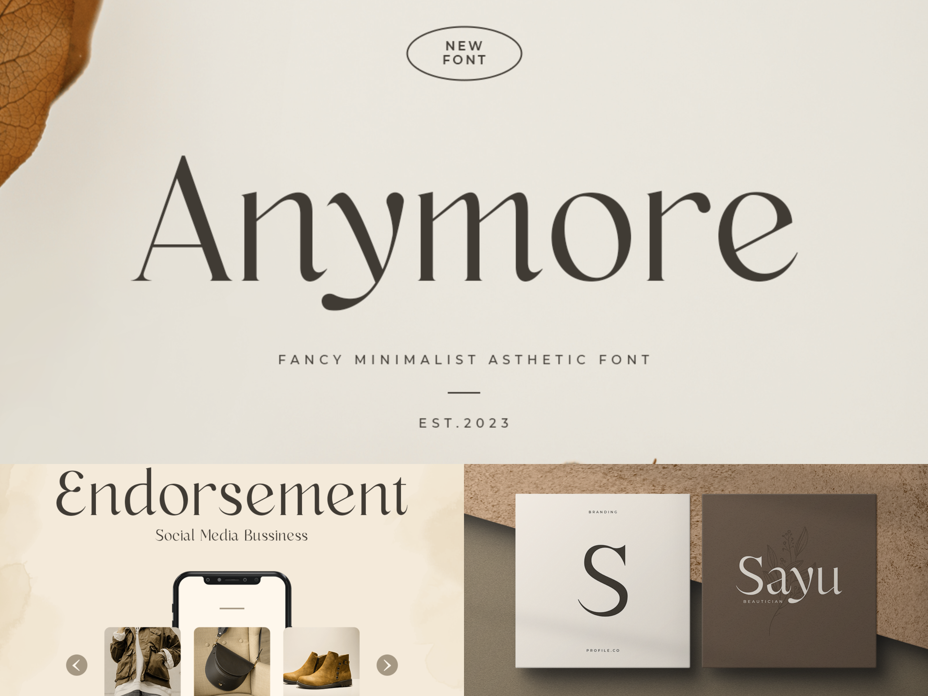
Anymore blends minimalist design with serif readability, producing a contemporary editorial feel. It works well for modern blogs and digital publishing environments.
Kumar — Unique Beauty Serif Font
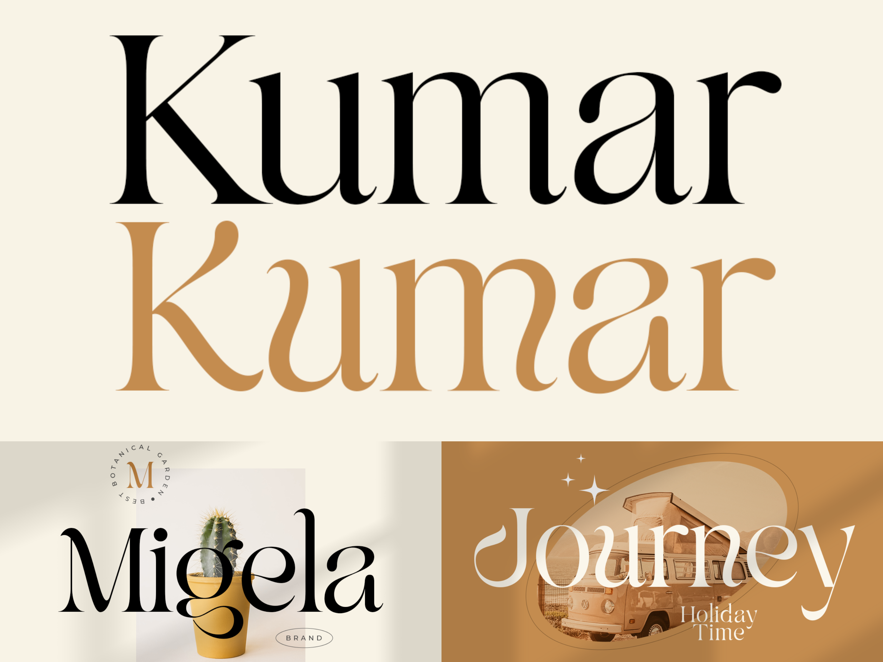
Kumar provides a distinctive serif personality while preserving legibility. This typeface is ideal for editorial projects that seek readability with subtle character.
Other Fonts Used in The Washington Post Design System
The Washington Post’s redesign also referenced several supporting typefaces for different editorial roles. According to the paper’s own explanation:
Didot was used for section nameplates,
Giza for columnist names and initials,
and Filosofia for bylines.
This is a useful reminder that major publications rarely rely on a single typeface. Instead, they build a typographic hierarchy, where each font supports a specific function. The result is a more controlled, more recognizable editorial voice.
The Washington Post Other Fonts Alternatives
If you want to achieve a similar clean and structured interface style, these sans-serif fonts provide effective alternatives.
Madani — Professional Modern Sans Serif Family
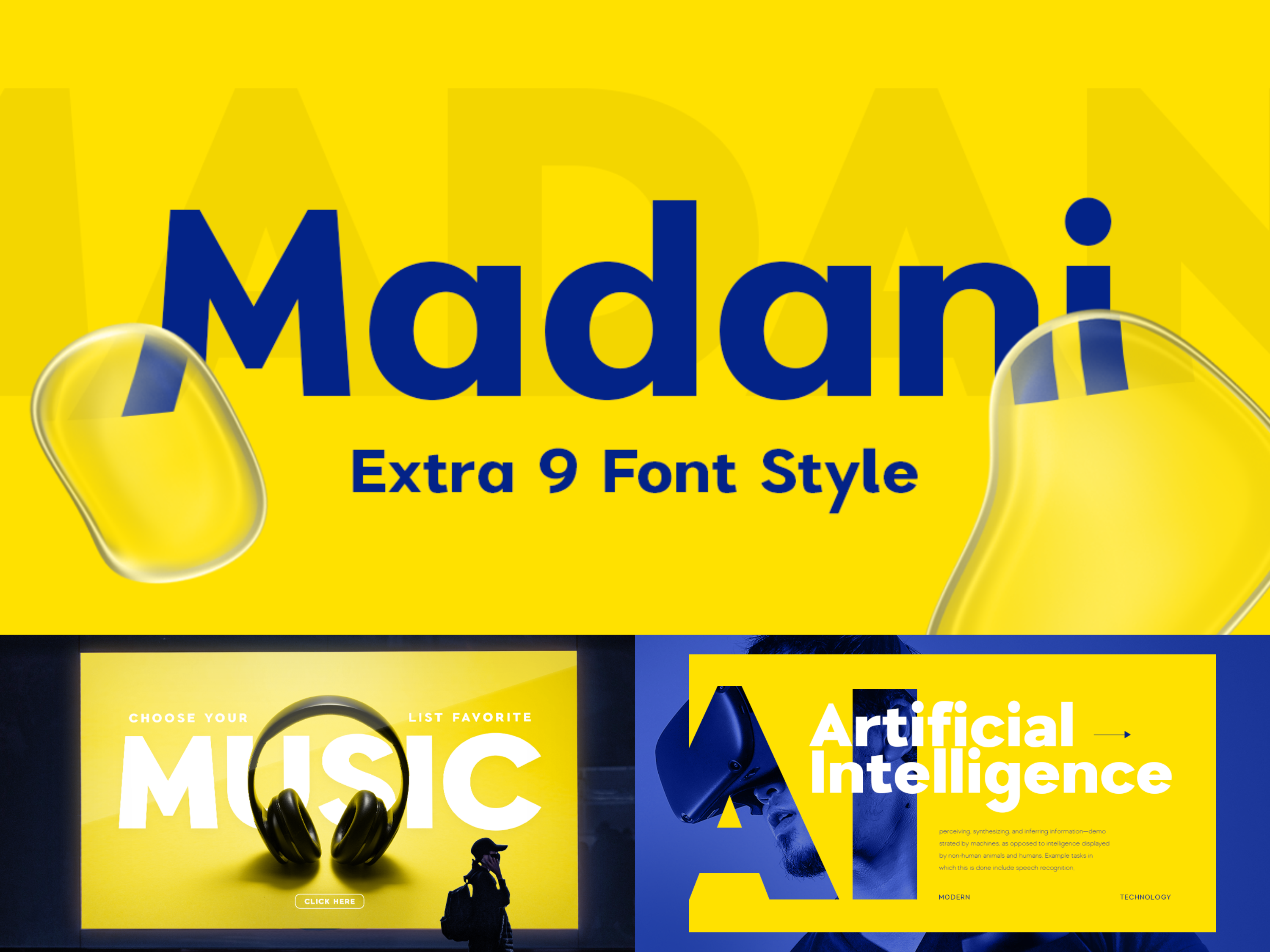
Madani offers a clean, professional structure designed for corporate and editorial interfaces. Its clarity makes it ideal for captions, navigation systems, and structured layouts.
Refoke — Luxury Corporate Font Family
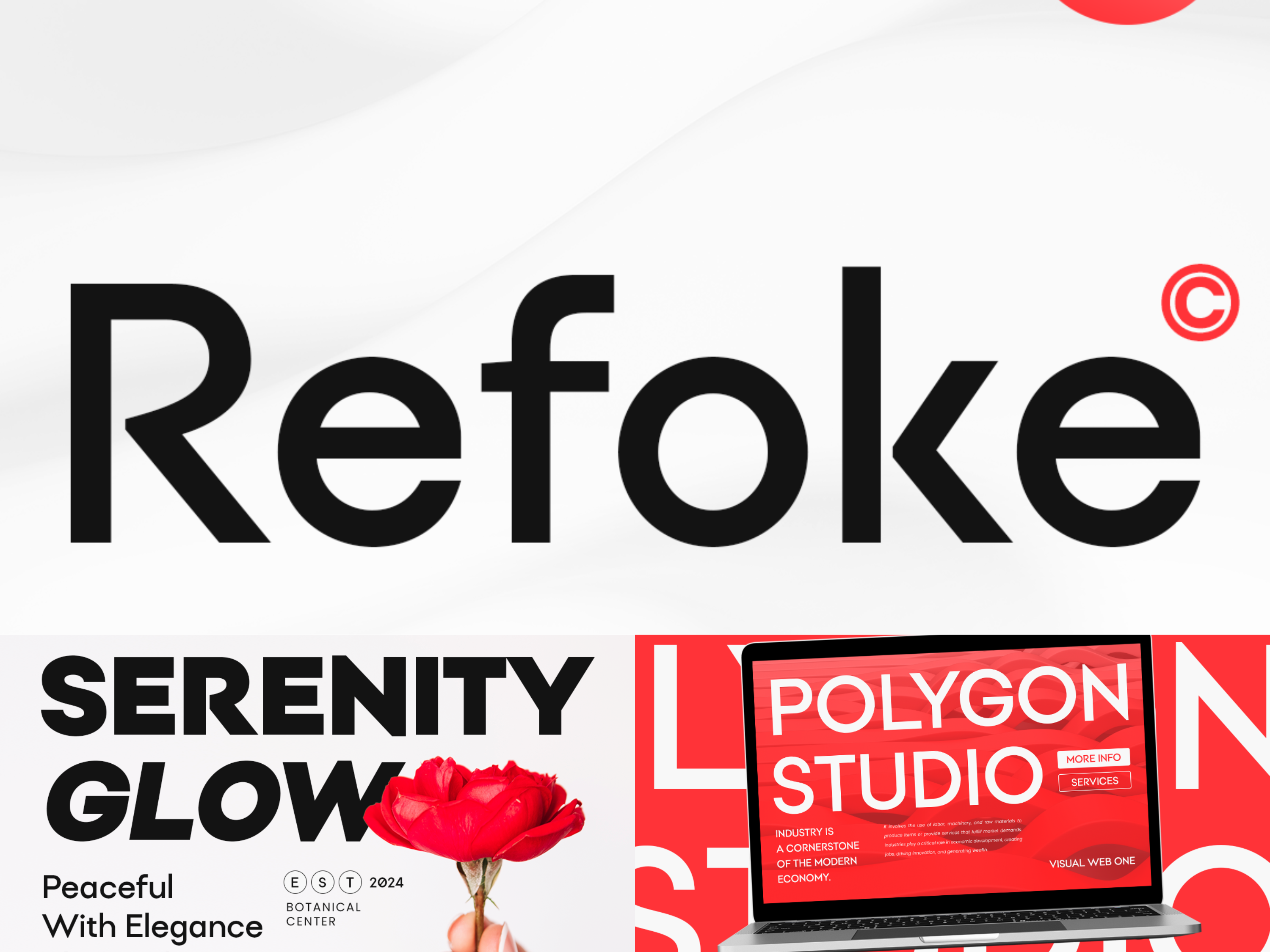
Refoke combines modern simplicity with professional polish. It works well for subheadings and UI elements that require clarity while maintaining a refined aesthetic.
Metara — Modern Geometric Font
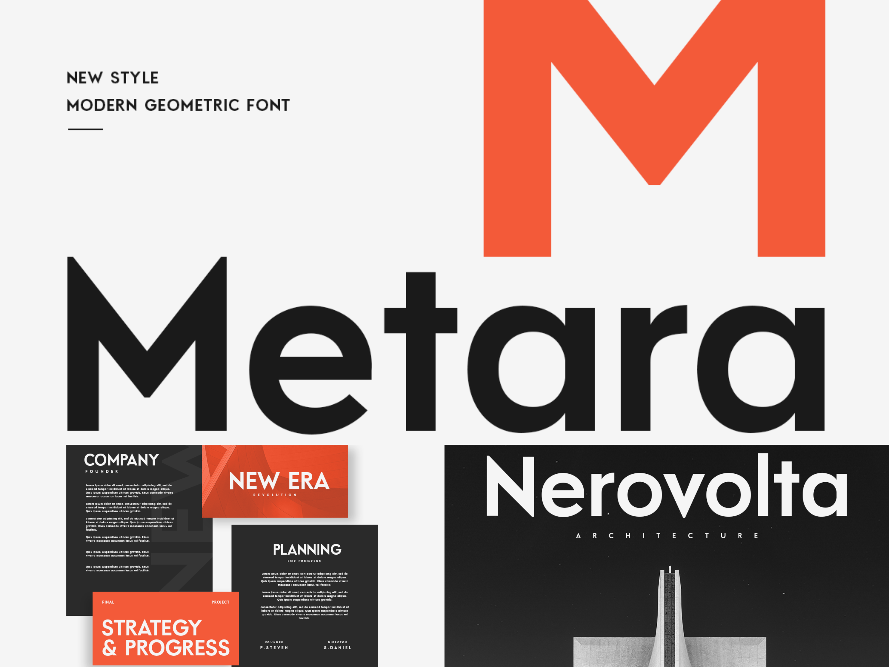
Metara features geometric precision and contemporary styling. This font is well suited for digital interfaces and structured editorial layouts.
New York — Modern Professional Font
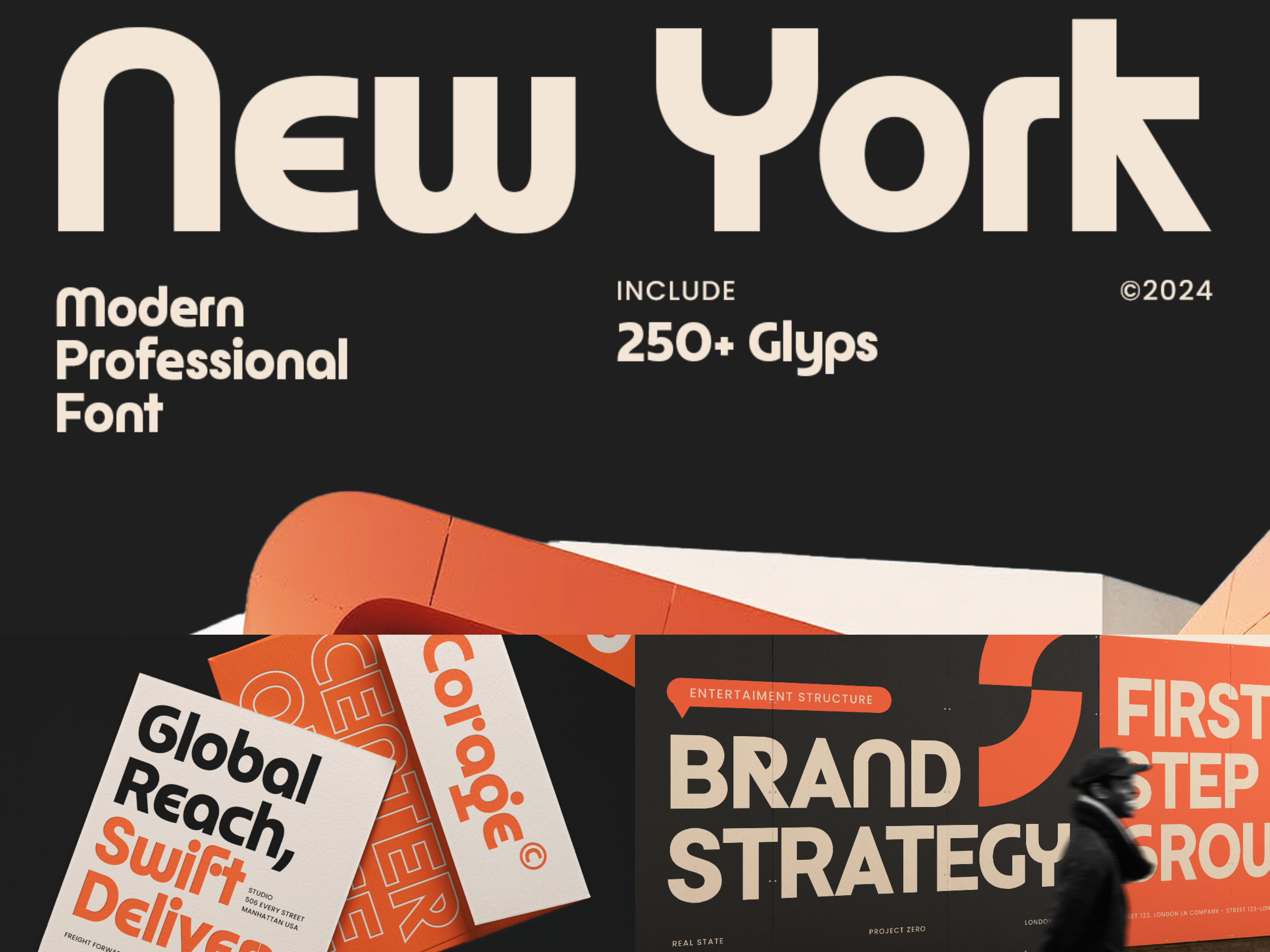
New York delivers clean letterforms with balanced spacing for enhanced readability. It is suitable for captions, menus, and modern publishing environments.
MOUNT — Modern Classy Geometric Sans Serif Font
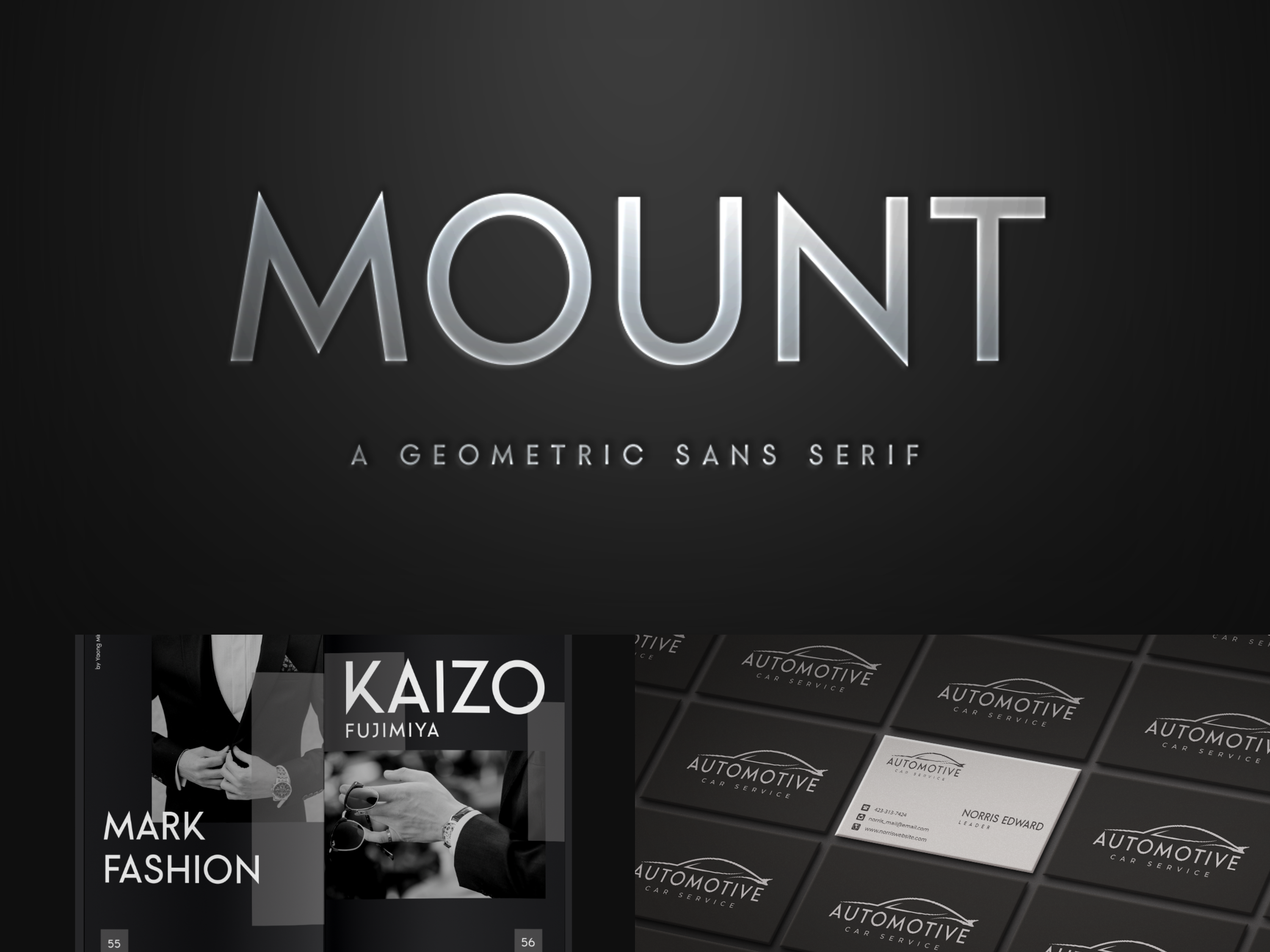
MOUNT blends geometric clarity with a professional tone. Its structure makes it ideal for UI hierarchy and supporting text elements.
Black — Modern Corporate Sans Serif
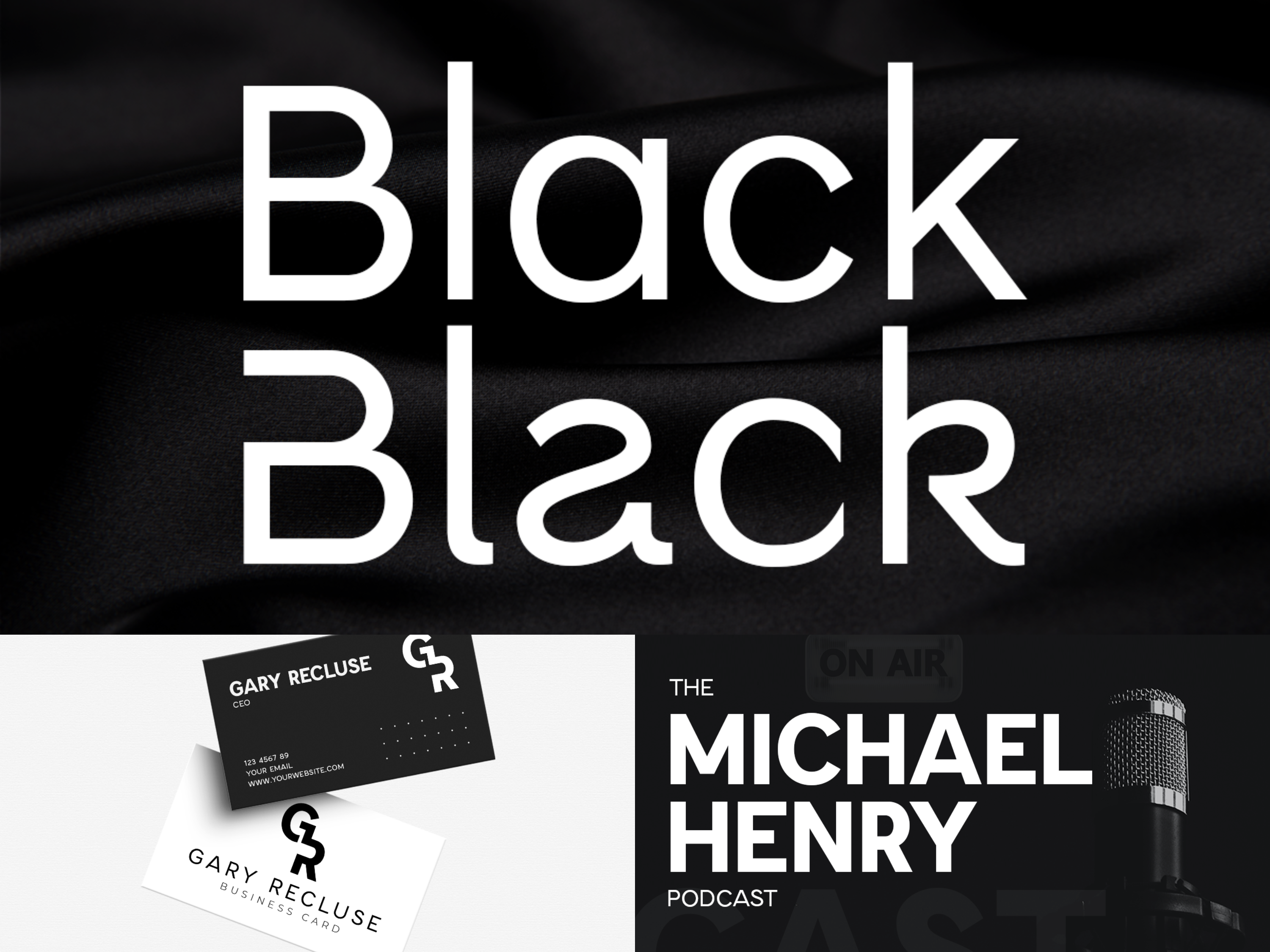
Black provides strong readability with a neutral and contemporary appearance. It is effective for captions, navigation, and structured content presentation.
What Designers Can Learn From The Washington Post
1. Heritage works best when it is focused
The blackletter masthead does not try to do everything. It handles symbolism and identity, while the working typefaces handle the actual reading experience.
2. Readability can still feel premium
Postoni and Postroman were designed to improve function, but they did not strip away editorial elegance. Utility and character can absolutely share the same page.
3. Typography should respond to real production needs
The redesign was tied to column width, readability, and print efficiency, not just aesthetics. Great editorial typography solves practical problems with grace.
4. A type system builds stronger brand memory than one font
The Washington Post is memorable because its masthead, headlines, and reading text each have their own voice, but still feel like part of the same newsroom family.
Final Answer
So, what font does The Washington Post use?
The best concise answer is:
Logo: custom blackletter-style masthead
Headlines: Postoni
Body text: Postroman
Related supporting styles: Didot, Giza, and Filosofia
The bigger truth is that The Washington Post does not rely on one font. It relies on a carefully built editorial type system, where heritage, clarity, and authority move together like well-edited columns on deadline.
And if you want to recreate that same historic editorial mood in your own design work, Times York New is one of the strongest Sensatype alternatives to explore.
FAQ Section
What font does The Washington Post use?
The Washington Post uses a blackletter-style masthead for its logo, Postoni for headlines, and Postroman for body text in its documented print redesign system.
What is The Washington Post logo font?
The logo is best described as a proprietary blackletter-style masthead rather than a standard retail font.
What font does The Washington Post use for headlines?
The headline system is most strongly associated with Postoni, a custom Bodoni-based typeface designed for the paper.
What font does The Washington Post use for body text?
The Washington Post redesign identifies Postroman, a redrawn version of Century Old Style, as the paper’s body text face.
What fonts are similar to The Washington Post?
For a similar look, use a blackletter font for the masthead mood, a Bodoni-inspired editorial serif for headlines, and a classic readable serif for body text.
What is the best Sensatype alternative to The Washington Post logo font?
Times York New is one of the strongest Sensatype alternatives for achieving a Washington Post-style newspaper masthead atmosphere.