
Best Fonts for Heat-Resistant Applications: A Designer's Buying Guide
Discover the best heat-resistant fonts for HTV, heat press, sublimation, screen printing, DTF, DTG, and signage. Learn how stroke thickness, spacing, font detail, and commercial licensing affect print quality, durability, and production results.
You've picked a font you love. It looks sharp on screen: clean lines, nice proportions, exactly the vibe you wanted for the shirt design or the storefront sign. Then it comes off the heat press with the thin strokes torn away, or the vinyl weeds into confetti, or the fine serifs vanish into a blurry smudge. The font wasn't wrong. It just wasn't built for what you were about to put it through.
"Heat resistant fonts" is a confusing search term, and that confusion is why so many designers end up guessing. It doesn't mean the font file itself withstands heat. A font is just data, it can't melt. What it actually refers to is whether a letterform's structure survives the physical stress of heat based production: the pulling and tearing of vinyl weeding, the pressure and temperature of a heat press, the loss of fine detail that happens during curing. Get the structure right, and the same design holds up cleanly across shirts, signs, and merch. Get it wrong, and you're reprinting.
This guide breaks down what makes a font production safe, then applies that framework across heat transfer vinyl (HTV), heat press, sublimation, screen printing, DTG, DTF, and signage, so you can look at any typeface and predict how it'll perform before you ever load the press.
What Makes a Font "Heat Resistant"?
Every heat based production method (cutting, pressing, curing) puts physical stress on a letterform. A font that's "heat resistant" is really just a font with a structure that tolerates that stress. Three characteristics decide the outcome: stroke thickness, spacing, and detail complexity.
This matters because the failure isn't random. It's predictable once you know what to look for, which means you can catch a bad font choice at the design stage instead of after a wasted print run.
In practice: A stroke that looks perfectly solid on a 27-inch monitor can shrink below 1mm at a small print size, and that's usually the exact point where it starts to fail. If you're designing at screen size and printing at shirt-pocket size, always zoom out and check the actual print dimensions before finalizing.
Most heat press manufacturers recommend HTV pressing somewhere in the range of 305–320°F for around 10 to 15 seconds, though this varies by vinyl brand and material. That's a good reminder that font structure is only half the equation; press calibration and vinyl quality matter just as much. Always follow your specific vinyl manufacturer's instructions over any general guideline.
Stroke Thickness and Weight
Thin strokes are the most common point of failure in heat based production. During vinyl weeding (the process of peeling away the excess vinyl around your design, typically with a weeding hook or tweezers) thin strokes don't have enough surface area to hold together, so they tear or lift entirely. Under a heat press, thin strokes can bleed or shift slightly under pressure, softening edges that were crisp on screen. At small print sizes, thin strokes simply lose definition and start to look muddy.
The fix is straightforward. For anything going through HTV or heat press, favor bold fonts for heat transfer with a stroke weight that stays substantial even at your final print size, not just the size you're viewing on your monitor.
Letter Spacing and Kerning
Spacing is easy to overlook because it doesn't look like a durability issue. It looks like a design choice. But tight kerning is a real production risk. When letters sit too close together, their strokes can fuse during pressing, or the vinyl between them can bridge instead of weeding away cleanly, leaving unwanted material stuck to your design.
Readable fonts for printing generally have generous default spacing, or spacing you can widen slightly in your design software without hurting the look. If two letters are nearly touching in your file, they're likely to actually touch after production.
Detail Complexity and Fine Serifs
Ornate flourishes, hairline serifs, and delicate decorative details are the third failure point. At heat press temperatures, fine details are the first thing to distort or disappear. There's simply not enough material there to hold its shape. In vinyl cutting, those same details are close to impossible to weed cleanly, and you'll spend more time picking out tiny fragments than actually applying the design.
This doesn't mean every detailed font is off limits. It means detail needs to be paired with enough underlying stroke weight to survive the process, which is why category (not individual font names) matters more than most buying guides let on.
Why File Quality Matters Too
One thing that rarely gets mentioned: the font file itself affects cutting precision, not just the letterform design. Fonts built with clean, well optimized vector paths (typically OTF or premium TTF files) cut more accurately on a Cricut, Silhouette, or professional plotter than fonts with messy or overly complex path data. This is a quieter reason why professionally produced fonts tend to outperform generic free downloads at the cutting stage, separate from the design itself.
[Visual suggestion: A labeled diagram showing font anatomy (stroke weight, counters, kerning, x-height) with arrows pointing to each term. Purpose: Gives readers a quick visual reference for terminology used throughout the article, useful for skimmers and beginners. Placement: End of this section, directly below.]
If you're already picturing the kind of bold, clean typeface this calls for, browse Sensatype's bold display fonts, built with this kind of production reliability in mind. Worth a look once you know what you're looking for.
Quick Comparison: Best Font Type by Production Method
Use this as a starting reference, then check the detailed section for your method below.
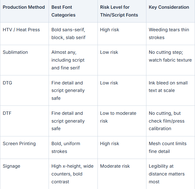
Treat this as starting guidance, not a guarantee. Always test your specific font at final size and material before a full production run. Results vary by cutter blade, vinyl brand, and press calibration.
Fonts for Heat Transfer Vinyl (HTV) and Heat Press Projects
HTV and heat press are the least forgiving production methods on this list, because they combine two stress points: cutting (weeding) and heat/pressure (pressing). A font needs to survive both.
Best Font Categories for HTV
Bold sans-serif, block, and slab serif fonts weed the most cleanly because their strokes are thick and consistent from top to bottom. There's no thin transition point where the vinyl is likely to tear. Open counters (the enclosed spaces inside letters like O, A, and e) matter here too: when a counter is too tight, the small piece of vinyl inside it either doesn't weed out at all or tears the surrounding letter as you try to remove it. Fonts designed with slightly wider counters release that inner material cleanly, leaving crisp edges. This is a mechanical issue, not just an aesthetic one, since the counter piece needs enough surface tension to lift as a single clean piece rather than fragmenting.
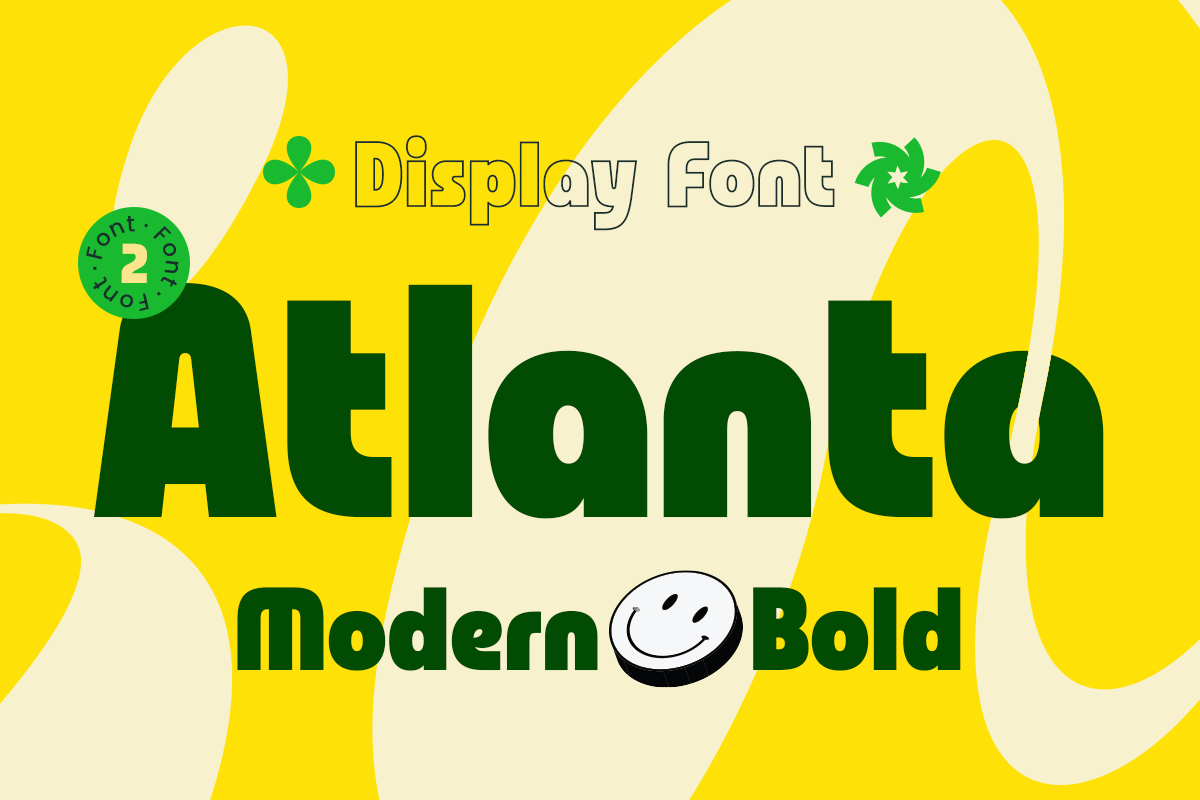
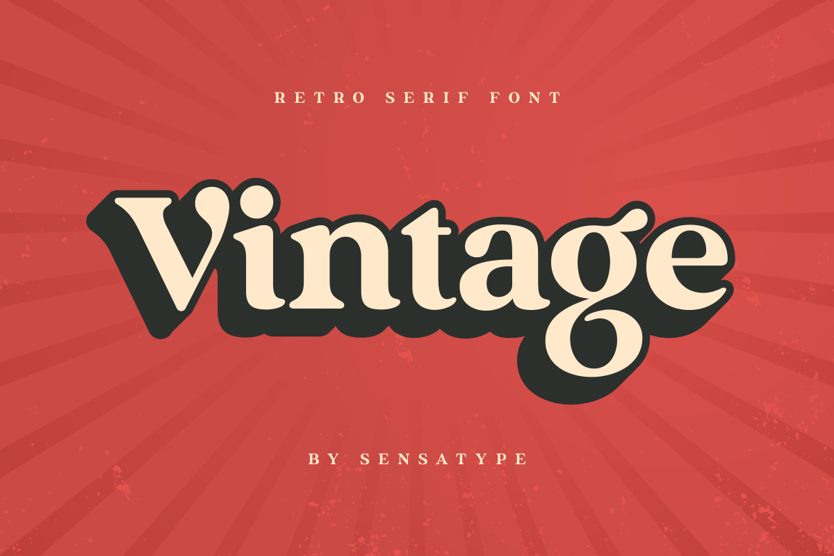
To make this concrete, a font like Atlanta, a modern bold display face with thick, consistent strokes and no thin transition points, is the kind of structural profile that weeds cleanly and holds its edges under a press. On the slab and retro side, Vintage shows how a serif font can still be HTV safe: its serifs are blocky and substantial rather than tapering to hairline points.
If you're cutting on a Cricut, Silhouette, or similar machine, the same rules apply. Blade pressure settings help, but they can't fully compensate for a font whose strokes are too thin to begin with.
Fonts to Avoid for Vinyl Cutting
Script fonts with fine connecting strokes: the thin joins between letters are the first thing to snap during weeding.
Hairline serif fonts: serifs that taper to a point simply don't have the material to survive cutting or pressing.
Overly condensed display fonts: cramming letters together at high weight can look fine digitally but creates the same fusing risk as tight kerning.
In practice, this shows up as torn strokes on a pressed shirt, incomplete letter transfers where part of a character stayed on the carrier sheet, or small text that's technically "there" but unreadable from three feet away. None of these are printer problems. They're font selection problems, and they're avoidable.
Fonts for Sublimation, Screen Printing, DTG, and DTF
Not every heat-based method involves cutting, and that changes the rules. If you're working across multiple production methods for the same apparel line, it's worth knowing where the font requirements diverge.
Why Sublimation and DTG Are More Forgiving
Direct-to-garment (DTG) printing and dye sublimation both skip the weeding step entirely. Ink or dye is applied directly, so there's no tearing risk related to cutting. This opens the door to finer detail and script fonts that would fail on HTV. That said, ink bleed on fabric is still a real risk at small sizes, particularly on textured or darker fabrics, so "more forgiving" doesn't mean "no rules." Test small text at actual print size before committing.
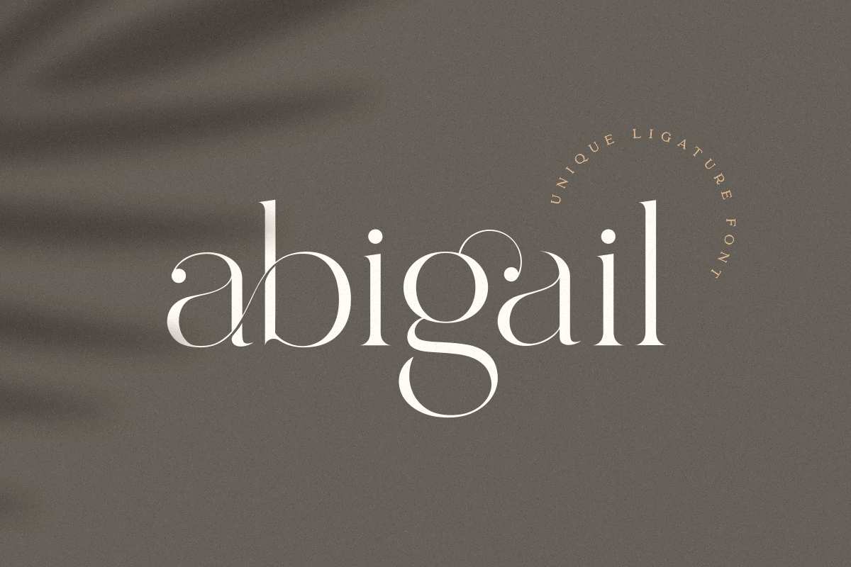
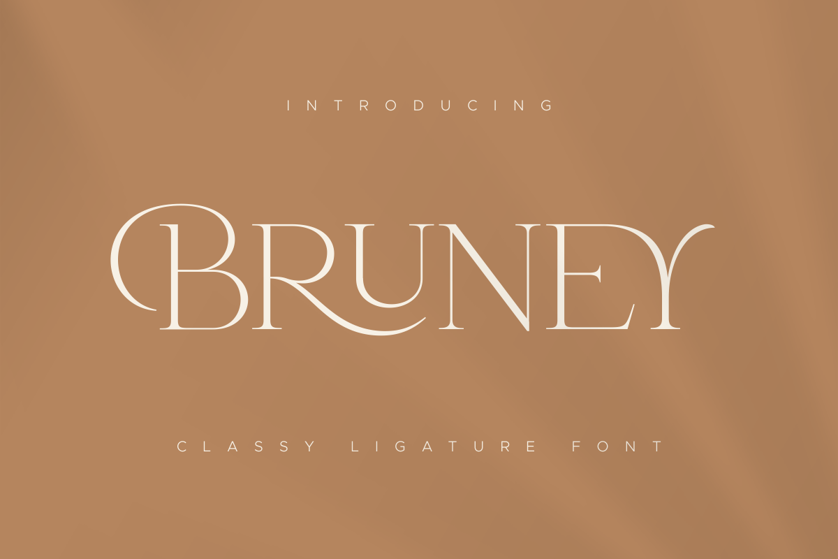
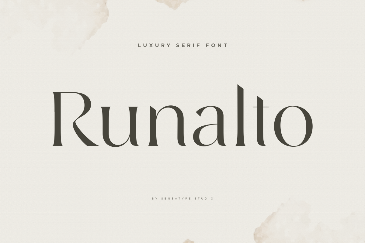
This is where elegant, detailed typefaces earn their place in a production workflow. Ligature and luxury fonts like Abigail, Bruney, or a high contrast serif like Runalto (fonts that would be genuinely risky on a vinyl cutter) print beautifully via DTG and sublimation, where their fine strokes and delicate connections are reproduced in ink rather than cut in vinyl. If your brand aesthetic leans elegant rather than bold, the answer usually isn't a different font. It's a different production method.
Where DTF Fits In
Direct-to-film (DTF) printing sits close to DTG and sublimation in terms of font flexibility. There's no weeding step, so fine detail and script fonts are generally safe. The main variables to watch are film quality and press calibration rather than the font itself, though very fine hairline details can still soften slightly during the curing step, so it's still worth pressing a test swatch before running a full order.
Screen Printing Considerations
Screen printing works through a mesh stencil, and mesh count (commonly somewhere in the 110–156 range for standard apparel printing) puts a hard limit on how much fine detail can pass through. Heavy, uniform strokes print far more reliably than delicate ones, and multicolor designs with fine detail can also run into registration issues, where colors don't align perfectly print to print, which compounds any problems the font's detail already causes.
Fonts for Signage and Industrial Lettering
Signage is its own category with its own physics: readability at distance matters more than fine detail, and the font is only one part of a bigger durability equation.
Readability at a Distance
Signage fonts need to work for someone walking past, driving by, or glancing across a room, not someone examining the letters up close. That calls for a high x-height (the height of lowercase letters relative to the font's full height), wide counters, and strong stroke contrast. Font choice for sign work should prioritize legibility under real viewing conditions, not just how the letterforms look in a design mockup. The same legibility principles used in accessible signage design apply broadly here, even outside formal compliance contexts.
Materials and Durability Beyond the Font
It's worth being upfront about something most competing guides skip: the font is one variable among several. Substrate choice (vinyl, acrylic, metal), lamination, and how the sign is applied all affect real-world durability just as much as typeface selection. A well-chosen font on a poorly laminated vinyl sign will still fail. High temperature resistant lettering comes from a combination of good typography and good materials, not typography alone.
Browse fonts built for signage and industrial lettering if legibility at distance is your priority.
Best Font Styles for T-Shirt and Apparel Design
Apparel is where most heat resistant font searches originate, and it's also where style and durability need to work together. A font that survives the press but looks generic doesn't actually solve the designer's problem.
Bold and Block Fonts for Statement Tees
For maximum impact and maximum durability in one choice, bold display and block fonts are the safest bet across almost every apparel production method. They read well at a distance, weed cleanly, and hold their shape under pressure, which is why they dominate streetwear and statement tee design.
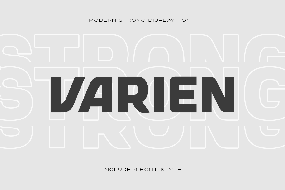
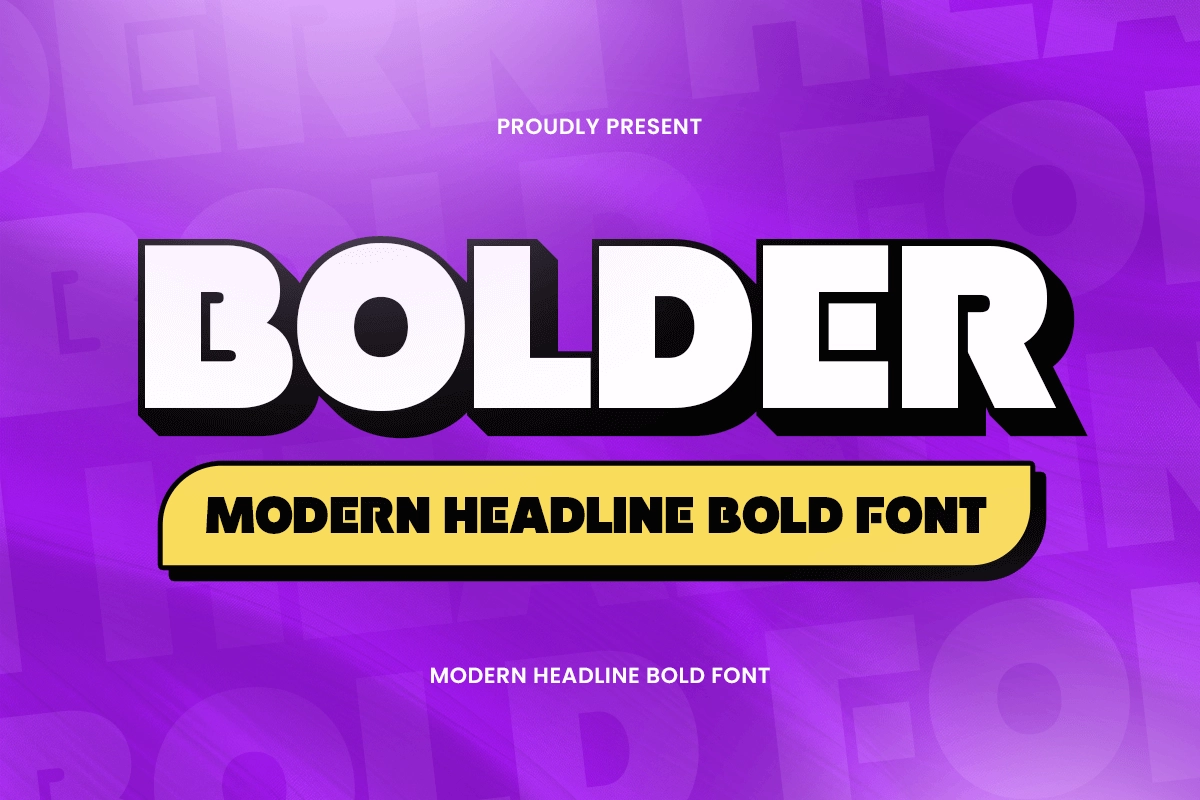
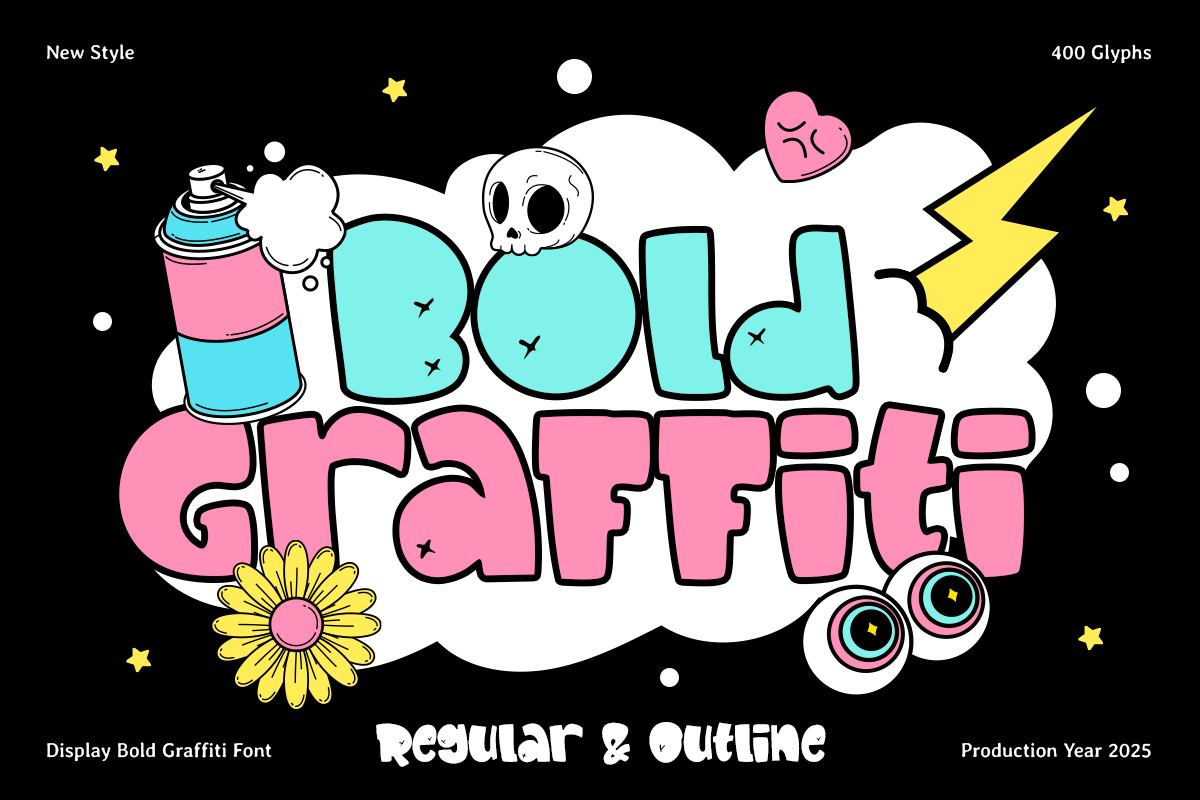
A few examples of what that profile looks like in practice: VARIEN, a strong display font with a sporty edge built for this kind of high impact apparel work; Bolder, a heavy headline face whose uniform weight keeps text readable at display sizes and intact through production; and Bold Graffiti, which delivers street art personality while keeping strokes thick enough to survive weeding. It's proof that "production safe" doesn't have to mean "plain."
Script and Handwritten Fonts: When (and When Not) to Use Them
Here's the honest version most listicles skip: script and handwritten fonts work well for DTG, DTF, and sublimation, where there's no cutting step to worry about. For HTV, they're genuinely risky, unless you choose a bold brush style script with thick, connected strokes rather than a fine cursive one. If you love the script aesthetic for a shirt design that's going through a heat press, look specifically for "bold script" or "brush script" categories rather than delicate calligraphic ones.
A common scenario: a designer picks a delicate script for a hoodie order, presses one test shirt via DTF (fine, no issue), then tries to switch the same design to HTV for a rush order and discovers the fine joins tear during weeding. The font didn't change. The production method did, and that's the variable that mattered.
Custom apparel fonts that blend personality with production safety are the middle ground worth looking for. Browse Sensatype's bold script and brush fonts, built to hold up under a press rather than just look good in a preview.
Font Licensing for Commercial Print Work: What Actually Matters
This is the part most buying guides either skip entirely or reduce to "here are 10 free fonts." Once you're printing for resale (a t-shirt brand, a print-on-demand shop, client signage) font choice stops being purely aesthetic and becomes a business decision.
The Licensing Risk Most Sellers Overlook
Many fonts floating around free download sites are licensed for personal use only. That means a font you downloaded to mock up a design might explicitly prohibit use on merchandise you sell. It's a genuinely common gap, one that catches sellers off guard, usually after they've already built a product line around a font they didn't check.
The safest habit: before any font touches a design you plan to sell, read its license and confirm it covers how you'll actually use it. If the license terms are vague, unavailable, or buried, that's a signal in itself.
How Sensatype Licensing Works
Sensatype keeps licensing deliberately simple, with three tiers: a Desktop License, a Business License, and a Corporate License. There's no separate "print license" or hidden per-use add-on to decode. You choose the tier that matches the scale of your work, and the terms for each are stated clearly on every font page. If you're unsure which tier fits your situation (for example, a solo print-on-demand shop versus an agency producing client signage), check the license terms on the font page or reach out before purchasing. That five-minute check is far cheaper than rebuilding a product line later.
Design Quality and Differentiation
There's also a quieter cost to defaulting to whatever's free: everyone else is using it too. A font pulled from a generic free font site is likely already on dozens of competing shops' shirts, which undercuts the "custom" feel a lot of apparel and merch brands are trying to sell. Professionally produced fonts tend to offer more distinct, less saturated letterforms, and because they're built with cleaner vector paths (see the file quality note earlier in this guide), they often weed and press more predictably too. That ties design quality directly back to the production framework covered earlier.
How to Test a Font Before You Commit
Before running a full production batch, it's worth a five-minute check: press or cut one test swatch at your actual final size, on your actual material, using your actual settings. This catches nearly every failure mode covered in this guide (torn strokes, fused kerning, blurred detail) before it costs you a full run of shirts or signs. A single licensed font tested properly on one swatch is a far smaller investment than a reprint of a full order.
When you're ready to commit to a design you'll actually sell, browse Sensatype's fonts built for heat-resistant applications. Every font comes with straightforward Desktop, Business, or Corporate licensing, so you're not left guessing whether your shirt line is covered.
FAQ
What font is best for heat transfer vinyl (HTV)?
Bold, block, or slab serif fonts with thick, uniform strokes and open counters weed and press most reliably. Avoid thin script fonts or hairline serifs for HTV specifically. They're the most common cause of tearing during weeding.
Do fonts actually get damaged by heat?
Not in the literal sense. A digital font file can't melt or burn. What can be damaged is the physical letterform once it's printed, cut, or pressed: vinyl can tear during weeding, ink can bleed under heat, and fine details can distort under press temperature. The font's structure determines how well it survives that physical process.
Can I use script or thin fonts for t-shirt printing?
It depends on the method. Script and thin fonts generally work fine for DTG, DTF, and sublimation, since there's no cutting step involved. For HTV or screen printing, they're risky unless the script is a bold brush style with thick, connected strokes rather than a fine, delicate cursive.
Are free fonts safe to use for commercial merchandise?
Only if the license explicitly allows commercial or resale use. Many fonts on free download sites restrict use to personal projects, which creates real legal risk for print-on-demand sellers and apparel businesses. Always check the license terms before using a font on anything you plan to sell.
What license do I need to use a font on products I sell?
It depends on the foundry, so always check the specific font's license terms. Sensatype offers three tiers, Desktop, Business, and Corporate, and the right one depends on the scale of your work. The terms for each tier are listed on every font page, so you can confirm coverage before you buy.
What size should text be for heat press or vinyl designs?
There's no single universal number, since it depends on the font and the production method, but the general rule holds across all of them: smaller or finer details need bolder, simpler letterforms to survive intact. Test your design's legibility at the actual final print size, not the size it appears on your screen, before finalizing it.
What's the difference between DTF and HTV for font choice?
DTF doesn't involve a weeding step, so fine detail and script fonts are generally safe to use. HTV requires cutting and weeding, which is where thin strokes and tight joins tend to fail. If you're choosing between the two methods specifically because of a detailed font, DTF is usually the safer route.
Do bold fonts work for every printing method, or just HTV?
Bold fonts are the safest default across nearly every method: HTV, screen printing, DTG, sublimation, DTF, and signage all handle bold strokes reliably. The reverse isn't true. Fine, delicate fonts that work on DTG or sublimation will often fail specifically on HTV and screen printing.
Can I pair a bold heat-resistant font with a script accent font?
Yes, and it's a common approach for apparel design. A bold primary font carries the main text safely through production, while a script or detailed font is used sparingly as an accent, often in a method (like DTF or sublimation) that can handle the finer detail, or at a large enough size that thin strokes stay intact.
Choosing a heat-resistant font really comes down to three questions: does the stroke weight hold up, does the spacing prevent fusing or bridging, and is the detail level simple enough to survive cutting or pressing? Answer those honestly for any font, and you'll know how it'll perform before it ever touches a press.
When you're ready to move from testing to production, browse Sensatype's fonts built for apparel, signage, and merch. Clean vector paths, straightforward Desktop, Business, and Corporate licensing, and letterforms designed to survive HTV, sublimation, DTF, screen printing, and signage.