
The Typography Trends Defining Branding in 2026 (And the Fonts to Match)
Discover the typography trends shaping modern branding in 2026. Explore expressive fonts, serif revival, luxury minimalism, variable typography, and the best typefaces to build memorable brand identities.
Type used to be the last decision in a brand identity project. Now it's often the first. Ask any creative director who sat through a rebrand pitch in the last year: typography trends for 2026 aren't a footnote to the logo conversation anymore, they are the conversation. Boards are asking about fonts the way they used to ask about color palettes, because in a market flooded with AI generated visuals that all start to look the same, the way a brand's words look on the page has become one of the few genuinely defensible differentiators left.
That's the shift this article is built around. Six trends are reshaping branding typography this year. Some are driven by culture, some by technology, and one by a very specific and very current reaction to AI design itself. The selection below reflects patterns showing up consistently across recent rebrand projects and design press coverage, not a generic trend roundup pulled from last year's list with new dates. For each trend, you'll get the reasoning behind it, a real world application, and a specific Sensatype typeface that already fits the brief, so you're not left with inspiration and nowhere to take it.
Why Typography Matters More Than Ever in 2026 Branding
For most of the last decade, branding followed a predictable order: logo first, colors second, type as an afterthought, usually whatever geometric sans serif was free on Google Fonts. That order has flipped. Type first branding, where the typeface is the primary visual signature and the logo is often just the wordmark (the brand name set in custom type, as distinct from a symbol or logo mark), has become the dominant approach for new and refreshed brands alike. Two forces are pushing this:
AI has made polish cheap. AI image and logo generators have made polished looking visual identities cheap and instant, which means polish alone no longer signals quality. A distinctive typeface is much harder to fake convincingly than a symbol or a color scheme, so it's become one of the most reliable ways a brand can look deliberately made rather than auto generated.
Type carries more memory weight than most teams credit it for. Research on brand recall consistently shows that people remember how something looked, the shape of the letters, the rhythm of the wordmark, long after they've forgotten the tagline. Get the type wrong, and no amount of clever positioning saves the first impression.
None of the trends below are decoration for decoration's sake. Each one is a response to something real: a cultural mood, a technical shift, or, in one case, an entire industry publicly rethinking what its typography says about trust.
The Typography Trends Shaping Branding in 2026
1. Expressive, Emotion Led Typography
After roughly ten years of safe, interchangeable minimalism, plenty of brands are done playing it quiet. Expressive typography, bold color pairings, playful or slightly irregular letterforms, type that's clearly felt rather than just laid out, is having a real moment, largely as a direct reaction against the sameness that minimalism eventually produced.
Why this trend is happening now:
When every fintech app and every DTC skincare brand uses the same restrained sans serif in the same three neutral tones, "safe" stops reading as premium and starts reading as forgettable. Category saturation with minimalism has made personality a genuine differentiator again, not just a stylistic choice.
Where it shows up:
Beauty and cosmetics branding, hospitality and boutique hotel signage, entertainment and youth focused retail, and anywhere personality is the product.
Real world application: A hotel brand leaning into a chunky, characterful display face on its signage does more to signal "we're not a chain" than any amount of copywriting could.
Best suited for: brands where warmth, individuality, and approachability matter more than restraint.
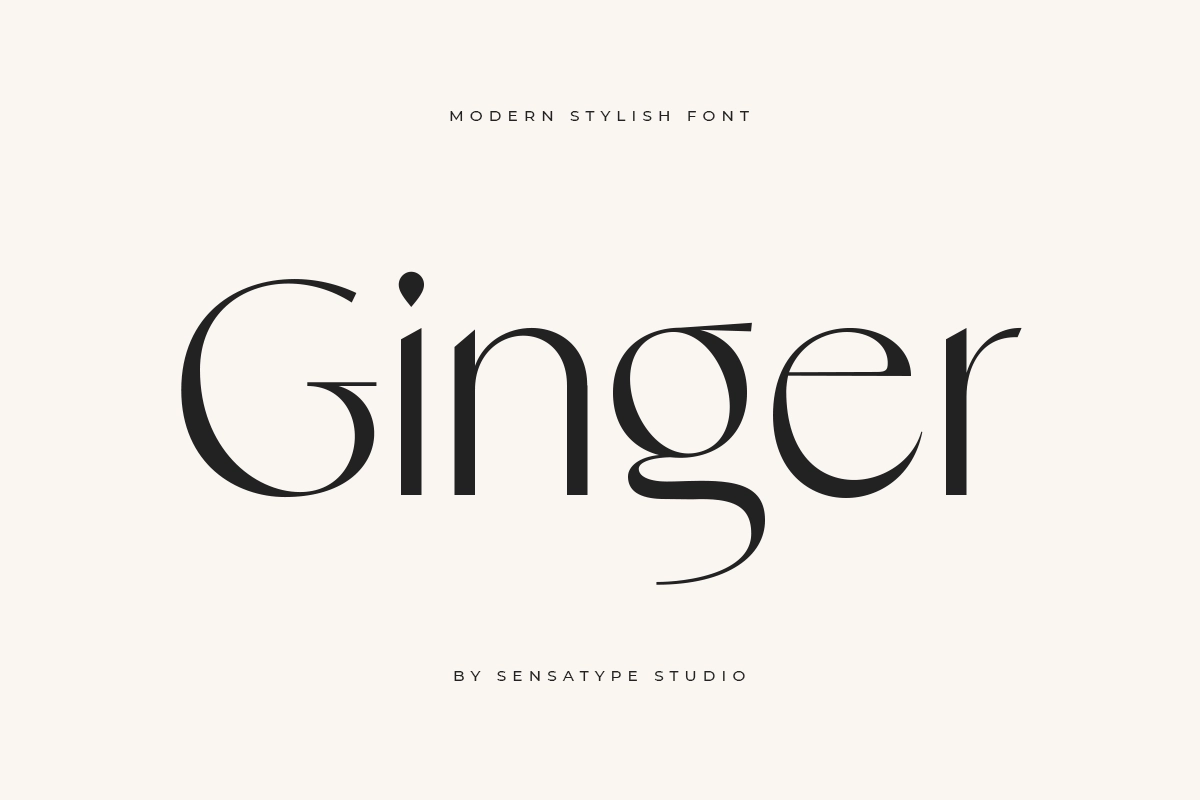
Sensatype pick for this trend: Ginger, a Modern Stylish Font, brings the curved, characterful warmth this trend calls for, built specifically with beauty and branding use cases in mind rather than as a generic display face repurposed for the occasion.
2. The Serif Revival, and What AI Branding Has to Do With It
Serif fonts are back, and the reason has almost nothing to do with nostalgia.
Why this trend is happening now:
For most of the last decade, "modern" meant flat, geometric sans serif: clean lines, no ornamentation, maximum on screen legibility. That aesthetic became so dominant it's now synonymous with tech brand sameness. Serifs, with their traditional roots in print and their associations with permanence and craft, read as the opposite: warm, considered, human made.
The clearest, most current driver is that design coverage this year has pointed out that a wave of AI native brands, Anthropic's Claude among them, alongside Perplexity, Runway, and others, have shifted their interfaces and marketing toward serif typefaces, often paired with warmer, paper like backgrounds that evoke the feel of a printed page. Type designers interviewed on the shift describe it as a deliberate bid for warmth and trust: serifs carry associations with scholarship, authorship, and human craft that sans serif screens have never quite managed to convey, and AI brands, facing real public unease about whether "AI" and "human" can coexist, are reaching for that signal on purpose.
The twist for brands outside the AI industry:
If every AI product converges on the same serif language to prove it's trustworthy, serif alone stops being a differentiator for anyone competing with those brands for attention, and starts being table stakes. The brands that will stand out next are the ones that pick a serif with genuine character, not the safest, most generic option, paired with a system built by people who understand type as craft, not as a template.
Best suited for: heritage brands, premium finance, editorial and publishing, and any brand competing for trust against AI native competitors.
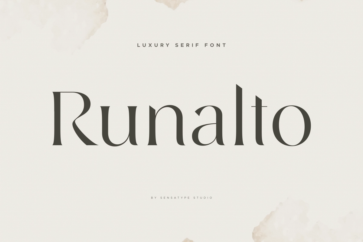
Sensatype pick for this trend: Runalto, a Luxury Serif Font, is a full 18 style serif family with refined, classy letterforms designed for premium branding, magazine, and logo work, closer to genuine editorial serif craft than the single weight "trend" serifs flooding free font sites. Runalto's full serif system gives a design team enough weight variation to build a complete brand system rather than a single display headline. Browse the wider serif and luxury collection for adjacent options.
3. Bold, Extended and Condensed Display Type
At the opposite end from quiet minimalism, wide and condensed display fonts are both trending, for different, almost opposite reasons, and the difference comes down to basic letterform mechanics.
Why extended (wide) type works:
Wider horizontal spacing and stroke width relative to height means the eye reads this as scale and stability. It projects confidence and permanence, and it's common in tech, architecture, and streetwear branding, where the goal is to feel expansive and unmistakably large.
Why condensed type works:
Tighter letter spacing paired with a taller x height relative to width creates visual tension and pace. It reads as urgency and momentum, and it's common in sport, fashion, and anything built around speed.
Where both show up as workhorses: a condensed, heavyweight face on a running shoe box reads as energy. The same weight stretched wide on a fintech homepage or real estate signage reads as authority.
The trend isn't really "bigger and bolder" as a single idea. It's that brands are getting more deliberate about which direction that boldness points, choosing the letterform mechanics that match the feeling they're actually trying to create.
Best suited for: tech, architecture, and real estate (extended), or sport, fashion, and fitness (condensed).
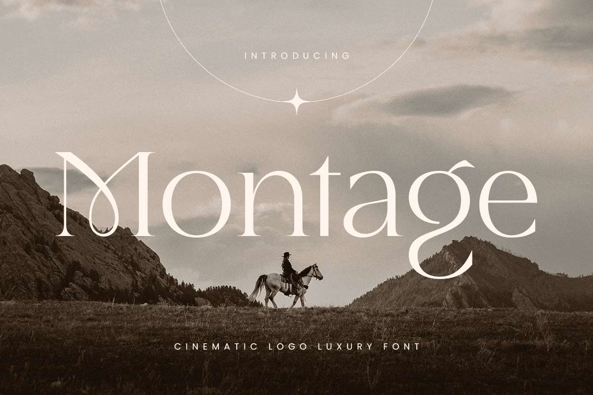
Sensatype pick for this trend: Montage, a Luxury Cinematic Logo Font, delivers wide, confident scale with a vintage glamour edge, particularly suited to high end logo and headline work. Browse the full range of wide set display typefaces before settling on one weight.
4. Variable and Kinetic Typography for Digital First Brands
Variable fonts, a single font file that can flex across weight, width, and optical size axes without needing a dozen separate files, have moved from a technical curiosity to a genuine branding tool.
Why this trend matters technically:
One file can smoothly interpolate between "thin" and "black," or "condensed" and "extended," rather than a brand needing to license and load six separate static files to cover the same range. For digital first brands running the same wordmark across a phone screen, a billboard, and a loading animation, this solves a real consistency problem: one typeface family that adapts cleanly to every context instead of looking slightly wrong, or loading slowly, in at least one of them.
Kinetic type follows the same logic. Type that moves, morphs, or responds to interaction is showing up in app onboarding, social first branding, and product UI. As more of a brand's first impression happens on a screen rather than on a business card, how type behaves, not just how it looks static, has become part of the design brief. It's worth building on a base that holds up for accessibility: sufficient weight contrast and legible letterforms at small sizes matter more once a typeface is doing double duty as both brand signature and interface text.
Best suited for: apps, SaaS products, and social first brands, anywhere the primary touchpoint is a screen rather than print.
Sensatype pick for this trend: look for a modern sans serif family built for digital products with multiple weights already included, so your system scales without requiring a custom variable font build from scratch.
5. Quiet Luxury and Minimalist Sans Serifs
Minimalism isn't dead. It's been refined, and it's found a new job.
Why this trend is different from "old" minimalism:
Rather than minimalism as the entire brand statement, "quiet luxury" typography now shows up as the disciplined, understated element paired against something louder elsewhere in the identity, a bold color, an expressive pattern, a maximalist packaging choice. The type itself goes quiet specifically so it can signal restraint and taste, not because restraint is the whole story.
What to look for:
Elegant, Art Deco influenced sans serifs that are classy without shouting, premium without needing a serif to prove it.
Best suited for: wellness brands, minimalist product design, and understated high end goods.
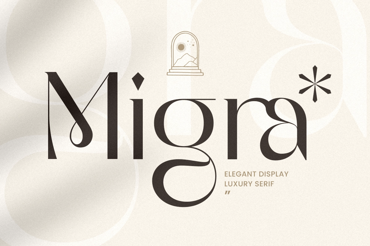
Sensatype pick for this trend: Migra, an Elegant Display Luxury Font, is a good example of this register, a display sans serif with graceful, refined letterforms built for upscale branding and editorial work, doing the "quiet luxury" job without defaulting to a serif to earn its premium feel. Browse more restrained, Art Deco influenced sans serifs in the collection.
6. Type as Graphic: Letterforms as Visual Identity
The sixth trend treats letters themselves as the imagery, not just the message.
How this shows up in practice:
Words wrapped around a product shape, letterforms used as repeating texture or pattern across packaging, and entire brand systems built on a single distinctive typeface with no supporting illustration at all.
Why it's happening:
It's a natural extension of type first branding taken to its logical end. If the typeface is distinctive enough, you don't need much else. Packaging and DTC brands have been the fastest adopters, since product boxes and labels give type room to become the dominant visual rather than competing with photography for space.
Best suited for: DTC, food and beverage, and packaging heavy product brands.
Sensatype’s full font collection and browse by style.
How to Choose the Right Typography Trend for Your Brand
Trend awareness is only useful once it's filtered through the one question that actually matters: what does this brand need to say? A brand personality mismatch is the single most common typography mistake, picking a trend because it's current, not because it fits.
Use brand personality and industry as your filter, not the calendar:
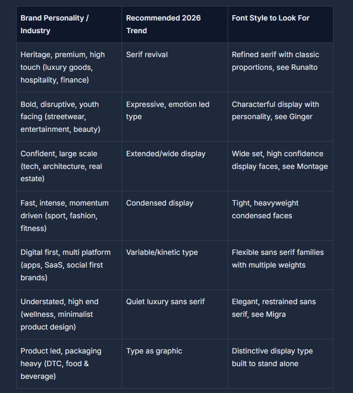
If your brand doesn't map cleanly onto any single row, which happens more often than trend listicles admit, especially for brands straddling two categories, that's usually the signal you need something built specifically for you rather than adapted from an off the shelf trend. Talk to Sensatype about a custom typeface build designed around your brand's actual personality rather than the closest available match.
How to Test a Typeface Before You Commit
Picking the right trend is only step one. The typeface still needs to survive contact with the real world before it goes on a brand system. A few checks worth running before finalizing anything:
Test it small. A display face that looks striking at 200pt on a mood board can fall apart at favicon or business card size. Set your wordmark at the smallest size it'll realistically appear and check it's still legible.
Test it across weights, not just the one you love. If the trend calls for a variable or multi weight family, mock up the lightest and heaviest weights, not just the hero weight from the specimen page. Brand systems live across headlines, body copy, and UI, not just the headline.
Test it on the actual material. A bold display font that looks perfect on screen can behave differently once it's cut for signage, pressed onto packaging, or embroidered. Thicker strokes and simpler letterforms generally hold up better across physical production methods than fine, high contrast serifs do.
Test it next to your body copy. Set a full paragraph in your proposed body font underneath the display headline. If the pairing fights for attention, the mismatch is usually a weight or era problem, see the pairing note below.
This is also the point to check licensing, before a typeface becomes load bearing in a brand system rather than after, which is where a surprising number of rebrands run into trouble.
Want a second opinion before you commit? Browse fonts by brand personality or reach out about a custom build if nothing quite fits.
Understanding Font Licensing for Brand Use
This is the least exciting part of typography and the most expensive one to get wrong, so it's worth its own section rather than a single warning bullet.
Font licenses aren't one size fits all. They're typically scoped by where and how much the font will be used:
Desktop license covers using the font in design software to create static assets (a logo file, a print ad, a packaging mockup). It generally does not cover embedding the font in a live website or app.
Web license (often priced by monthly page views) covers embedding the font as a web font (formats like WOFF2) so it renders live in a browser rather than being converted to an image.
App license covers embedding the font file inside a mobile or desktop application's code, which is a separate right from both desktop and web use.
Broadcast license covers use in video, television, or streamed content, again licensed separately, since the scale of exposure is different from a single printed asset.
The mistake that causes the most expensive problems is licensing a font for personal or desktop only use and then embedding it in an app, printing it at commercial scale, or using it in broadcast without upgrading the license. This happens more often than it should, usually because a designer sourced a "free for commercial use" font without checking exactly what "commercial" covers.
Before building a brand system around any typeface, check exactly what the license permits for your specific use case. See how Sensatype's licensing works for desktop, web, app, and broadcast use, scoped and priced separately so there's no ambiguity later. It's also worth being honest about free font risk here: a free geometric sans might be fine for a personal project, but for a brand asset that needs to survive scaling, legal scrutiny, and years of consistent use, the license terms matter as much as the letterforms.
Common Typography Mistakes to Avoid in 2026 Branding
A few patterns show up again and again in brand refreshes that don't land, worth flagging before you commit to anything:
Chasing every trend at once. A wordmark that tries to be expressive and minimal and kinetic ends up reading as indecisive, not versatile. Pick the one or two trends that genuinely match your brand personality and commit.
Poor font pairing. A striking display face paired with a mismatched body font (wrong weight, wrong era, wrong mood) undercuts the whole system. The simplest fix is to contrast your headline and body font in one dimension, weight or era, not both. If your headline font is doing expressive, emotional work, your body copy usually needs to be quiet enough to let it.
Ignoring licensing and usage rights. Covered in detail above, this is the mistake with the most expensive consequences, and the easiest to avoid by checking scope before you commit.
Inconsistent type systems across touchpoints. A brand that uses one weight on the website, a slightly different cut on packaging, and a substitute web safe font in emails looks unfinished, even if each individual asset looks fine in isolation. A proper type system, documented in brand guidelines, not just remembered by whoever built the last asset, defines every context up front.
The Future of Typography Beyond 2026
None of this is a one year fashion cycle. AI assisted type design is maturing fast enough that highly polished, on trend fonts are becoming table stakes rather than a differentiator, which means the brands that stand out next won't be the ones that found a trendy typeface, but the ones that paired a genuinely well crafted one with a system nobody else has. Expect the expressive versus minimal pendulum to keep swinging, often within the same brand system rather than as opposing camps. And expect typography to keep climbing further up the strategic ladder, not back down it. Once a boardroom starts treating type as a brand asset instead of a formatting decision, it doesn't tend to go back to treating it as an afterthought.
Find the Right Typeface for Your Brand's 2026 Identity
Trends are only useful once they're executed well. Knowing that serif is having a moment, or that expressive type is pulling ahead in your category, doesn't do much for your brand until it's a real typeface, correctly licensed, sitting in your design files.
That's the gap Sensatype is built to close, not a font marketplace bundling generic files, but a working type foundry with a catalog built specifically around branding, logo, and identity use cases. If your brand fits the serif revival, needs the confidence of an extended display face, or calls for the quiet restraint of a refined sans serif, there's a typeface in the collection built for exactly that brief, and if none of them fit, that's what the custom service is for.
Browse Sensatype's premium font collection →
Need something no off the shelf trend quite captures? Commission a custom typeface built around your brand →
FAQ
What are the biggest typography trends for 2026?
Six trends are defining branding typography this year: expressive, emotion led type reacting against a decade of minimalism; a serif revival tied partly to AI brands adopting serifs to signal warmth and trust; bold extended and condensed display type; variable and kinetic type for digital first brands; refined "quiet luxury" sans serifs; and type used as the dominant graphic element itself, particularly in packaging.
Why are serif fonts trending in 2026?
Serifs signal warmth, craft, and permanence in a way flat sans serif design generally doesn't, and that's become especially valuable as AI generated visuals have made "clean and modern" feel generic. The trend has been accelerated by AI native brands themselves: coverage this year has highlighted that companies like Anthropic (Claude), Perplexity, and Runway have shifted toward serif typefaces specifically to counter the perception that AI products are cold or impersonal.
What font should I use for my brand in 2026?
It depends on your brand personality more than the calendar. Heritage or premium brands generally suit the serif revival. Bold, youth facing brands suit expressive type. Digital first, multi platform brands benefit most from variable font families. Use the decision framework above to match your brand type to a trend, then browse Sensatype's collection filtered to that style, or request a custom font if nothing off the shelf fits.
Are variable fonts worth using for branding?
For digital first brands that need one typeface to work cleanly across a phone screen, a website, and an app interface, yes. A variable font solves real consistency problems that separate static font files don't, and typically means smaller total file weight than loading multiple static cuts. For brands that are primarily print based or only need type in one or two fixed contexts, a variable font is a nice to have rather than a necessity.
Is minimalist typography dead in 2026?
No, it's evolved rather than disappeared. Minimalist, "quiet luxury" sans serifs are still very much in use, but typically as the restrained element in a system that's bolder somewhere else (color, pattern, packaging), rather than as the entire brand statement on their own.
What's the difference between a trendy font and a timeless brand font?
A trendy font signals cultural currency right now but risks dating quickly once the trend passes. A well crafted, timeless font, a refined serif, a considered sans serif, tends to age much better because it isn't tied to a specific visual moment. A common, effective approach is pairing a timeless primary typeface with a more trend forward accent font used sparingly, so the brand feels current without betting its entire identity on a look that might feel dated in two years.
How much does a premium branding font cost?
It varies by foundry, the number of styles included, and, most significantly, the license type. Desktop only licenses, web licenses, app embedding licenses, and broadcast licenses are typically priced and scoped differently, since each covers a different scale of commercial use. Rather than quoting figures that shift by product, it's worth checking Sensatype's licensing page directly for current terms on the specific typeface you're considering.
Should I use a custom font or a premium off the shelf font for my brand?
A premium off the shelf font is the right call for most brands: it's faster to license, more affordable, and, when chosen well, still gives you a distinctive, trend aligned look. A custom typeface makes sense when your brand needs full exclusivity, when no existing trend or style quite matches your personality, or when you're an agency building an identity system for a client that specifically needs to own its type outright. If that's your situation, Sensatype's custom typeface service is built for exactly that brief.
What's the difference between a desktop license and a web license for fonts?
A desktop license covers using a font inside design software to produce static assets, logos, print materials, mockups. A web license is a separate right that covers embedding the same font as a live web font (typically in WOFF2 format) so it renders directly in a browser. Using a desktop only license to embed a font on a website is a common but avoidable licensing mistake, since the two rights are scoped and priced differently.
Can an agency use the same font license across multiple client brands?
This depends entirely on the specific license terms, and it's worth checking before assuming. Most standard commercial licenses are scoped to a single brand or end product, not unlimited use across an agency's full client roster. Agencies building identity systems for multiple clients should check whether an extended or multi use license is available, which is one of the more common reasons agencies move toward a custom typeface arrangement instead.
Ready to see which 2026 trend actually fits your brand? Explore the full Sensatype font collection and find a typeface that's ready to license today, or start a custom typeface conversation if your brand needs something no one else has.