
What Font Does KFC Use?
Discover the typography secrets behind KFC’s iconic visual identity and explore carefully selected font alternatives from Sensatype Studio. Perfect for creating bold food branding, restaurant logos, packaging, and memorable creative projects.
KFC Font Alternative: Similar Fonts for Branding and Logo Design
Looking for a KFC font alternative for a restaurant logo, food packaging, menu, or commercial branding project? KFC uses custom lettering rather than a publicly available typeface, so there is no exact font you can simply download and use.
The better approach is to choose a bold display font that captures the same overall personality: confident, friendly, highly visible, and slightly retro.
In this guide, we’ll break down the KFC font style and explore five fonts similar to the KFC logo that designers can use for restaurant branding, packaging, advertising, menus, social media, and other commercial design projects.
What Font Does KFC Use?
KFC does not use a standard commercial font for its official logo. The lettering is custom-made as part of the brand’s visual identity.
That means designers searching for a “KFC font” are usually better off choosing a typeface with similar visual characteristics rather than trying to find an exact match.
The KFC typography style is recognizable because of several key traits:
Bold, highly visible letterforms
Strong headline presence
Friendly and approachable shapes
Slightly classic or retro character
Simple, memorable construction
Strong readability at a distance
These characteristics make the logo effective across restaurant signage, packaging, advertising, menus, and digital media. If you are creating a commercial restaurant brand, the goal should not be to copy KFC’s lettering. Instead, use the same design principles to build a bold and recognizable identity of your own.
Best KFC Font Alternatives for Commercial Branding
The best KFC font alternative depends on the type of brand you are creating. Some fonts feel more classic and established, while others create a modern, playful, or premium interpretation of food branding.
Below are five KFC-inspired font alternatives suitable for restaurant logos, food packaging, menu design, advertising, and other commercial creative projects.
Crispy – Modern Bold Food Serif Font
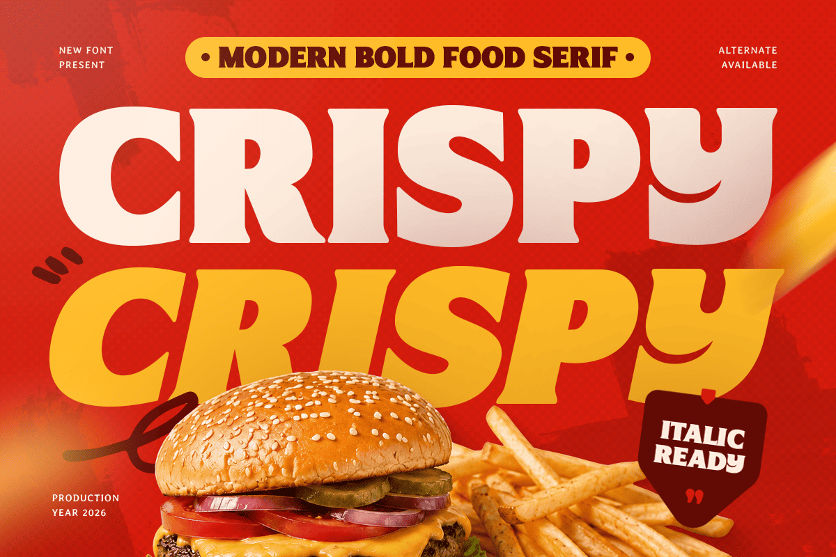
Crispy is one of the strongest choices for designers looking for a bold food-branding typeface with a classic personality. Its thick letterforms and serif-inspired details give it a confident appearance that works especially well for restaurant logos, packaging, menu headings, labels, and promotional graphics.
Why it works as a KFC font alternative: Crispy combines strong visual weight with a slightly traditional character. That balance makes it useful for food brands that want to feel established, recognizable, and professional without becoming overly formal.
For designers building a restaurant identity, Crispy can work particularly well when the logo needs to feel bold enough for storefront signage while remaining distinctive on packaging and digital platforms.
Best for:
Restaurant logos
Food packaging
Menu titles
Product labels
Promotional graphics
Commercial food branding
Style: Bold, classic, appetizing, confident
Choose Crispy if: You want a strong KFC-style alternative with a classic food-branding feel.
Burger – Modern Branding Food Font
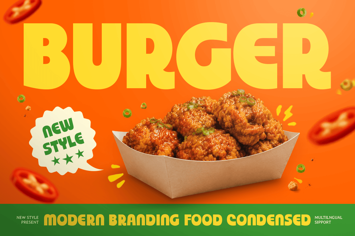
Burger is a modern food branding font with bold, distinctive letterforms and a compact display style. Its strong shapes make it useful for restaurant names, packaging, posters, menu designs, and other applications where typography needs to attract attention quickly.
Why it works as a KFC font alternative: Burger captures the commercial energy associated with fast-food branding. Its bold construction gives short restaurant names strong visual impact, especially when used in logos, signs, packaging, and advertising.
This makes Burger a good option for designers working on fast-food concepts, burger restaurants, food trucks, takeaway brands, or modern casual dining identities.
Best for:
Fast-food branding
Restaurant logos
Packaging
Menu design
Posters
Advertising
Food truck branding
Style: Modern, bold, energetic, commercial
Choose Burger if: You want a modern KFC-inspired font with strong fast-food branding appeal.
Bakerian – Modern Bold Food Font
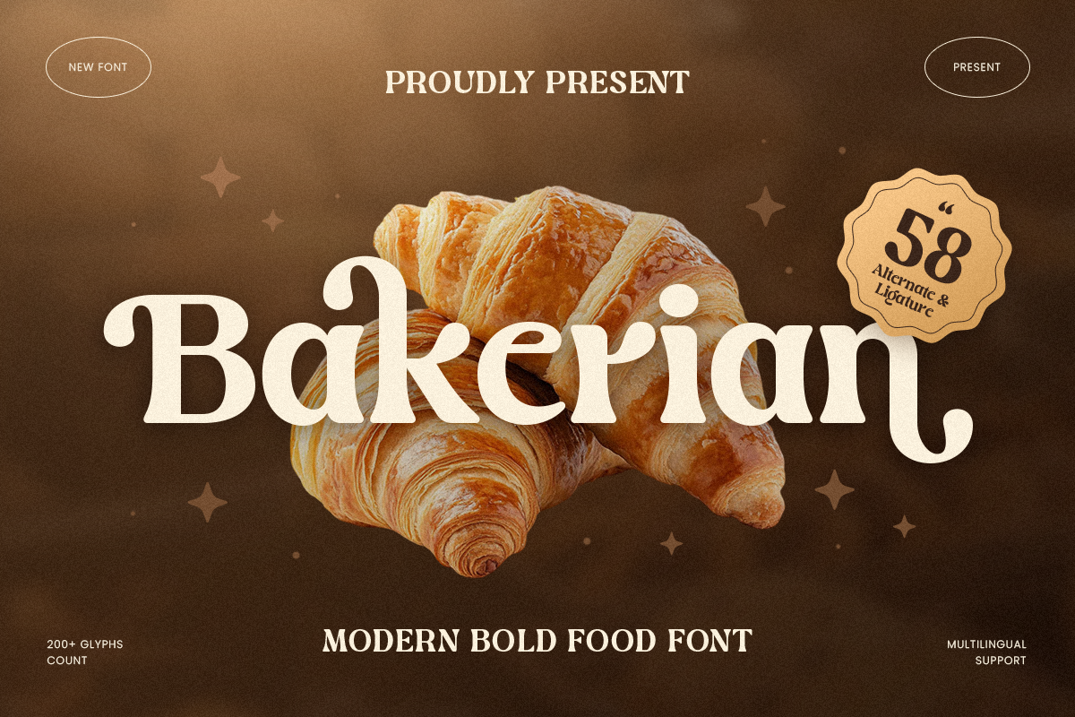
Bakerian features thick strokes, rounded forms, and a friendly contemporary personality. The font feels welcoming rather than aggressive, making it a strong choice for food brands that want a bold identity while still appearing approachable.
Why it works as a KFC font alternative: One of the strengths of KFC-style branding is the combination of visibility and friendliness. Bakerian follows a similar principle by pairing substantial letterforms with softer curves.
For commercial branding, this makes Bakerian especially useful for restaurants, bakeries, cafés, snack products, and packaged food brands that need to feel friendly, memorable, and professional.
Best for:
Restaurant identities
Bakery branding
Food packaging
Menu covers
Social media graphics
Promotional materials
Café branding
Style: Friendly, bold, warm, contemporary
Choose Bakerian if: You want a bold restaurant font with a softer and more approachable personality.
Salgen – Kids Funny Food Font
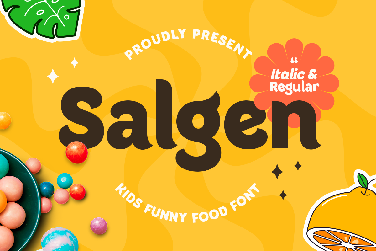
Salgen takes a more playful approach to food typography. Its exaggerated curves and cheerful letterforms make it suitable for brands targeting families, children, snacks, desserts, or casual dining concepts.
Why it works as a KFC-inspired font: Salgen is not the closest visual match to the KFC logo, but it captures the approachable and memorable side of food branding.
It can be a smart choice for commercial projects where the goal is not to recreate KFC’s traditional look, but to capture the same sense of friendliness and recognition in a more playful direction.
Best for:
Kids' food brands
Snack packaging
Family restaurants
Dessert branding
Menu graphics
Posters
Social media designs
Style: Playful, cheerful, casual, memorable
Choose Salgen if: You are building a fun, family-oriented, or youth-focused food brand.
Gestard – Headline Food Font
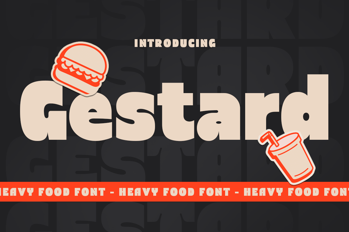
Gestard is a heavy display font designed to make an immediate visual impact. Its thick and confident letterforms work particularly well in headlines, signage, advertising, packaging, and restaurant branding where readability and presence are essential.
Why it works as a KFC font alternative: Gestard shares the strong headline quality associated with major food brands. Its heavy weight helps short names stand out clearly across storefronts, menus, packaging, posters, and digital advertising.
For commercial restaurant branding, Gestard is particularly useful when the name needs to feel powerful, premium, and highly visible.
Best for:
Restaurant signs
Food advertising
Menu headlines
Packaging
Posters
Logo concepts
Commercial campaigns
Style: Heavy, confident, bold, premium
Choose Gestard if: You need maximum visual impact for a restaurant logo, headline, or promotional campaign.
Which KFC Font Alternative Is Best?
Each font creates a different interpretation of KFC-inspired food branding.
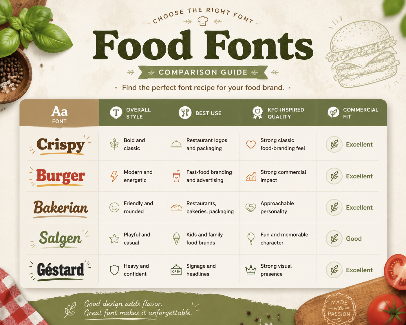
If you want a more classic restaurant identity, Crispy is a strong starting point.
If your goal is a modern fast-food look, Burger offers a more contemporary direction.
For a softer and friendlier brand personality, Bakerian may be the better choice.
If maximum headline impact is the priority, Gestard is a strong option for signage, menus, posters, and advertising.
Salgen works best for playful food concepts rather than projects intended to closely resemble KFC’s overall visual tone.
How to Choose a Font for a Restaurant Logo
When choosing a font for a commercial restaurant logo, visual similarity should not be the only consideration. The typeface also needs to work across the places customers will actually see the brand.
1. Check Logo Readability
Restaurant logos often appear on storefront signs, takeaway packaging, delivery apps, menu boards, websites, and social media. Choose a font that remains easy to recognize at both large and small sizes.
2. Match the Brand Personality
A font should support the type of food experience you are selling.
For example:
Bold serif fonts can feel established and classic.
Heavy display fonts can create a powerful fast-food identity.
Rounded fonts often feel friendly and approachable.
Playful fonts work well for family, dessert, or snack brands.
The best font is not simply the one that looks closest to KFC. It is the one that communicates the right personality for your own brand.
3. Consider Packaging and Advertising
A restaurant font needs to do more than work inside a logo. Test how the typeface looks on:
Food boxes
Cups
Bags
Labels
Menu covers
Posters
Social media posts
Digital advertisements
A strong commercial font should remain recognizable across all of these applications.
4. Customize the Lettering
For a more distinctive restaurant identity, avoid relying on an untouched typeface alone. Consider adjusting:
Letter spacing
Individual characters
Ligatures
Baselines
Outlines
Supporting graphic elements
Small customizations can help turn a good font into a more ownable brand identity.
5. Check the Font License
If the design will be used commercially, always review the font license before publishing the final branding. Commercial projects may include restaurant logos, packaging, advertisements, merchandise, client work, social media campaigns, and other business applications. Make sure the license covers the intended use before delivering or launching the project.
How to Create a KFC-Inspired Food Logo Without Copying KFC
KFC can be useful as design inspiration, but your final brand should have its own identity. Rather than copying the original logo, focus on the underlying principles that make it effective.
Use Strong Typography
Choose bold typography that remains visible on restaurant signs, packaging, menu boards, and digital screens.
Keep the Wordmark Simple
KFC demonstrates how effective a short, direct wordmark can be. Avoid unnecessary decorative elements that make the logo harder to recognize.
Create Strong Contrast
Bold food fonts often work best when paired with a simple supporting typeface. For example, use a heavy display font for the restaurant name and a clean sans serif for taglines, prices, menu information, or secondary copy.
Build a Distinctive Visual System
Your font should work together with the rest of the identity. Consider how it interacts with:
Brand colors
Illustrations
Photography
Packaging
Menu layouts
Store signage
Social media templates
This creates a complete visual identity rather than a logo that depends entirely on one typeface.
What Makes KFC Typography Effective?
KFC’s typography works because it is simple enough to recognize quickly and strong enough to remain memorable.
Several principles contribute to that effectiveness:
Strong visual impact: Bold lettering attracts attention immediately.
Easy readability: The short wordmark is easy to identify from a distance.
Approachable personality: The typography supports the friendly nature of the brand.
Consistency: The visual style remains recognizable across different applications.
Memorability: Simple, distinctive lettering helps reinforce brand recognition.
These same principles can be applied to restaurant logos, food packaging, menu designs, advertisements, and commercial branding projects.
FAQ
Q: What font does KFC use?
A: KFC uses custom lettering created specifically for its brand identity. The official logo is not based on a publicly available font. Designers looking for a similar style should focus on bold display fonts with strong, friendly, and slightly classic characteristics.
Q: What font is most similar to the KFC logo?
A: There is no exact commercial equivalent because KFC’s lettering is custom. Fonts such as Crispy, Burger, Bakerian, and Gestard can create a similar bold food-branding impression depending on the visual direction of your project.
Q: What is the best KFC font alternative for a restaurant logo?
A: Crispy is a strong option for designers who want a classic, bold food-branding feel, while Burger is better suited to more modern fast-food concepts. Gestard is a good choice when strong signage and headline visibility are the priority.
Q: What font style is best for restaurant branding?
A: Bold display fonts, serif display fonts, heavy sans serifs, and custom lettering are common choices for restaurant branding. The right choice depends on the brand personality, target customer, menu concept, and where the typography will be used.
Q: Can I use a KFC-inspired font for a commercial restaurant logo?
A: You can use similar typography principles as inspiration, but the final logo should have its own visual identity. If you are using a commercial font, also make sure its license allows the type of business use you need.
Q: Can these fonts be used for packaging and advertising?
A: Fonts designed for food branding can work well across packaging, menu design, advertising, social media, signage, and other commercial applications. Before using any font commercially, check the specific license included with the font.
Q: Why are food branding fonts important?
A: Typography helps communicate what a food brand feels like before customers experience the product. Bold lettering can suggest confidence and energy, rounded fonts can feel friendly, while classic serif fonts may create a more established or premium impression. The right typeface also improves recognition across restaurant signage, packaging, menus, advertising, and digital platforms.
Final Thoughts
Finding the right KFC font alternative is not about locating an exact copy of the original logo lettering.
The better approach is to study what makes the typography effective: strong visual weight, clear readability, approachable character, and memorable shapes.
Fonts such as Crispy, Burger, Bakerian, Salgen, and Gestard each offer a different way to bring those qualities into a commercial food-branding project.
For restaurant logos and packaging, start with the option that best matches your brand personality, then customize the typography so the final identity feels distinctive rather than derivative.
A strong food font should not only look attractive. It should also work across logos, signage, packaging, menus, advertising, and digital content.
Find the Right Font for Your Food Brand
Ready to create a stronger restaurant or food identity?
Explore Sensatype Studio’s premium food branding fonts, restaurant logo fonts, vintage typefaces, and bold display fonts for logos, packaging, menus, advertising, and commercial creative projects.
Choose a typeface that matches your brand personality, test it across your key applications, and build a visual identity that customers can recognize and remember.