
What Font Is Used in Spider-Noir?
Discover what font is used in Spider-Noir and explore the typography behind its dark cinematic style. Learn about noir-inspired lettering, gothic and Art Deco influences, and the best Spider-Noir font alternatives from Sensatype Studio for movie posters, gaming logos, branding, and creative projects.
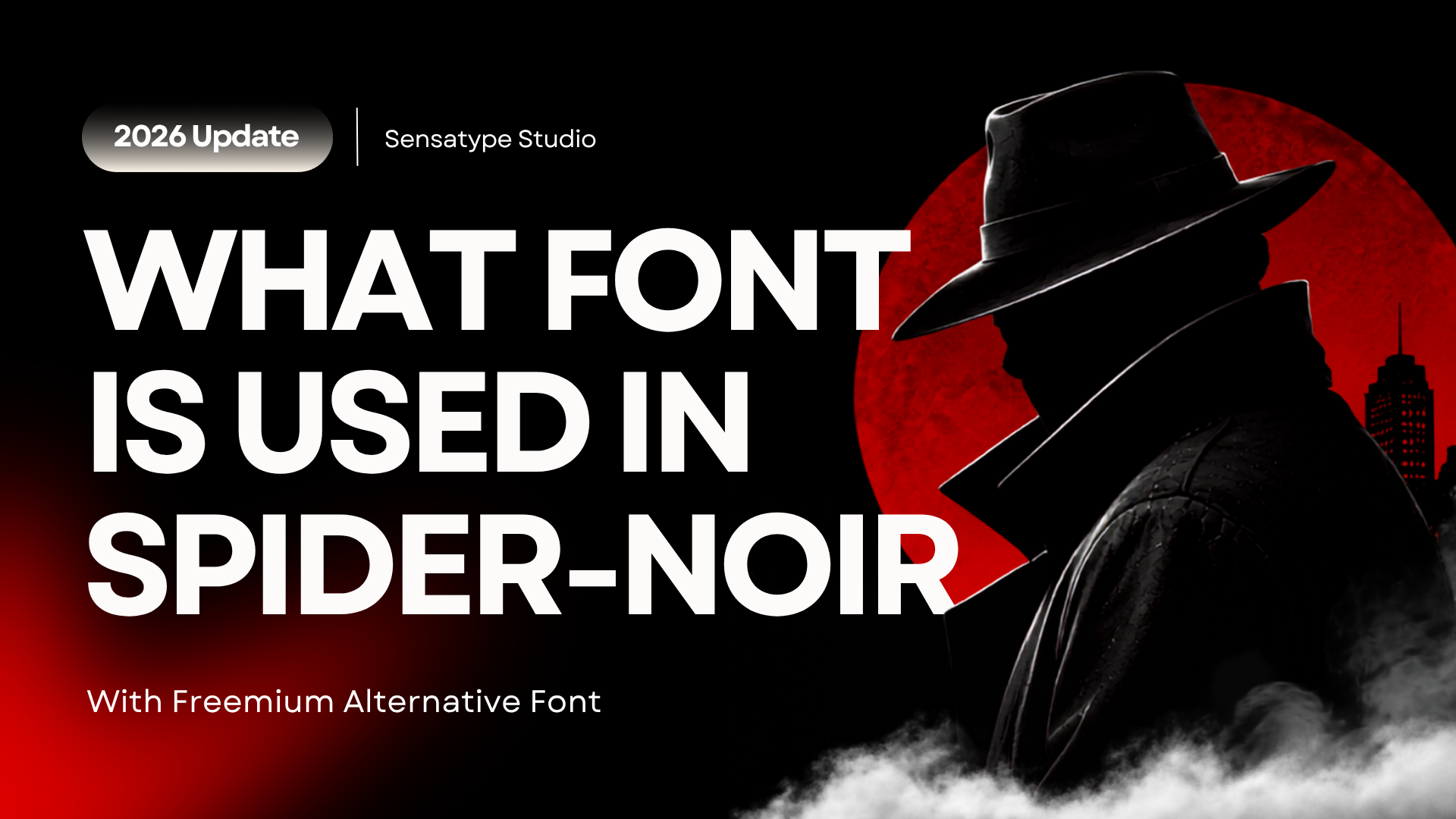
What Font Is Used in Spider-Noir? (And the Best Noir Style Alternatives)
Spider-Noir is an alternate version of Spider-Man with a completely different visual identity from the traditional character. First appearing in Marvel's Spider-Man Noir comic series in 2009, part of the Marvel Noir alternate universe, this version trades the bright, optimistic tone of the original Peter Parker for something darker and more atmospheric, closer to a 1930s detective film than a superhero comic.
That mood comes through most clearly in the typography. Title treatments built around Spider-Noir use bold, dramatic lettering that feels cinematic and mysterious rather than heroic. Like most entertainment logos, the exact font hasn't been publicly released. It's almost certainly custom lettering rather than an off the shelf typeface. So instead of chasing a font that doesn't officially exist, this guide breaks down why that style reads as dark and cinematic, then rounds up Sensatype fonts that capture the same mood for your own projects: movie posters, gaming logos, streetwear graphics, or brand identities that want to feel dramatic rather than cheerful.
Looking for display fonts with that same dramatic edge? Browse Sensatype's full collection of bold and gothic display typefaces while you read.
Is There an Official Spider-Noir Font?
No. The font used for the Spider-Noir logo has never been publicly confirmed or released for licensing. This isn't unusual. Most entertainment and film logos aren't built from a standard typeface at all; they're custom wordmarks, drawn letter by letter and adjusted until the shape matches the brand exactly.
Building a custom logo like this typically involves:
Custom letter construction, rather than starting from an existing typeface
Manual kerning and spacing adjustments unique to that logo
Modified character shapes that deviate from any standard font
Texture, grain, or lighting effects layered on top of the base letterforms
Proportions adjusted specifically for the title card or poster format
That's why searching for "the Spider-Noir font" turns up nothing official. There isn't one to find. The more useful question for designers is what makes that style of lettering read as dark, mysterious, and cinematic, because that's a look you can absolutely recreate with the right typeface.
What Makes Typography Feel Noir or Cinematic
A handful of specific typographic traits are doing the work behind that noir feeling, and understanding them makes font selection much easier than just browsing by "vibe."
High stroke contrast. Fonts where thick and thin strokes differ dramatically create visual drama and a sense of old world elegance, the same contrast you see in vintage newspaper mastheads and 1930s film titles.
Condensed or extended proportions. Noir and detective era typography rarely sits at a neutral width. Condensed letterforms feel tense and urgent; extended ones feel formal and imposing. Either direction reads as more deliberate than a standard width font.
Gothic and blackletter influence. Sharp terminals, angular strokes, and heavier weights borrow from gothic and blackletter traditions, which is where a lot of "horror" or "mystery" typography gets its edge.
Tight kerning and letter spacing. Noir titles are often set tighter than body text, which creates density and weight on the page, useful for a poster title that needs to command attention at a glance.
Texture and lighting effects. This one isn't about the font itself but how it's finished. Grain overlays, subtle vignettes, or dramatic lighting behind the letterforms are what push a clean typeface into genuinely cinematic territory.
None of this requires a custom built logo. A well chosen display font, combined with the right finishing touches, gets you most of the way there.
Choosing the Right Style: Gothic vs. Art Deco vs. High Contrast Sans
Not every "dark and dramatic" project wants the same typographic style. Three directions cover most noir inspired use cases, and picking the right one depends on the era and mood you're going for.
Gothic and horror influenced display fonts suit projects that lean into mystery, suspense, or genuine darkness: horror movie titles, thriller branding, game logos with a menacing edge. These fonts use heavier weights and sharper terminals to create tension.
Art Deco fonts fit the 1920s to 1930s period specifically, the same era Spider-Noir's aesthetic draws from. Geometric structure, refined detailing, and a sense of vintage glamour make these ideal for period accurate detective or gangster era branding, luxury identities, and editorial layouts with a retro feel.
High contrast luxury sans serifs work when you want the drama without the vintage signaling: sleek, modern, and elegant rather than explicitly retro. These suit fashion branding, premium product identities, and any project where "dramatic" needs to also read as "high end."
If you're not sure which direction fits, ask what era and tone your project is actually going for. Genuinely dark and suspenseful points toward gothic. Period specific glamour points toward Art Deco. Modern and elevated points toward high contrast sans.
Font Alternatives for Spider-Noir Style Branding
These Sensatype fonts aren't reproductions of any official logo. There isn't one to reproduce. They're selected for the same underlying traits covered above: contrast, structure, and mood.
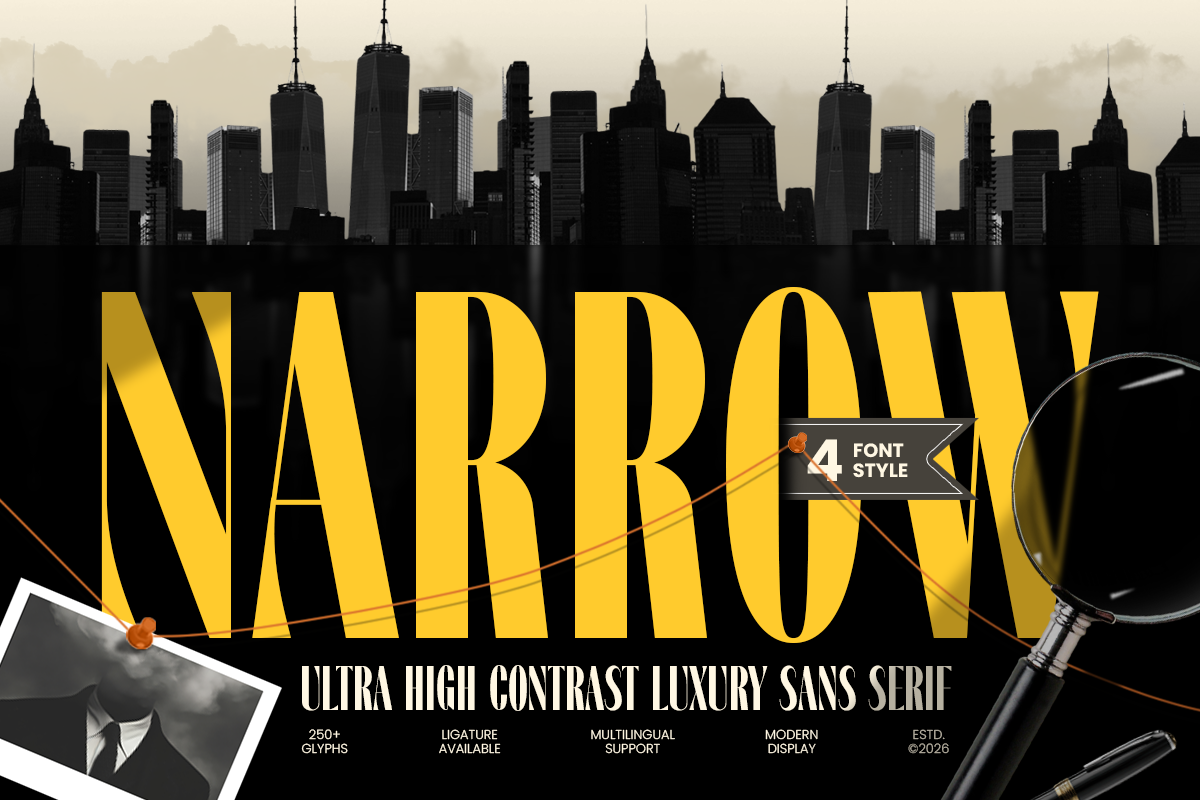
Narrow — Ultra High Contrast Luxury Sans
Narrow pairs dramatic stroke contrast with narrow, refined proportions, giving it a sleek and premium character. It works well where you want cinematic weight without a vintage feel: luxury branding, fashion identities, and sophisticated logo work. View Narrow on Sensatype →
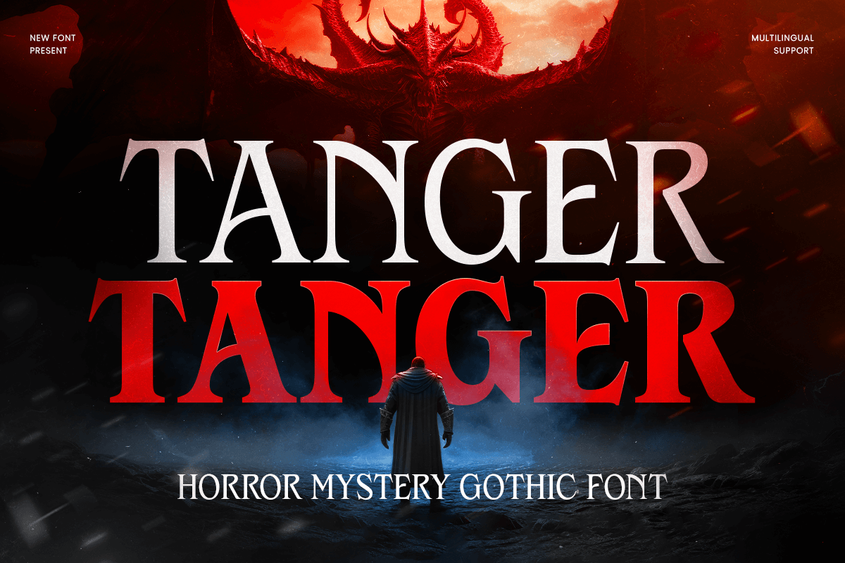
Tanger — Horror Mystery Gothic Font
Tanger leans into gothic, angular letterforms built for genuine suspense. Its weight and sharp terminals make it a strong fit for horror posters, mystery genre branding, and game logos that need to feel unsettling rather than just "dark." View Tanger on Sensatype →
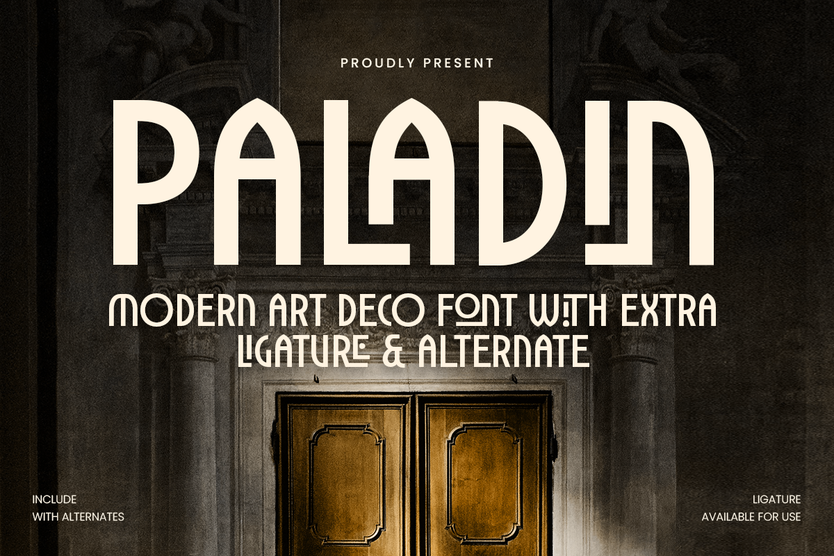
Paladin — Modern Art Deco Font
Paladin's geometric structure and period accurate detailing make it a close match for 1920s to 30s detective era aesthetics, the exact era Spider-Noir's visual world is built on. Strong for branding, packaging, and editorial work with a vintage luxury feel. View Paladin on Sensatype →
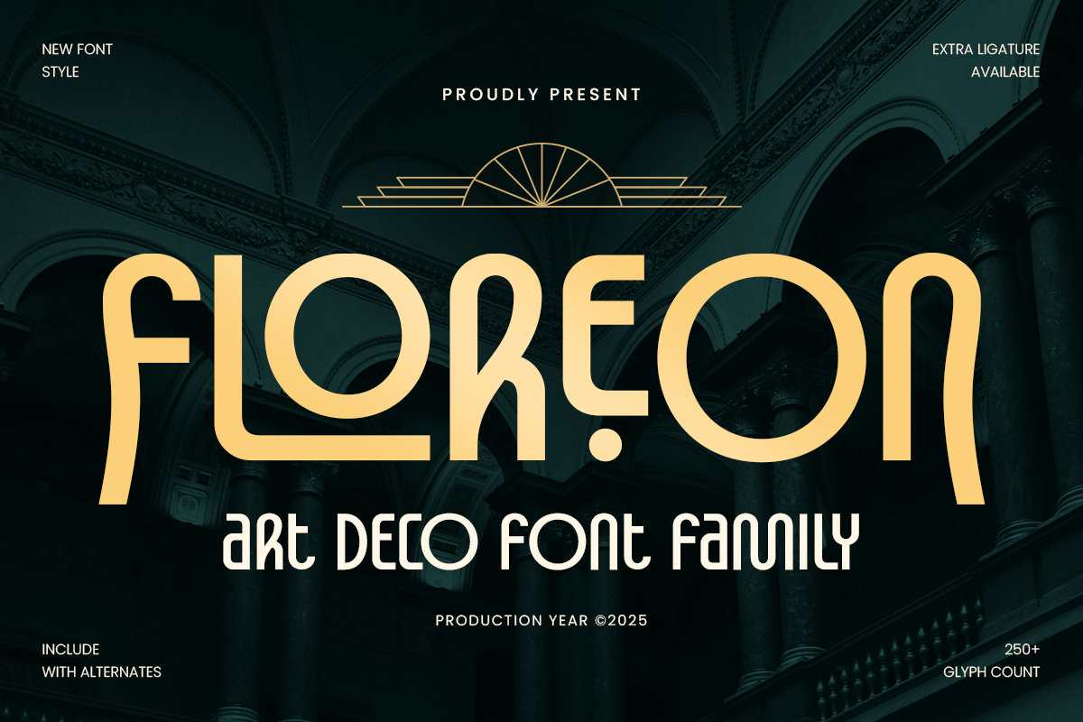
Floreon — Art Deco Font Family
As a full family with multiple weights, Floreon offers more flexibility than a single weight display font, useful if your project needs a heading weight and a lighter companion weight from the same visual family, such as a poster with both a title and supporting text. View Floreon on Sensatype →
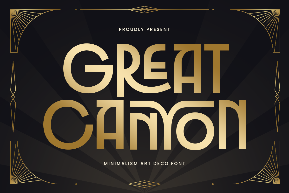
Great Canyon — Fashion Brand Art Deco Font
Great Canyon combines Art Deco geometry with sleeker, more fashion forward proportions and high contrast strokes. It suits projects that want vintage glamour applied to a more editorial or luxury fashion context rather than a strictly period one. View Great Canyon on Sensatype →
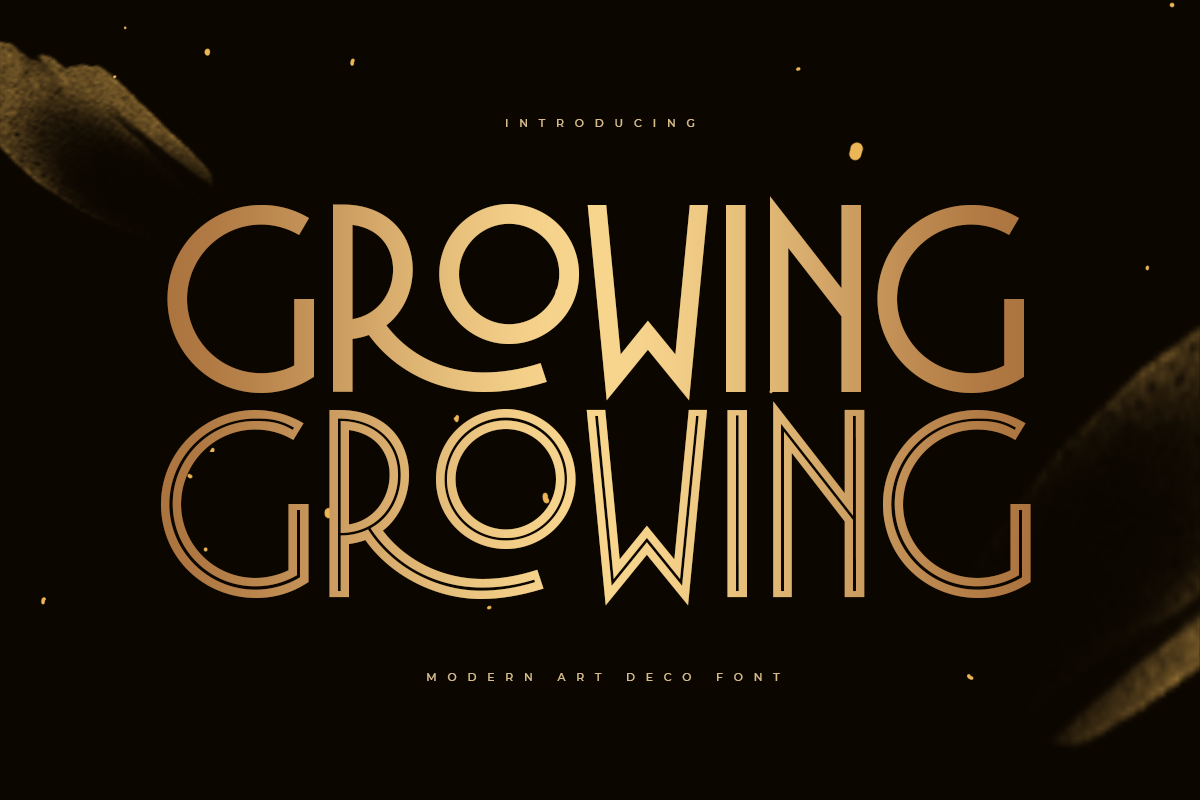
Growing — Luxury Modern Art Deco Font
Growing's stylistic ligatures and character variations add a distinctive, handcrafted quality that reads as premium and considered, a good option when you want Art Deco structure with a bit more personality in the details. View Growing on Sensatype →
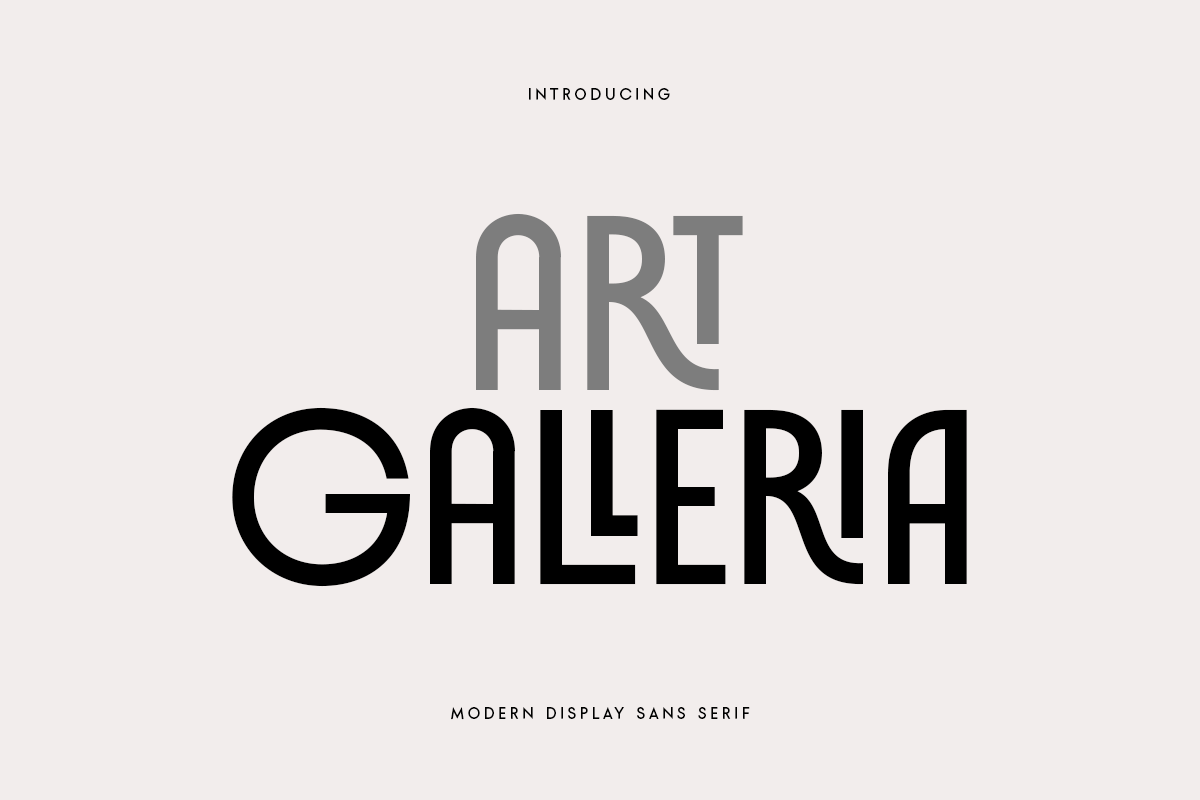
Art Galleria — Modern Display Sans Serif
Art Galleria trades vintage cues for a cleaner, more contemporary display style, while still using ligatures and alternate characters to keep it from feeling generic. Best suited to modern branding that wants dramatic presence without leaning retro. View Art Galleria on Sensatype →
Found a style that fits your project? Preview the full glyph set and licensing details on each font's product page linked above.
Licensing These Fonts for Client or Commercial Work
If you're building a logo, poster, or brand identity for a client and not just a personal project, the license matters as much as the font itself. A basic desktop license typically covers personal use only and may not extend to client deliverables, merchandise, or resold designs.
Sensatype fonts are available under three license tiers: Desktop, Business, and Corporate. Check the license page to confirm which tier covers your specific use case. Client branding work, printed merchandise, and large scale commercial rollouts typically require Business or Corporate coverage rather than a Desktop license. Confirming this before you build a project around a typeface is far simpler than re-licensing after client work has already shipped.
Common Mistakes to Avoid
Treating "dark" as one style. Gothic, Art Deco, and high contrast sans all read as dramatic, but they signal different eras and tones. Mismatching the style to the project, an Art Deco font on a modern horror game, for instance, undercuts the effect.
Skipping texture entirely. A clean display font alone rarely reads as fully cinematic. Grain, lighting, or subtle wear effects are often what separates a flat logo from one that feels like a movie title.
Overcrowding the composition. Noir and cinematic titles tend to work best with restraint: one strong display font, limited color, and clear hierarchy, rather than multiple competing display styles.
Assuming a personal license covers client work. This is the most common licensing mistake for designers taking on paid branding projects. Verify tier coverage before you commit a typeface to client deliverables.
Frequently Asked Questions
What font is used in Spider-Noir? The exact font has never been officially confirmed or released. It's almost certainly custom lettering created specifically for the character's branding, not a licensable typeface.
Is there a Spider-Noir font available for download? No official Spider-Noir font has ever been released. Designers instead use gothic, Art Deco, or high contrast display fonts that capture a similar dark, cinematic mood.
What typography style does Spider-Noir use? It combines bold display lettering, gothic and comic book influences, vintage 1930s noir aesthetics, and cinematic title composition, built around high contrast and dramatic proportions rather than a specific named font.
What fonts are similar to Spider-Noir's style? Fonts with high stroke contrast, gothic detailing, or Art Deco structure tend to capture the mood most closely. Narrow offers a sleek high contrast take, Tanger leans into gothic horror, and Paladin, Floreon, and Great Canyon cover Art Deco and vintage glamour directions.
Can I use these fonts for a client project or commercial branding? Yes, provided you have the correct license tier. Sensatype's Business and Corporate licenses are built for client work and commercial use. Check the license page before starting a paid project.
How do I create a Spider-Noir inspired design without copying the original? Focus on the underlying style rather than the specific character: a high contrast or gothic display font, a restrained dark color palette, subtle texture or lighting effects, and tight composition. That combination reads as noir and cinematic on its own, independent of any particular logo.
There's no official Spider-Noir font to find, but the typographic DNA behind it is well understood: high contrast, gothic or Art Deco structure, and tight, deliberate composition. Explore Sensatype's full display and gothic font collection to find the typeface that fits your own dark, cinematic project.